Prototype Update 06/22/2023
Revisions
This week I am heading up some new work on my course app by rethinking how my course pages will look. While functional, I didn't feel like my first designs I had created last summer had really invoked the right mood I was aiming more. It well short in the illustrations and animations department that I had hoped to accompany the actual course content and bring some visual context to the science.
Content Strategy for Prototype
For the prototype submission this weekend, I am aiming to complete one sub-lesson within a module in order to demonstrate the overall course design and structure and to provide a preview of the lessons.
In the future, my goal is to animate some of these illustrations where appropriate to further lend to the content's visual narrative. I view these illustrations the same way as pictures in a storybook to help the audiences imagination.
Old vs New
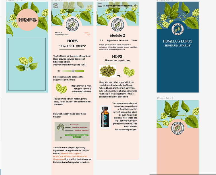
On the left is my course design from Design Studio the previous summer and the two images on the right demonstrate the new approach I would like to take towards the course design. I added more padding between the text and interspersed into the design my illustrations that I have been working on in Procreate using my Ipad.
Overall my goal was to brighten the mood and add some visual life to the text content to "breath life" into learning. My dragon I would like to slay while creating this app is overcoming the idea that a complex topic cannot be learned easily. I want to make what is a scary concept to some, more approachable.
To make sure to keep the audience engaged, I retooled my color palette minorly to include a softer and more vibrant blue. This paired with the greens of my hops very nice to lend an overall fresh & fun vibe.
Botanical Illustrations
Illustrations styled after vintage botanicals was my goal for this project and something that was missing from my previous prototype. For my prototype submission this week, I want to further expand on these illustrations to include a few more pieces that will help to illustrate the brewing process.
Punch list for week remainder
During the remainder of the week there are many tasks to complete
1) Complete 2-3 more illustrations detailing more of the course section
2) Finish design layout including adding missing titles, buttons, navigation components, etc.
3) Input illustrations into design in Figma and finalize spacing for content
4) Prototype app where appropriate within Figma for a clickable product
5) I also need to finalize a list of questions about the functionality of the app for a live user test next week. Aiming to also have questions about features they would like to see in a brewing app. I have gathered a small cohort of people who enjoy beer but would like to learn brewing to be a tester for my user feedback


