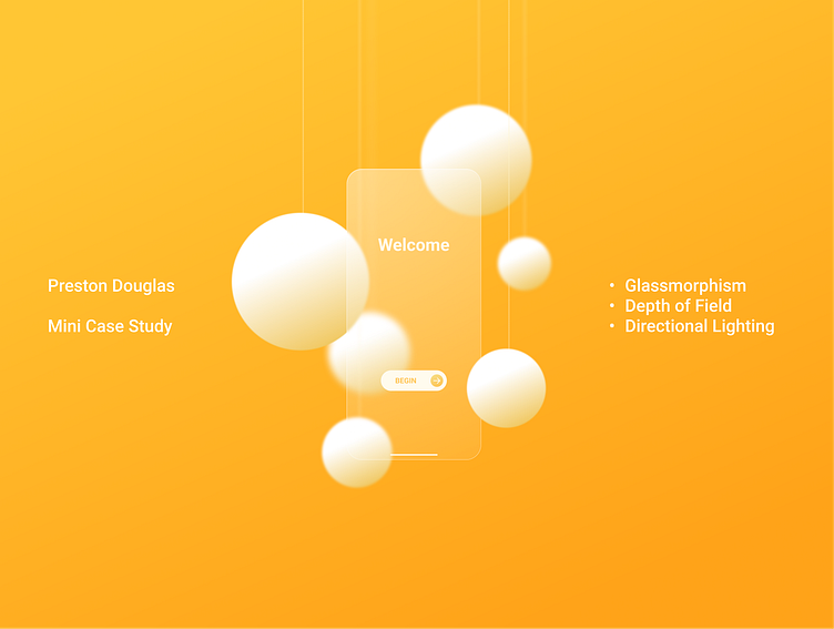
Glassmorphism - Depth - Lighting | Mini Case Study
Purpose
My goal for this study was to further my knowledge on the techniques of Glassmorphism, Depth of Field, and Directional Lighting using Figma. It was also a perfect opportunity practice crafting posts for Dribbble and Linkedin. What originated as a simple Glassmorphism UI Tutorial turned into a very educational project where I had the opportunity to explore, experiment, and explain these techniques.
Experimenting with Glassmorphism
Glassmorphism gained popularity through its implementation by Apple in the macOS Big Sur update. It is expected to remain a prominent part of Apple’s design in Vision OS.
Radial Gradient, Background Blur, and Inner Stroke are widely universal elements in Glassmorphic design. An Inner Shadow can also help add a bevel to the edges.
Radial Gradient is used to achieve the reflection visible on the surface of a glass pane.
Background Blur creates the “frosty” effect added to objects positioned behind the main Glassmorphic element.
Inner Stroke clarifies the edges seen on glass.
Creating Depth Using Layer Blur
Depth of field is used to express hierarchy by showing priority based on which elements are more in focus.
To achieve this effect, the Layer Blur level is increased for each sphere and string element based on its distance from the Focal Plane (the center card).
The center card is the only element completely in focus, clearly indicating its priority to the viewer.
Creating Perspective with Directional Lighting
Directional Lighting helps create perspective, showing the viewer the depth relationship between each element by how the light is reflected on those elements.
To create this effect, an imaginary point light is placed out of frame in the top left corner. The point light simulates how light is projected, similar to how a light bulb casts shadows in a room.
A Linear Gradient aligned with the point light helps simulate the angle of the light cast. When imagining this effect in real life, objects placed further back have less shadow because they are “behind the light” while closer objects have more shadow because they are “in front.” Adjusting the shadow is achieved by positioning the Linear Gradient closer or further away from the source.
Find me on Linkedin! https://www.linkedin.com/in/preston-douglas-5a964026b/


