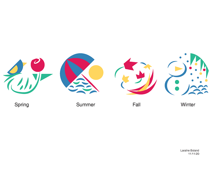
Four Seasons
Each symbol was made with the same red, yellow, blue and green color palette. Each symbol was meant to fit in a sort of circle. These symbols were meant to fit on some kind of product, so I chose a soap branding. The box is extremely colorful with fun patterns.
More by LaraineDrop View profile
Like

