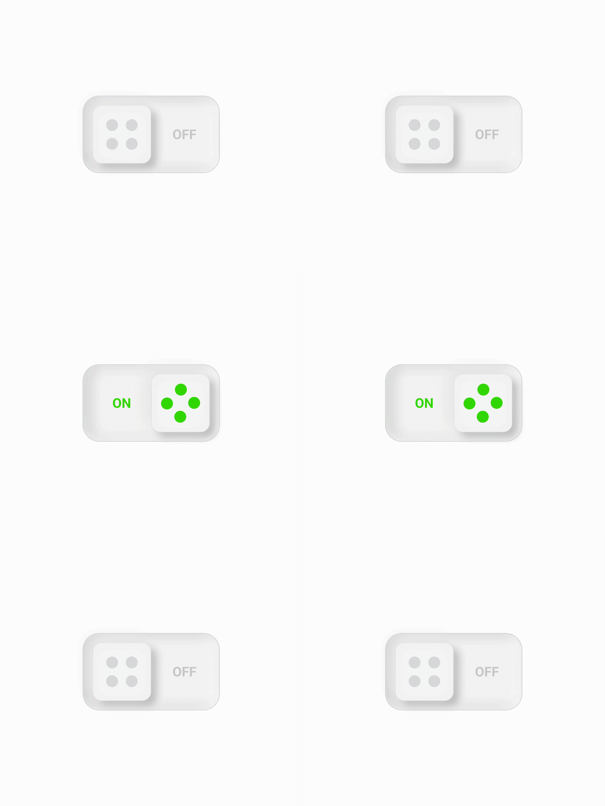
Animated Toggle Button
Our job as UX designers is to create interfaces that are easy to understand, accessible, and engaging to users. To achieve this, I applied a series of fundamental UX principles in the design of an animated toggle button in Figma.
Design Consistency: The toggle button is universally recognized, allowing users to understand the functionality instantly. The design preserves the traditional on-off switch metaphor but incorporates added visual cues (dots and labels).
Affordances and Signifiers: The 4-dot representation on the slider indicates that it can be slid, and the words 'on' and 'off' serve as clear signifiers to state the current state of the switch, thereby making the interaction more intuitive.
Feedback: The transformation of the dots and text from grey (off) to green (on) and vice versa provides immediate visual feedback, enabling users to understand the result of their actions.
Simplicity: The design minimizes cognitive load by keeping the visual elements straightforward and clean. This simplicity aids understanding and promotes better user engagement.
Color Usage: The choice of grey for 'off' and green for 'on' is intentional. Grey is usually associated with deactivated elements, and green signifies success or activation in most UIs. This ensures the design aligns with color expectations and is readily understood.
Accessibility: To improve accessibility, I've made sure that the contrast ratio between the active (green) and inactive (grey) states is high enough to be distinguishable for people with visual impairments.
The animation of the button sliding adds an element of delight, enhances user engagement, and reinforces the feedback of an action being taken. Although not revolutionary, this decision aligns with the principle of creating pleasurable and engaging interfaces.
Overall, these design choices and the use of animation make the button not only functional but also intuitive, engaging, and accessible to a wide range of users.

