Selecting pet insurance UI
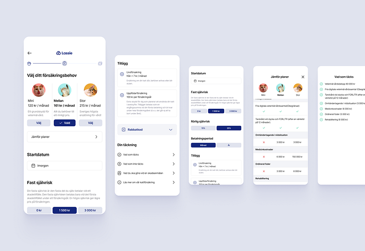
As a part of the increasing conversion design task, I re-imagined the Insurance selection view.
Main problems that I was solving with the redesign:
On mobile, two subscription types were out of the view. It was hard to compare all of the value propositions of each subscription type.
Important items that were affecting the price were hidden out of the view and hard to relate to the subscription.
Unclear what step I was at and how much is left after a bunch of questions in the application process.
Customers didn't have enough information and value proposition.