Lity
Lity © 2023
Introducing Lity, a bold brand with a clear vision: democratizing connection in our digital age. The Lity's visual was crafted to amplify this mission, using simplicity as a vehicle for impact and brand recognition.
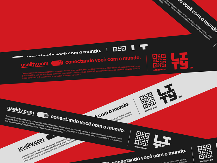
The logo is an artistic rendering of the word "Lity", embodied in a clean, minimalist design. Designed with a modern, easy-to-read font, the logo manages to be striking yet subtle at the same time, capturing the vibrant essence of the brand.
The colors, a mix of red, white, black, and gray, are the backbone of the design. Each color was handpicked to mirror the brand's personality: red for energy, white for simplicity, black for sophistication, and gray for balance.
With this project, the aim was to go beyond merely creating a visual that represented Lity. The goal was to craft something aesthetically appealing and instantly recognizable. Through the union of minimalism with expressive colors, the result is a design that encapsulates everything that Lity stands for, establishing innovative and accessible connections.


