WP2P — Case Study — Visual Identity


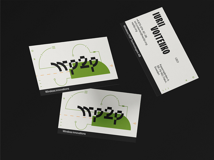
WP2P — WIRELESS P2P TECHNOLOGIES AB
Type of Design: Brand Identity
Business Area: Monet (communication systems)
Client
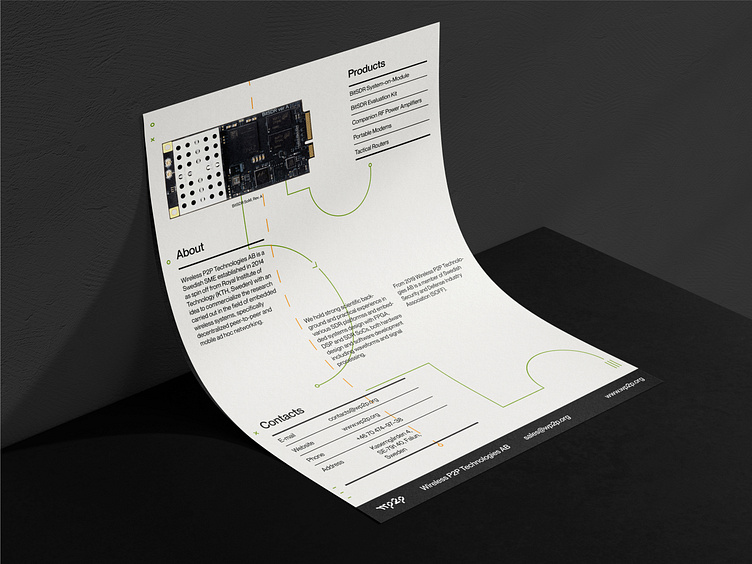
WIRELESS P2P TECHNOLOGIES AB is a Swedish SME established in 2014 as a spin-off from the Royal Institute of Technology (KTH, Sweden) with an idea to commercialize the research in the field of embedded wireless systems, specifically decentralized peer-to-peer and mobile ad hoc networking.
Goals
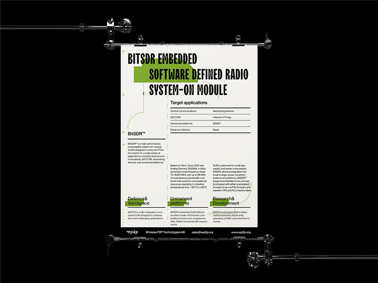
— To create an identity system that appeals to the two target groups: scientists (science students) and military sphere workers.
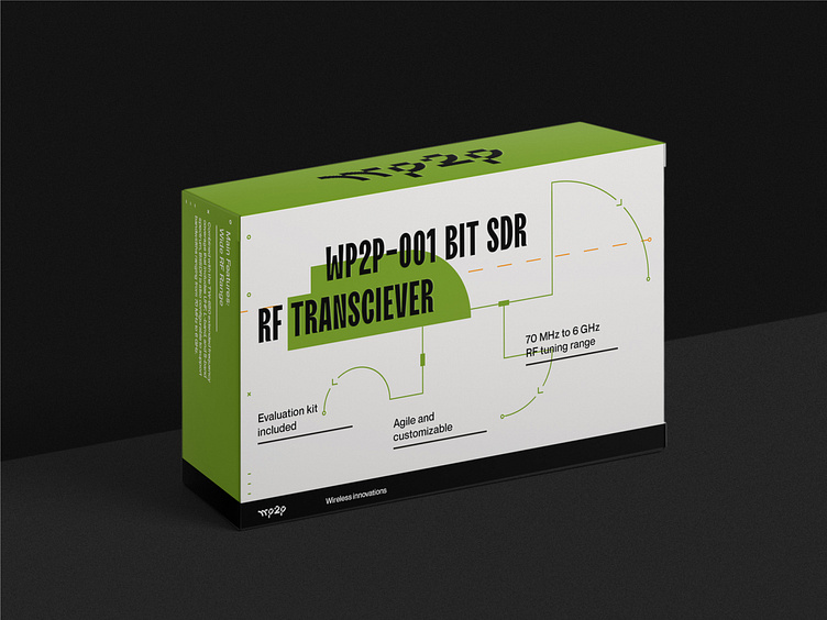
— To explain the work principles of sophisticated technology using graphics. WP2P had to take part in several conferences to meet potential clients from both spheres and to represent themselves with a new look.

Concept
The metaphor helped us to explain the working principle of the mechanisms with which the brand works, and to enrich the identity of additional meaning. WP2P, like the flight control center, helps to direct air traffic. Flight operational center monitors and maintains contact with the aircraft during the flight, showing him the way. Each airport has its control station. It contacts pilots and helps them take off and land. In addition to verbal communication, marking the runway helps to control the movement of aircraft either. These symbols became the basis for corporate identity language.