Be Strong!
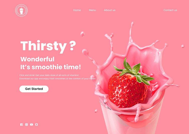
I created a landing page design for a smoothie brand named "Be Strong." The primary objective was to achieve a modern, minimal, and fresh aesthetic with a feminine touch. The dominant color scheme revolves around pink, a hue that embodies tranquility, love, kindness, and femininity.
More by Kristina View profile
Like
