Material Design Exploration
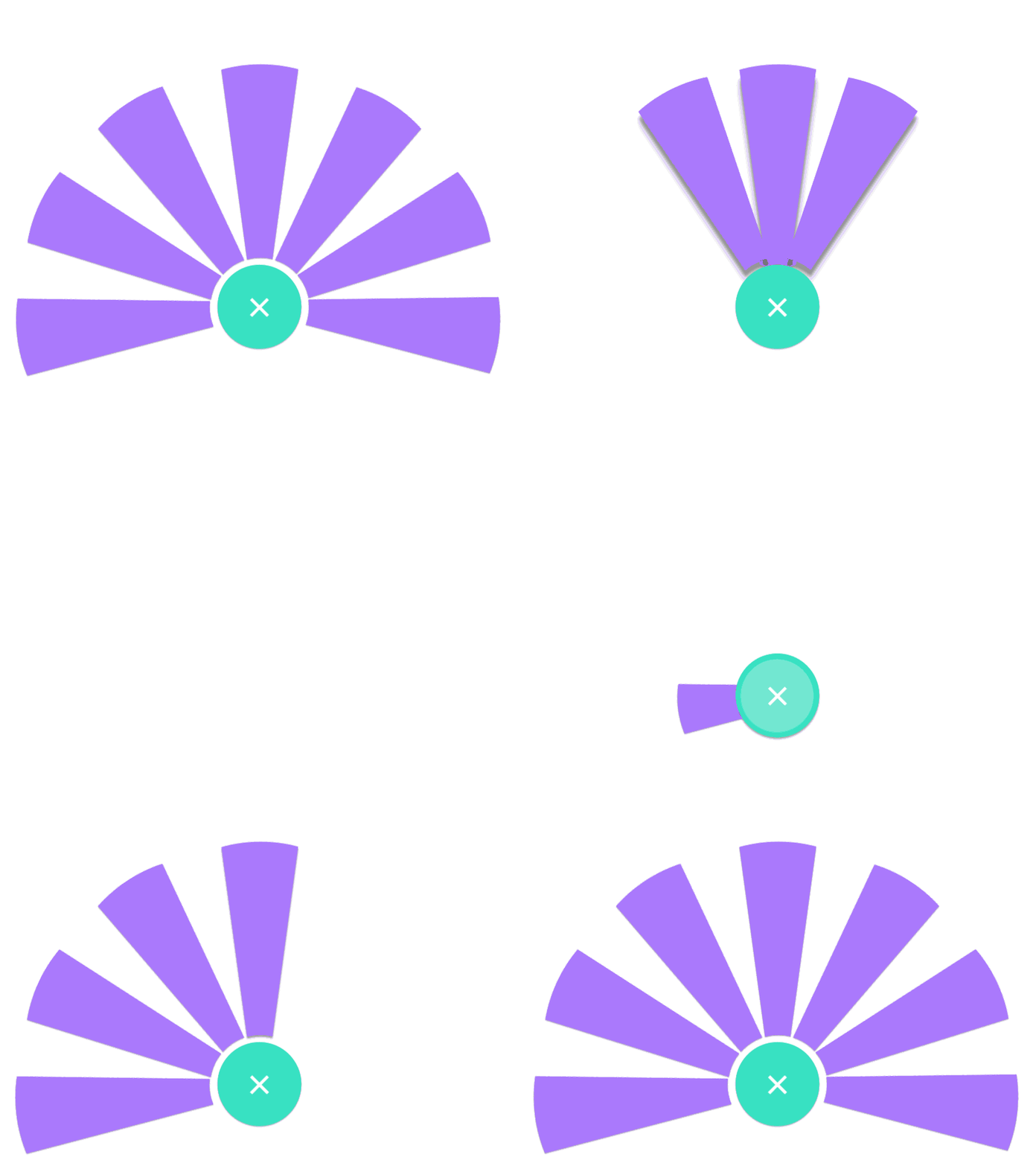
This was a quick test of a menu interaction. I followed the Material Design guidelines for most of it (including the shadows and effects). I had this idea before the FAB (Floating Action Button) was introduced but thought that this could be the perfect presentation for the idea. If this idea was implemented in a product, obviously the timing, sizing and animation flow might have to change depending on what the user's goal is/was, as well as not getting in the way of what the user is trying to accomplish. Comments welcome!
More by 5o5 View profile
Like
