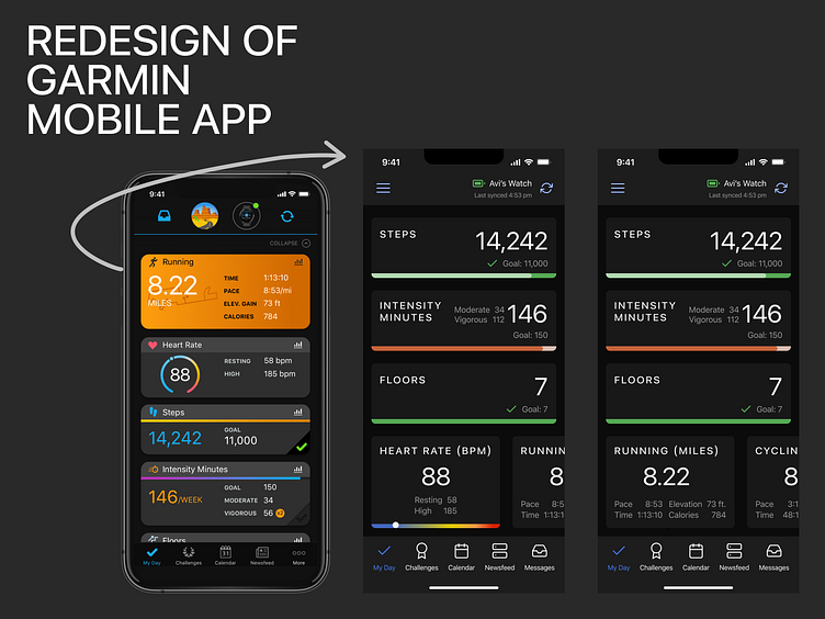
Garmin Mobile App Redesign
First, a disclaimer -- this redesign was part of #shiftnudge, so as I'm not a Garmin user, I made some assumptions on functionality that might be incorrect!
The icons on the mobile app screen weren’t adding a whole lot. Running, heart rate, steps and intensity minutes icons didn’t communicate what those sections were any faster than the labels themselves did, and the different colors were distracting. I removed those, and separated the labels from the score/counts (88, 14,242, 146) to make each more scannable.
Arguably the most important data to note after the score/counts (88, 14,242, 146), was which daily goals were met, and which weren’t. This wasn’t obvious in the original design, so I pulled that into a progress bar at the bottom of each card.
I thought it was more important to show the synced status and battery life of the Garmin device, so I removed the big avatar (presumably for the account), as well as the big image of the Garmin watch, and replaced it with an indicator of the name of the device (Avi’s watch), the battery level, sync status, and a button to sync.
It seemed odd to me that there would be a more button in the bottom tab bar, so I moved that into the upper left in a hamburger menu, swapping it with the placement of the messages icon. Tapping the hamburger meu would open up a sidebar nav that would show the bottom nav controls and everything else that would have been behind that “more.”
I originally had the green check mark for each topic on the right side of the goal, so that it would be easily scannable, and I considered adding an orange progress icon in place of the checkmark icon for the topics where the goal has not yet been met, but realized that icon would basically do the same thing as the horizontal progress bar. So when I decided not to use the progress icon, I switched the green check mark icon to the left side of the goal so that the goal text wouldn’t move around and shift left/right when the checkmark came in.
It seemed odd to me that seeing details/stats for each item would be dependent on tap of a small graph icon taptarget, so I decided to simplify and make the whole card clickable to see those details.
It also seemed odd to me that you’d see “intensity minutes” for the week on a page called “My Day”, so adjusted that to a daily goal.
