Logo | Brand identity | UIUX for PEPARTS
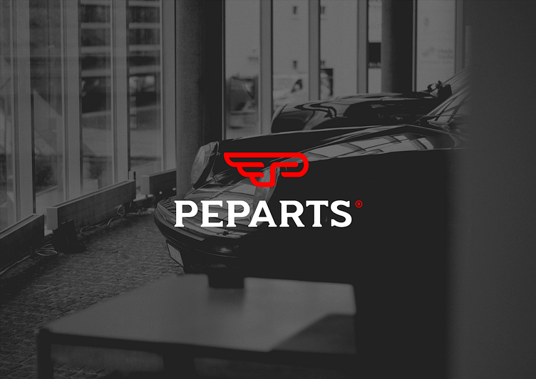
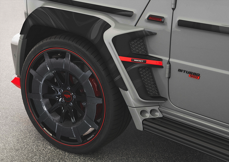
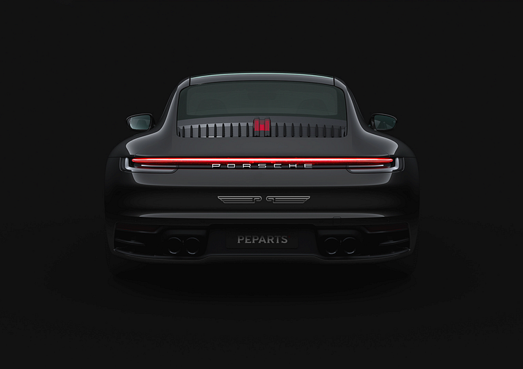
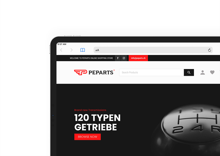
As the demand for high-quality tuning equipment and accessories soars, Peparts emerges as a leading player in Switzerland's tuning car industry. With a focus on local clients and international standards, Peparts aims to deliver top-notch services and products.
Through meticulous brand identity creation, we have captured Peparts essence and vision.
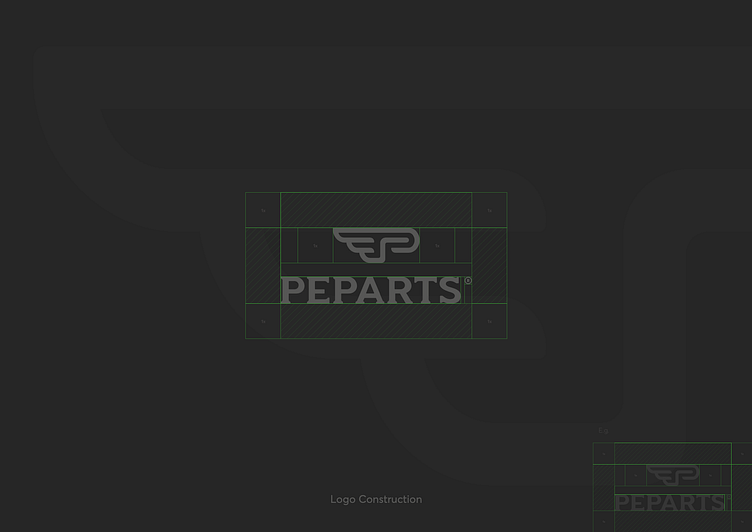
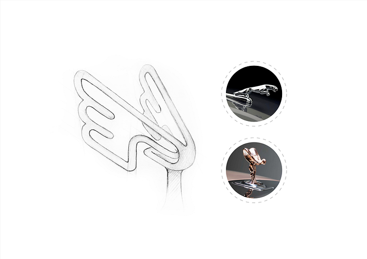
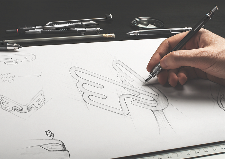
Concept behind the logo
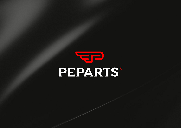
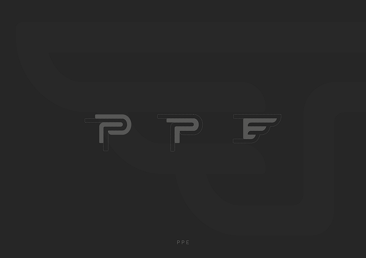
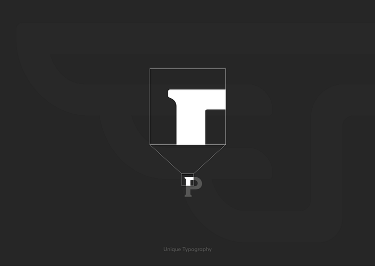
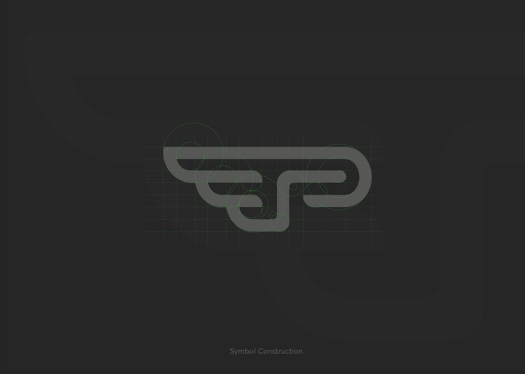
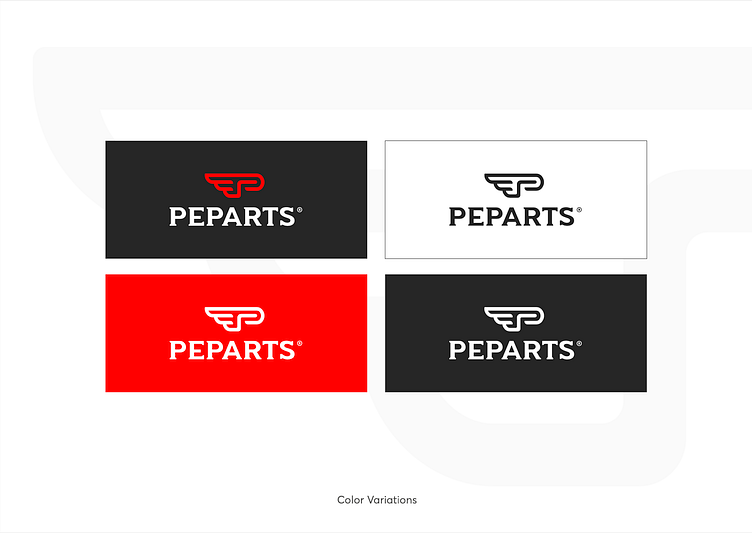
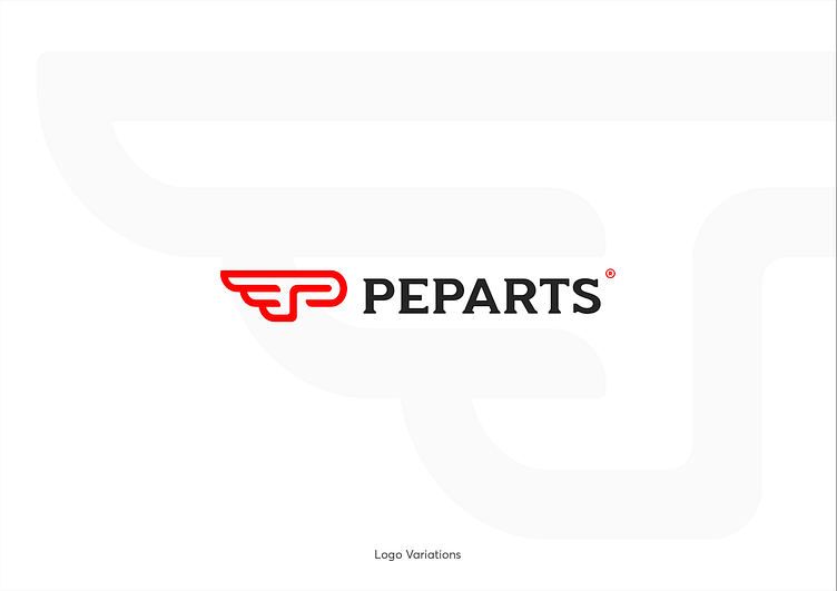
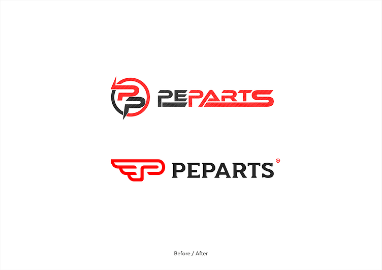
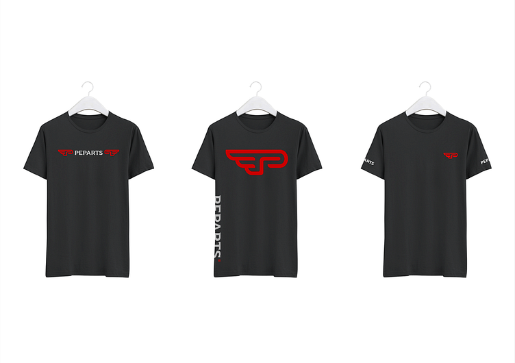
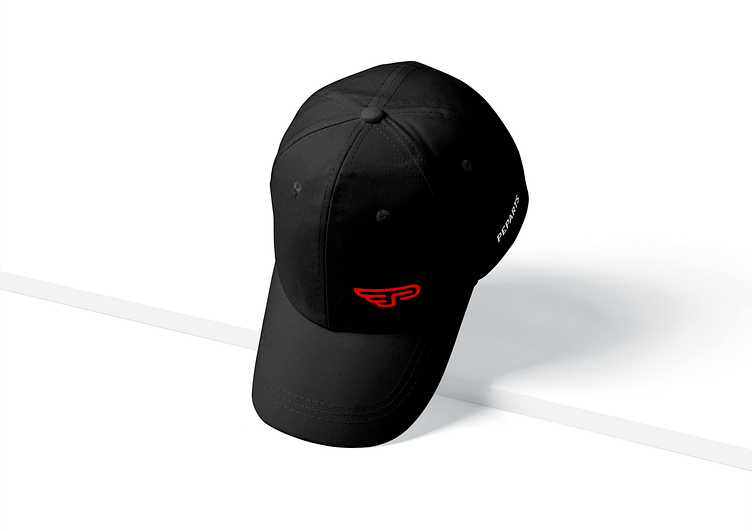
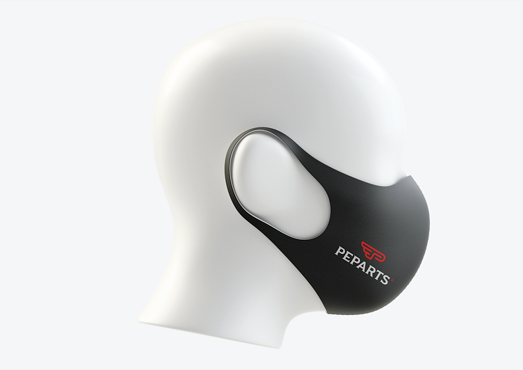
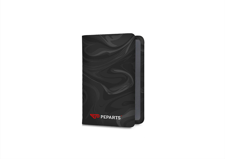
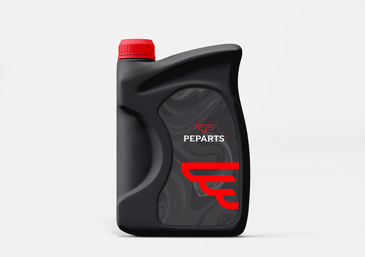
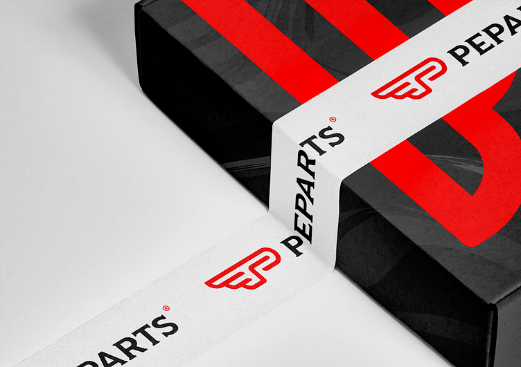
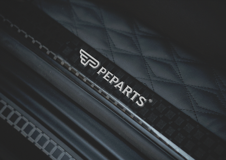
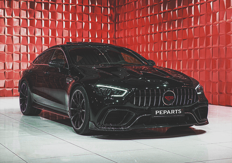
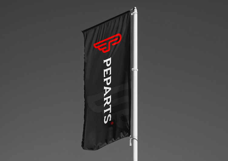
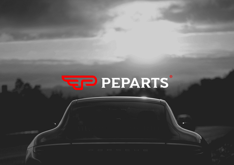
The logo symbolizes speed and excitement with crossed racing flags, cleverly integrated into the initials "PPE" which are given wings. To further define the adrenaline and speed that these modified cars provide, the letter E was flipped. The vibrant red color, now more illuminated, maintains continuity with the previous brand, while the sophisticated serif typography conveys durability and finesse.
Every element of the brand system has been thoughtfully crafted to position Peparts as a reference in the ever-growing trend of car modifications. This rebranding marks a significant milestone, elevating Peparts to new heights in the Swiss tuning industry.
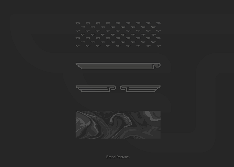
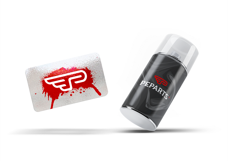
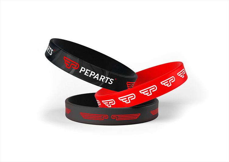
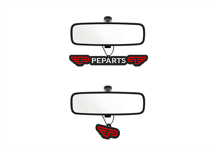
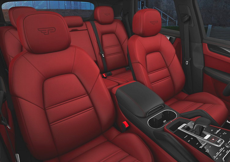
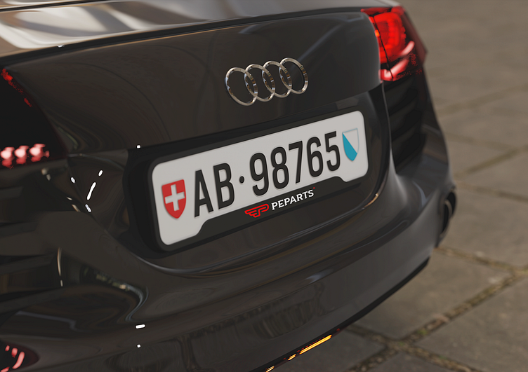
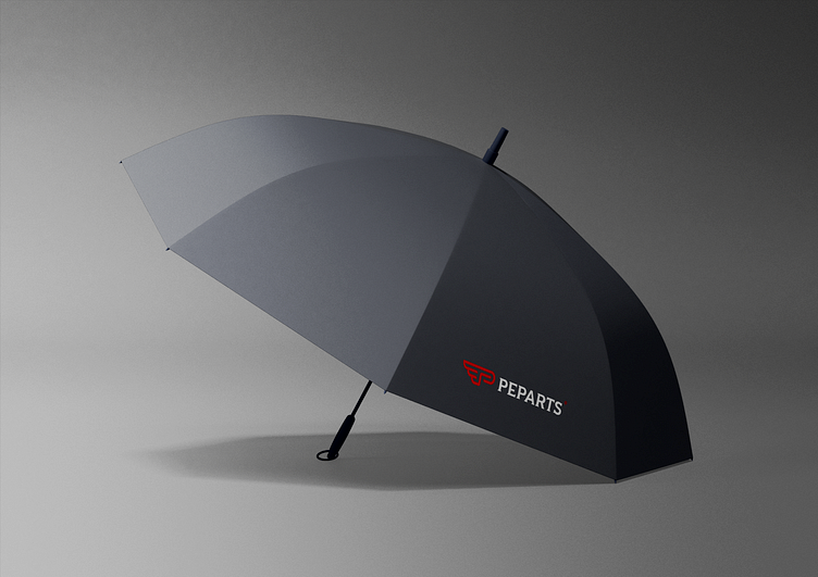
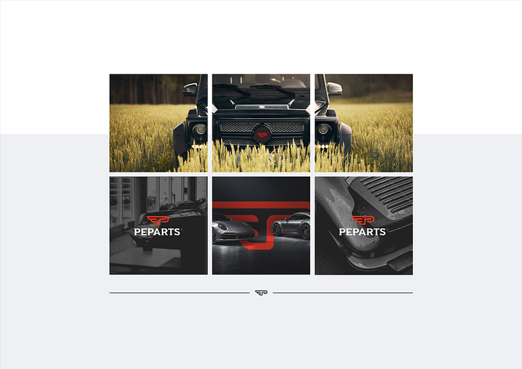
Visual concept below:


This project is done by TROKIT Agency Creative.
Proud to have been part of it as Lead Brand & Advertising Designer.
