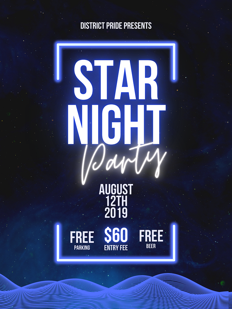
Club Advertisement Poster
This is one of my earliest pieces that I made in terms of palette. I wanted to challenge myself and opt for a darker yet ambient palette that suited the "nightclub" theme for this composition. Looking back, I feel that there could've been a lot more I wish to bring into the work.
More by Faiza Barise View profile
Like
