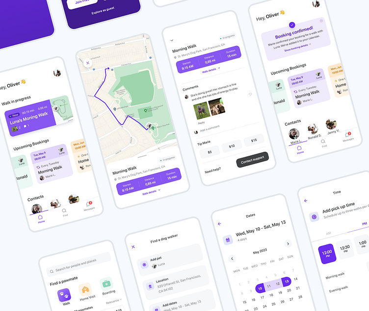
Pawmates - mobile app case study
🌏 Context
This case study outlines the product design process for Pawmates, a mobile app that connects dog owners with trusted local caregivers. The goal of Pawmates is to provide a convenient and reliable platform for dog owners to find reliable and loving care for their furry companions.
👨💻 My role
As a solo product designer, I was responsible for conducting user research, ideating and conceptualising the product, creating wireframes and prototypes, conducting user testing, designing a visually appealing interface.
🗓 Time frame: 12 weeks
🚩 The problem
Dog owners with busy schedules need a convenient and reliable solution to find on-demand trustworthy dog care services that ensure their dogs receive the needed exercise, care and attention. There is a need for a solution that simplifies and streamlines the process of connecting dog owners with trustworthy caregivers in their local area.
🕵️♂️ Discover
User research, desk research, user interviews, concept testing
Market research
Conducted market research to learn more about the existing market and identify the key players. Performed competitive analysis between the two dominant applications in this field: Wag! and Rover.
Findings:
Both apps offer multiple dog care services and both aim for to establish trust/transparency claiming background checks and a form of verification for service providers along with detailed caregiver profiles. However, both are only available in the U.S., onboarding was a bit heavy and somewhat overwhelming for first time use. Searching and filtering could be improved to offer more specific results.
User interviews
Understanding the needs and goals of dog owners and their dogs
Conducted 10 one-on-one interviews with target users to understand the pain points and needs of dog owners and their pets in order to gather insights and identify the key features that would address the users' needs effectively.
Findings:
The major challenges users faced in the process were not one-dimensional. They were a complex mixture between the practical aspect and logistics of finding, booking and scheduling dog care services and a set of psychological and emotional factors of entrusting “a stranger” for the task.
🎯 Define
With information from the research and understanding of the user's pain points, needs and goals, I summarised it into affinity map and user personas to help keep the ideation process focused and help inform the design decisions going forward.
Who are we designing for?
Creating the user personas ensured I kept the users' specific pain points and goals in mind and the proposed solutions/features are there to solve them.
With the insight gained from research, I was able to identify three major areas the solutions and features should focus on, that correspond to user pain points and challenges.
💡 Ideate
With a clear understanding of the user of their pain points, needs and goals, it was time to put a thinking cap on and come up with ideas for possible solutions.
How might we..?
Kicked off the ideation phase with a brainstorming session aiming to outline and map potential solutions
With the core features identified, I proceeded to map out the main user flows and organise the information architecture
User flows: a key factor for the main user flow was it should allow new users to explore and try out the product, before committing to an account.
Users learn best through doing.
Wireframes
Started with sketching ideas on paper, then when i had an idea of what the main screen contain, i blocked them out as sections to have a clear overview of what each screen would contain.
I proceeded with the design the high fidelity wireframes and prototyped the main flows to test with target users. The tests were quite helpful, as they pointed out several opportunities for improvement. I iterated and ran user tests again until I smooth out the experience.
🛠 Visual Design & Prototype
With the main flows locked in, I moved on with design of the interface, defining my styles and organising all components into a system.
Live tracking feature with real time stats and GPS track allow users to get all the necessary information with one glimpse. The comments section would allow for an unobtrusive way to communicate with the caregiver and share additional updates or photo from that walk.
Allowing both flexible and specific searching and also adding the ability to book a caregiver for multiple days and multiple walks per day (most dogs need at least two). That would allow users to find matches based on their schedule and organise service close their dog's usual routine.
🧐 Testing
With the prototype in hand, I went on to test it with users. It consisted of 5 users and the goal was evaluate the main flows.
Findings
The test results were satisfying overall and users managed to complete tasks easily without need of additional help. They were delighted with the concept in general. As expected a few things came up that could be improved.
Positive
Color coded services and calendar
Detailed search / Well matched results
Live tracking feature is very informative
Negative
Notifications and system updates need to be more consistent
Search can allow for more customisation
Price estimation when booking was confusing
Conclusion
I was thrilled to work on this project and develop a product from scratch.
One thing that stood out to me in the process is the importance of research before even thinking about any visual design. Taking the time and choosing the right methodologies to get valuable insight really sets a solid foundation to build upon and ensures all further effort goes towards the right direction.
Thank you for your time and attention. All feedback will be appreciated 🙏
If you liked it, don't forget to hit ❤️


