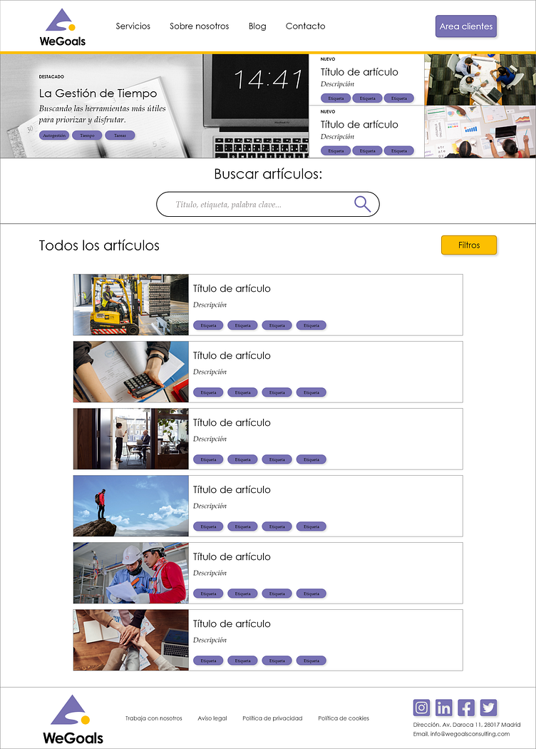
WeGoals Consulting Blog Webpage
This is one page from my redesign of the WeGoals website. They requested a blog layout for content they are currently writing, and this is the final design. As you can see, I included a tagging feature ("Etiqueta") to make content searches more user-friendly, along with the search bar and a filter option ("Filtros").
Before designing the blog page, I wanted to get a better idea of what type of content users would be interested in before starting the iteration process. I created a poll that was then sent out to WeGoals' contacts to better define the content I would be designing for. Below you can see screenshots of the poll sent out, as well as the response data.
Thanks for taking a look at my design!
To view the full case study, including user research and design iteration, please check out my portfolio.


