Finance Dashboard on Apple Vision Pro
Context
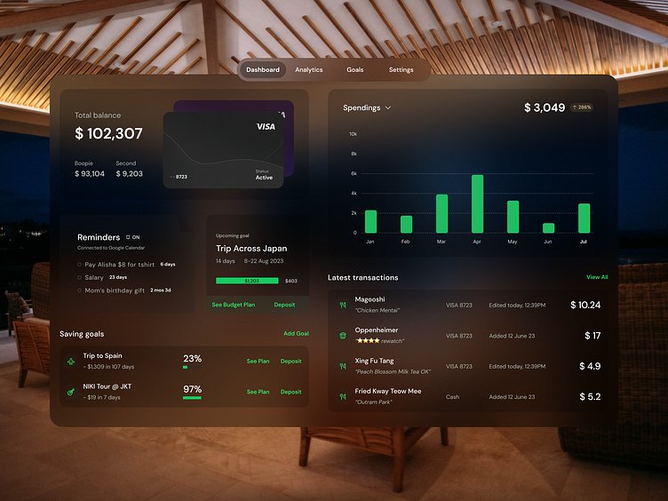
This is how an imagined personal finance dashboard I designed previously would look like on Vision Pro in dark mode.
Design
This is an exploration of how the dashboard would look like on Vision Pro in the dark. I wanted to create a comfortable and pleasing experience for the users who might use Vision Pro at night, when the surroundings are dim and a bright screen can be harsh on the eyes.
To match VisionOS’ aesthetics, I used background blurs and shadows instead of borders. I also adjusted the colors to ensure a good color contrast ratio.
Closure
What do you think I can improve for this design? Let me know in the comments! :)
Hi! I'm Tania, a product designer experienced in fintech and AIaaS, currently interested in microinteractions and XR design.
