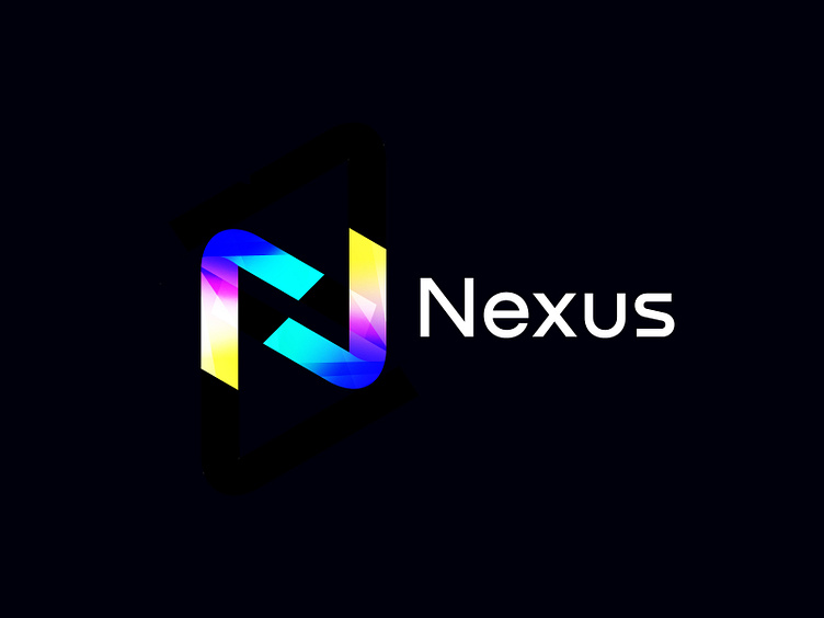
N logo | Letter N | Logo Branding | Brand Identity | Modern Log
The Nexus logo is a well-known and established brand, specifically associated with Nexus smartphones and other technology products. The logo has gone through iterations over the years, but here are some key elements and characteristics commonly associated with the Nexus logo:
Wordmark: The logo typically consists of the word "Nexus" written in a clean and modern sans-serif font. The letters are usually capitalized, emphasizing a bold and sleek appearance.
Color Palette: The Nexus logo has often used a combination of bright and vibrant colors. One notable version of the logo featured a gradient color scheme, transitioning from red to yellow to blue from left to right.
Rounded Edges: The letters in the Nexus logo tend to have rounded edges, contributing to a softer and more approachable feel.
Minimalistic Design: The Nexus logo has a minimalist aesthetic, focusing on simplicity and clarity. It avoids unnecessary details and distractions, creating a clean and visually appealing design.
Brand Symbol: In some versions of the Nexus logo, a small symbol or icon accompanies the wordmark. These symbols often reflect technology, connectivity, or futuristic elements. Examples include a stylized "X" or a small orb-like shape.
Available for sale
Let's talk about project:
💬 Email : ayonseddiq@gmail.com
