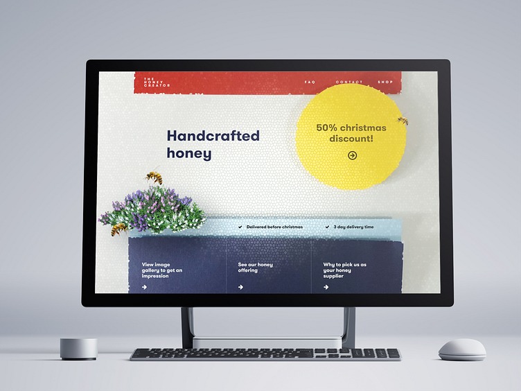
Papercut UI Design for Honey Brand
Hi! So I was going through some older designs today, and came across this piece! I realised I never shared the process behind this design before!
It all started a question. Can we design shading behind elements differently, or perhaps more realistic?
In an attempt to discover this I started cutting out some UI parts and build the basics of a design.
I threw this photograph into photoshop, added a funky filter on top of it..
...and you have the perfect design for a honey brand, with a very unique look as well!
More by Mark View profile
Like


