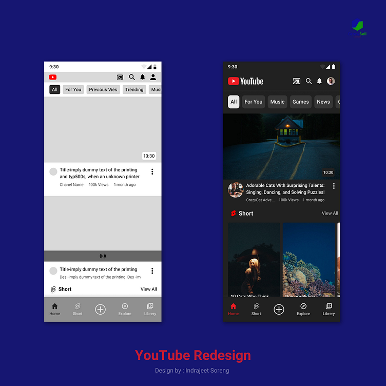
My Redesign of the YouTube Mobile App Home Screen
'm a UX/UI designer, and I've been working on a redesign of the YouTube mobile app home screen. I wanted to make the app more user-friendly and intuitive, while also making it more visually appealing.
Here are some of the changes I made:
I simplified the layout so that it's easier to find what you're looking for.
I added more prominent search and navigation features so that you can quickly find the videos you want to watch.
I improved the way videos are displayed so that they're more engaging and visually appealing.
I made the app more responsive and easier to use on smaller screens.
I'm still working on the redesign, but I'm happy to share what I have so far. I'd love to get your feedback on the design.
Leave a comment below and let me know what you think of the redesign.
Share this post with your friends and colleagues who are interested in UX/UI design.
Follow me on Dribbble to see more of my work.
#uxdesign
#uidesign
#youtube
#mobileapp
#redesign
I hope you like the redesign!
I'll be posting more screenshots of the redesigned app in the future, so stay tuned!
