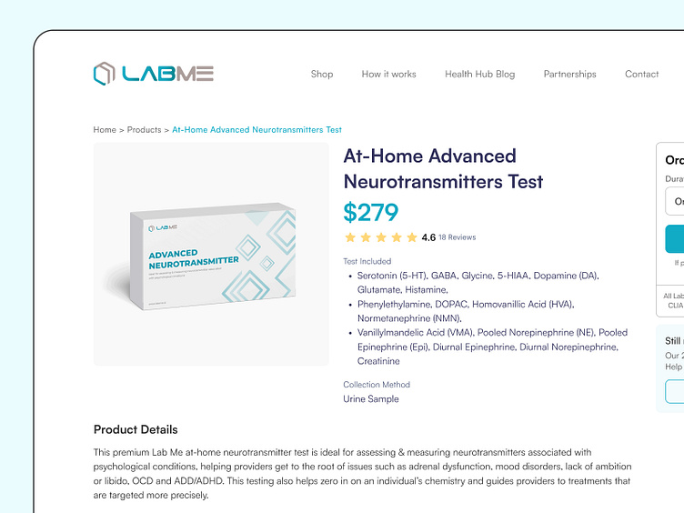
Product Details Exploration for Lab Me Analytics
Back to Lab Me Analytics exploration, now is for the product details. Action menu on the right side will be sticky, so if users go down to read the product details, the action still on the right of the screen. It's easier for user to checkout without scroll back to top.
How do you guys think with the layout, style, and concept? let me know on the comments :)
Anyway, i do upload every monday, follow me so you won't miss out any updates
____________________________________________________________
📩 Contact if you need any custom UI/UX design Services.
🤝 Say Hello: dennypratama194@gmail.com
LinkedIn | Instagram | Website
Design services with subscription-based: tanka
Digital agency services: revo.
UI Kit for sale on Gumroad
More by Denny Pratama View profile
Like


