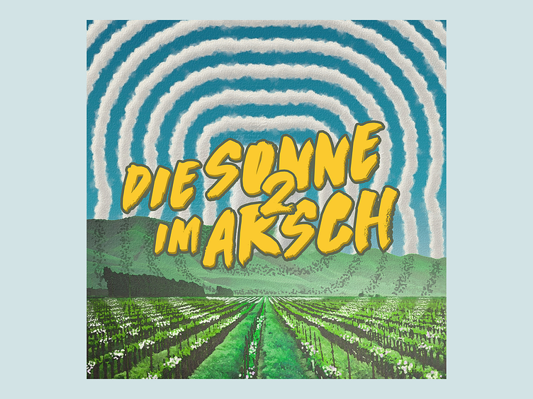
Die Sonne im Arsch II - CD Packaging
7 years after the first release the german hip-hop artist Breichle needed a branding for his latest mixtape. I created this cover as well as a full CD packaging and some social media graphics.
The cover picks up the circular line elements from the first release to create a visual bridge to its cover. The main goal was convey the summer vibes of the music through bright and sunny landscapes.
I used various Photoshop actions to create clouds out of simple paths which allowed for a lot of freedom during creation.
My initial goal was an anime like look as seen in this poster by Zakaria Ourhou. I started by combining a landscape stock photo "낮에 녹색 잎이 많은 식물" by Adele Payman and a sky from 30daysreplay (which sadly has been deleted).
A combination of multiple regular photoshop painting effects covers up any incongruity.
I'm very happy with the result since we ended up with a quite unique look that not only matches the theme of the music perfectly, but also provides enough freedom to produce lots of fitting variations in no time.


