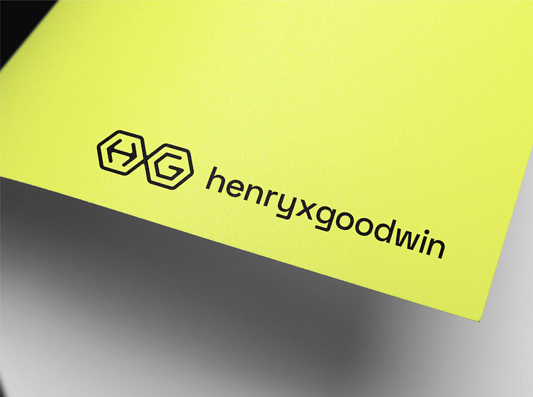
HXG logo design
HenryXGoodwin is a well-known music producer and singer/songwriter. This was more of a proactive project (he’s one of my friends) as I was doodling some ideas and stumbled across this brilliant execution for his HXG logomark where the X is found betwixt two hexagons. I sent this over and he loved it - I just needed to narrow down some type and colours.
Being at the cutting edge of his genre of music, we went down the road of a quirky and modern typeface to match. The angular nature of this typeface mirrors the geometric logomark nicely.
When it came to a colour palette, I knew to involve black as a staple as I didn’t what to dilute too much of his existing branding. That said, I liked the idea of swapping out his current pink hue to something that will stand out in the industry. I sent over some options and he was quickly drawn to this soft, pastel yellow as one of his biggest inspirations is Brian Eno who uses a similar colour in his branded material. I then added in an off-white to balance the palette and to break up the black and yellow and we were good to go!
Ready to create or refresh your brand's identity?


