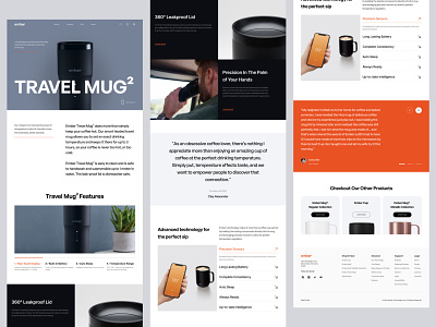
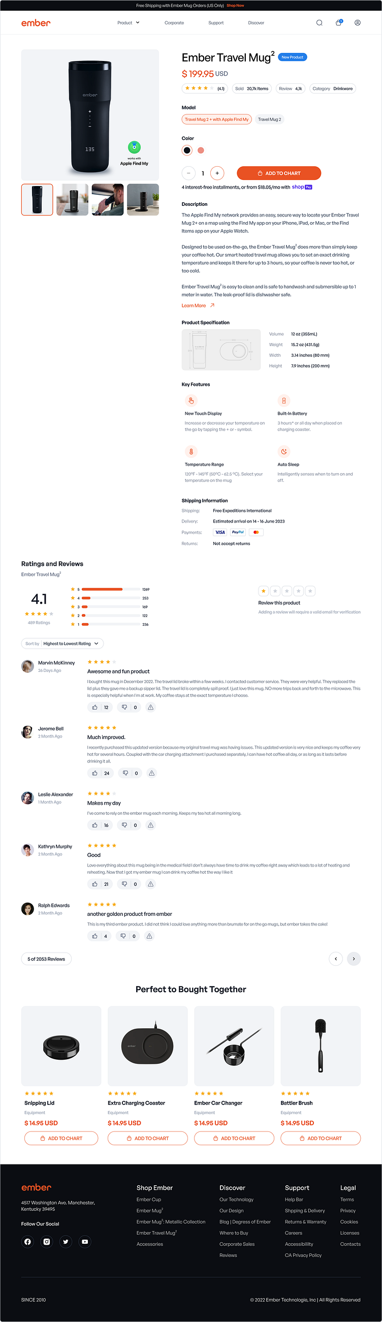
Ember Travel Mug² - Product Page
Hello Friends!!👋
Today I want to share the latest exploration. This time I'm redesigning the
product page for Ember Travel Mug but there are several things that can be improved from this product page. So I'm doing a little analysis and getting some points that I use to redesign this page.
1) On the top banner, we can make it contrast properly with the background and the text and give more attention to the CTA’s.
2) For the badge, rating, and chart pin. Need to change the color that has high contrast from the brand color so it can give more differentiation and attention for users to notice. Like blue color for the badge, and chart pin and yellow for the rating.
3) Adding a gallery carousel for the user to explore the product preview.
4) Product Detail. Making content more compact and making information more useful into one straight column to help users to cut time in deciding.
5) Reviews Section. Making the top banner proper contrast to differentiate information Re-layout the content to give users proper information about the reviews.
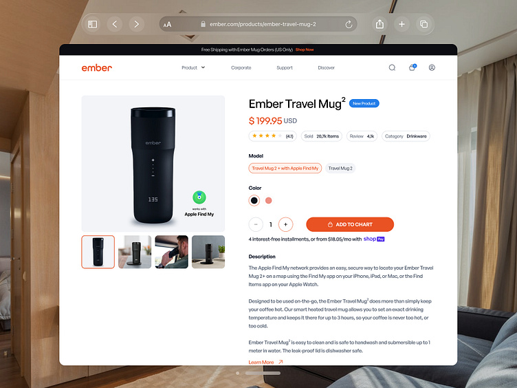
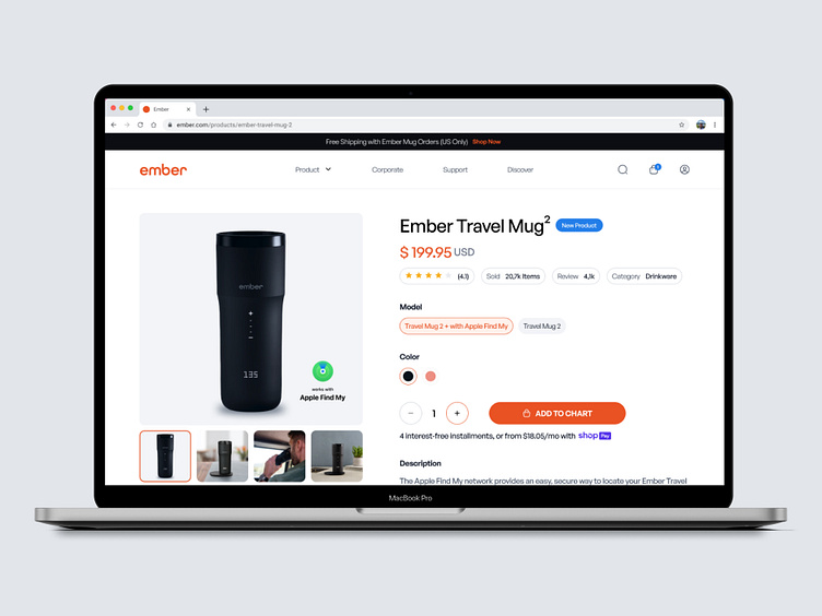
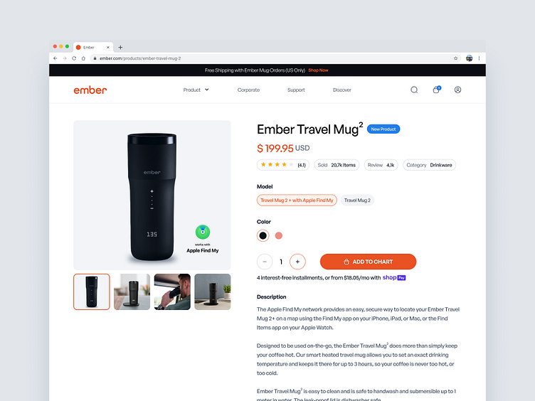
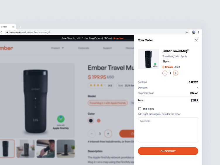
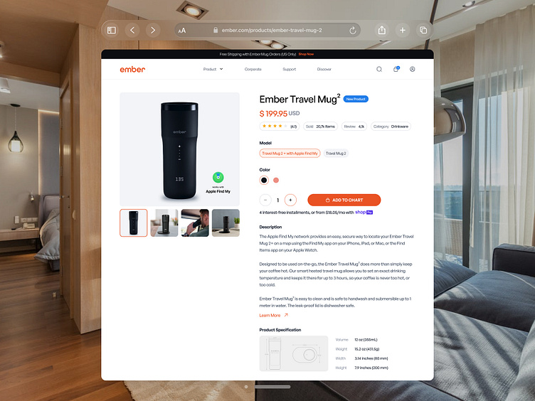
and here's the result.
Browser Preview
Get in touch with us!
Email | Whatsapp | Telegram | Skype | Book a Call
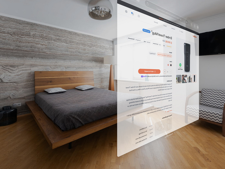
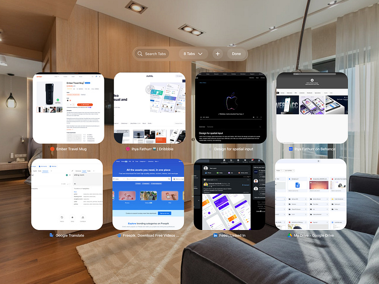
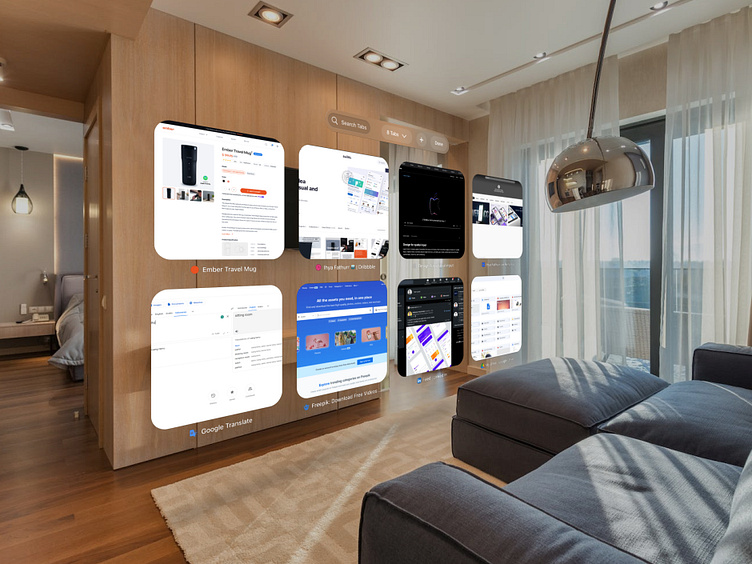
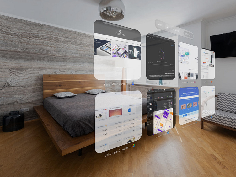
Safari for Vision OS Preview
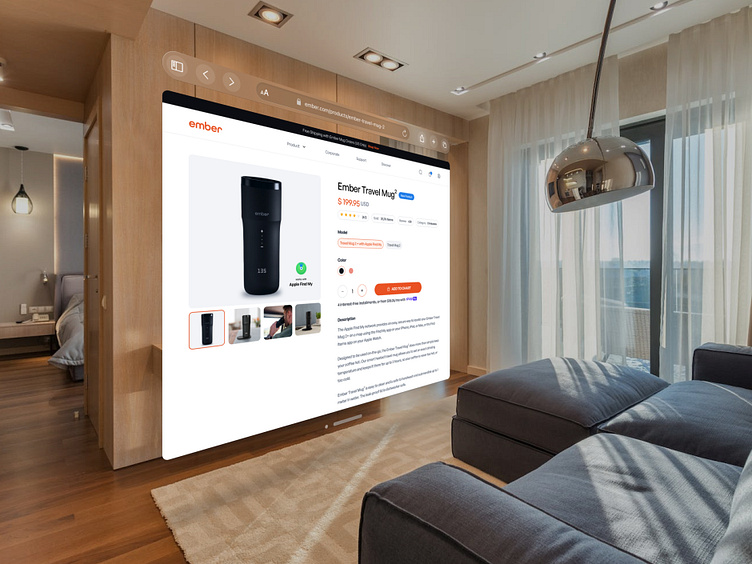
Full Page
Thank You For Scrolling 👌
Any comments or suggestions? Let me know your thought!
Leave a like if you like this design, Thank You!!
We are available for new projects 🏄♀️
💌 Email Us: hello@vektora.studio
😍 Social media : Instagram | Linked In | Behance
🛍️ Vektora Product: UI8 | Iconscout | Creative Market | Gumroad | Canva
www.vektora.studio