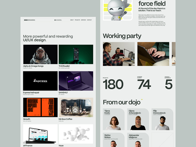
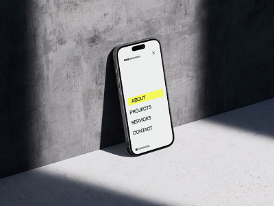
Broworks Website Pages
Overview of Broworks website redesign. From what we do, to who we are!
We invested a lot of old experience and new knowledge in this design and development in order to achieve a classic look with a more stable layout.
Some would say we played safe, from shapes to colors, but every step of this site has been seriously thought out to achieve such effective simplicity.
Our priority was that people always know where they are when they come to us - to explore our projects, the industries we work and our studio life with ease. We wanted to show off the spirit of Broworks yet give a smooth & pleasant experience for users who look at a lot of stuff on the internet every day.
Tell us your thoughts on this one!
Check out our full presentation on Behance
and live site - Broworks.
Stalk us:

