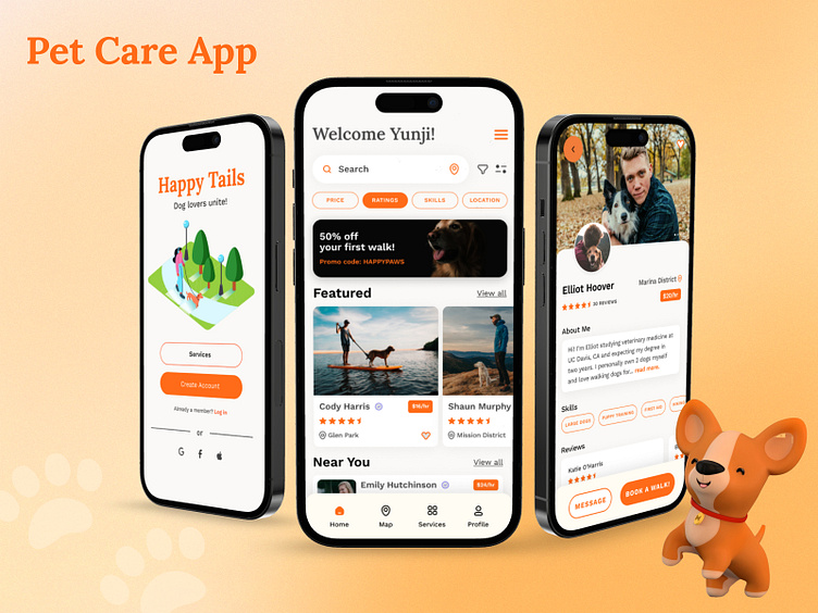
Pet Care / Dog Walking App
Dog Walking Mobile App Case Study
This case study was created as part of Dribbble's Product Design Academy certification course with Jesse Showalter and my amazing mentor / senior product designer, Kristina Volchek!
My Role: Product Designer
Responsibilities:
User Research
Market Research
User Flows
Information Architecture
& Wireframes
Visual Designs
Prototypes
Design Thinking
Through this course, I learned and implemented the full product design life cycle of concepting, ideation and generating ideas quickly through a design sprint exercise.
Step 1: Research & Empathize
Step 2: Define & Plan
Step 3: Ideate & Trim
Step 4: Prototype & Validate
Step 5: Test & Improve
Step 6: Refine & Deliver
Step 7: Measure & Analyze
The Design Brief
The problem: Dog owners sometimes need help caring for and walking their dogs. Create a service to connect dog owners with dog walkers. Consider how we can help dog owners trust their dogs are in safe hands.
User Research
I conducted several interviews of local dog owners, professional pet care takers, and friends / family across rural, suburban and city areas across California and New York. Some of my findings are below.
Market Research
I compared existing pet care type services and competitor apps such as Wag!, Rover, Fetch and pet delivery services within Doordash and Yelp and began to examine and analyze their offerings and services.
To the Whiteboard!
We brainstormed as a team with our mentor using FigJam as a digital whiteboard. I found that the sum of our parts = more than the individual and found when we combined forces, we discovered great ideas through our diverse background and experiences. Students came from various countries and cultures which I really found exciting and fun!
Together, we picked apart two competitor apps to see how we may improve our own. We brainstormed good apps that stuck out to us for outstanding service and design and had trouble trying to remember the poorly designed apps... it goes to show our brains tend to remember the good experiences and forget the bad ones which was a good psychology lesson!
Affinity Mapping
Based on everyone's post-it notes, we began to cluster similar ideas together to look for themes. We uncovered 4 themes to help build trust between dog owners and dog walkers.
Building relationships (video chat, intro meets, direct messaging)
Qualifications (certifications, training, background checks)
Social Proof (reviews, ratings, references)
Live Proof (live GPS map, pictures, videos)
Proposed Solution
I designed a mobile app based using the above features to help build trust.
User Personas
Based on the research and interviews I conducted of local neighbors, friends and family, I created two user personas:
One who is too busy with work and has limited time for the dog and needs extra support or is out of town or on vacation.
The second persona is an elderly or senior dog owner who seeks animal companionship but may not have the physical ability to exercise their dog daily. This also includes people who are temporarily injured or may be recovering from a physical accident and needs extra pet support.
User Flow Onboarding
Based on competitor research, I created my own user onboarding flow and one that simplifies user and business goals.
Wireframes & Sketches
I began to create quick hand drawn sketches as well as digital wireframes using Figma. I explored different onboarding and finding a dog walker user flows.
Moodboard
I began to gather visual inspiration to guide my initial sketches - I looked for a mix and balance between two concepts:
Concept 1: Confident, trustworthy, safe and corporate
Concept 2: Bright, bouncy, soft, happy, friendly and playful!
I personally was drawn to the color yellow and orange for creating a more playful uplifting mood while I found the color blue to be commonly used in many Fortune 500, banking, airlines and tech companies to convey safety and trustworthiness!
Visual Designs - 1st Iterations
I went through various digital sketches and visual language such as:
vector illustrations vs. photography
serif vs. san serif typography
color explorations such as yellows, magenta and greens (to represent the outdoors and nature)
My final decision was to go with orange / pale yellow hues as my primary color to represent the playfulness and fun of playing with a dog.
Design Systems / UI Library
As I began to refine my visual design, I expanded to create a UI library of styles and components that grew. This was a tougher process as I began to create parent and sibling components with active / default and inactive states and an overall design system to manage.
Final Visual Designs
After various iterations and refinements, I honed in on a final design!
Prototype & Usability Testing
I tested the prototype on a few users to validate my UI decisions. The users were tasked to:
Sign up for an account
Find a dog walker
Send a message to a dog walker
Schedule a new dog walk appointment
Based on user testing, I made adjustments to minimize as much steps as possible to seamlessly complete the booking process.
Outcome / Results
Through the product design life cycle exercise, I learned so much about the process of a digital product from ideation to execution and the evolution of how a product can be refined through testing and validation.
If you enjoyed my case study and would like to work with me or connect, feel free to find me on LinkedIn or Behance! :)


