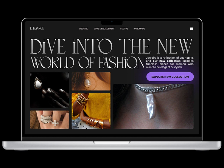
Day 15 Web Design Challenge
🌐 Challenge: Design of the hero section of the website of a jewelry shop in which the purpose is to make you look at their new collection of products.
An interesting detail that you might like; When examining the heading text, an interesting design detail emerges: the dot of the letter 'i' subtly mirrors the shimmer of jewelry, adding a delightful nuance to the composition. It's a small yet captivating element that contributes to the overall aesthetic appeal.
Typeface used: Simple Candy, Spline Sans
Images: Unsplash, Pexels
👍 Enjoyed this design? Show your support by giving it a like! Your likes fuel my creativity and encourage me to share more of my work with the Dribbble community.
More by Ajay Krish View profile
Like
