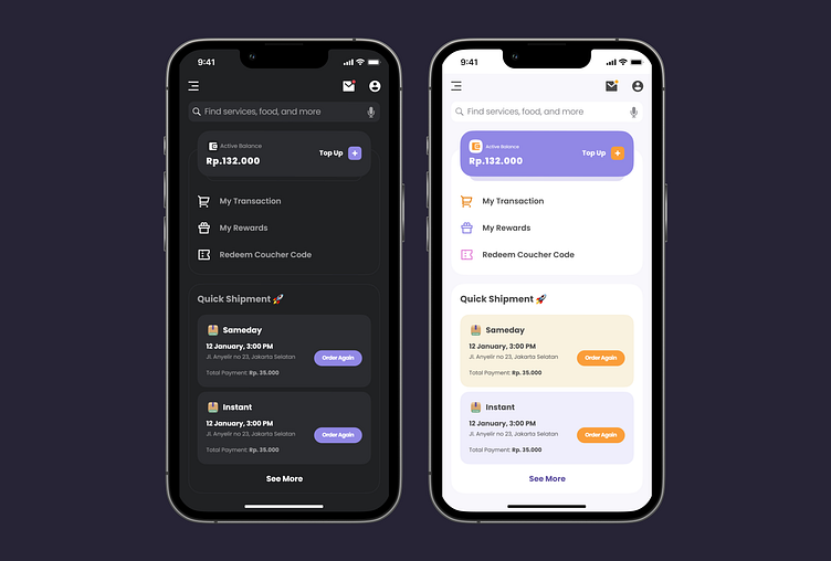
Dark Mode and Light Mode themes of Paxel app


Hey 👋🏻
Welcome to my UI/UX portfolio! I'm excited to present my design project, showcasing the Homepage Exploration of the Paxel app in both Dark Mode and Light Mode themes.
Recognizing the importance of catering to users' preferences and providing a seamless experience, I've designed the Paxel app with two distinct visual styles to accommodate different user preferences and environments.
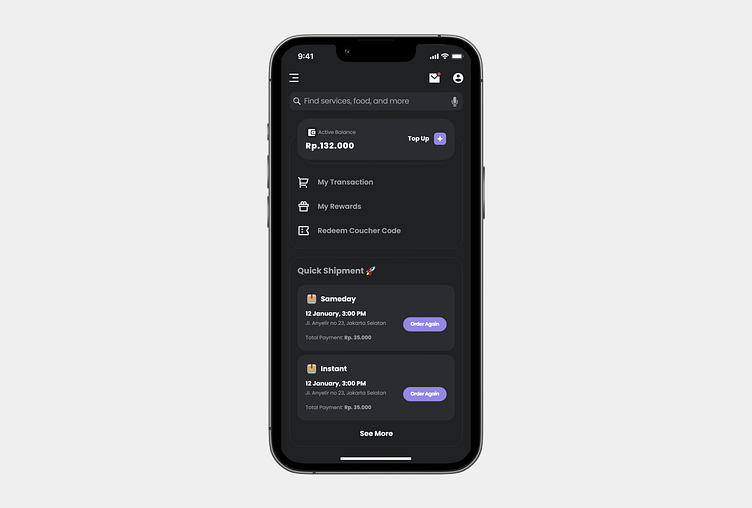
Starting with the Dark Mode theme, I've created an immersive and visually striking interface that appeals to users who prefer a sleek and modern aesthetic. The use of dark color tones, such as light purple and blacks, creates a sense of elegance and sophistication. Contrasting elements, like vibrant accent colors, enhance visual hierarchy and draw users' attention to essential information. The dark interface also reduces eye strain and provides a more comfortable viewing experience in low-light conditions.
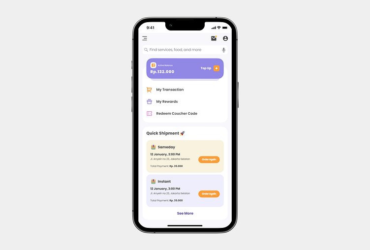
For the Light Mode theme, I've opted for a clean and minimalist design that embraces simplicity and clarity. Light backgrounds with subtle gradients and soft color palettes create a sense of openness and freshness. This style aligns with the iOS design guidelines, ensuring a seamless integration within the iOS ecosystem. The Light Mode offers optimal legibility and readability, making it suitable for well-lit environments and enhancing overall usability.
In both themes, the Homepage serves as the gateway to the app, featuring a user-centered and intuitive layout. Key features, promotions, and personalized recommendations are prominently displayed, ensuring users can quickly access relevant information. Clear typography and thoughtfully chosen icons maintain consistency and facilitate easy navigation.
To ensure a cohesive experience, I've maintained consistency in the placement and functionality of elements across both dark and light modes. Users can seamlessly switch between the themes based on their preference or the lighting conditions they find themselves in, without sacrificing usability or familiarity.
Overall, my Homepage Exploration of the Paxel app in Dark Mode and Light Mode showcases my versatility in creating visually appealing and user-centered interfaces. Whether users prefer the sleek elegance of Dark Mode or the clean simplicity of Light Mode, the Paxel app provides an immersive and seamless experience tailored to their individual preferences. I'm proud to present this project as a testament to my commitment to enhancing user experiences through thoughtful design choices in both dark and light visual themes.
Let me know what you think. 🫶🏻
Stay tuned for my new eye-catchy designs 👀
