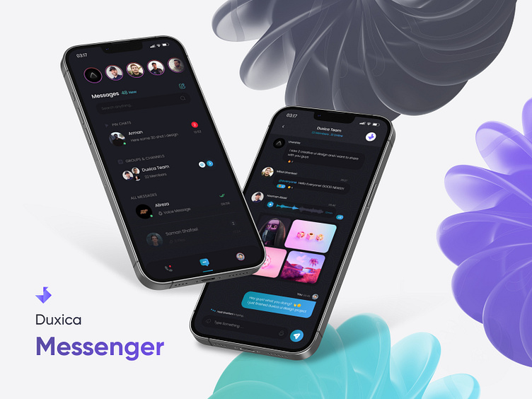
Messenger Case Study
In this UX/UI case study, we explore the design process behind a mobile and desktop messenger application. Our goal was to create an engaging and efficient platform that facilitates seamless communication while providing a visually appealing and intuitive user experience. The case study encompasses various stages, including benchmarking, user flow design, wireframe design, mobile app design, desktop app design, and prototype design.
1- Benchmarking
In the initial phase of our project, we conducted a comprehensive benchmarking analysis to gain insights into existing mobile and desktop messenger applications. We examined popular platforms such as WhatsApp, Telegram, and Slack to understand their strengths, weaknesses, and user experience. This analysis allowed us to identify key features and design patterns that resonate well with users, providing a solid foundation for our subsequent design process.
2- User Flow Design
With a clear understanding of user expectations and preferences, we focused on designing an intuitive user flow for our messenger application. We identified key user actions, such as creating an account, adding contacts, initiating conversations, sending messages, and managing settings. Through iterative wireframing and prototyping, we refined the user flow to ensure a seamless and efficient experience across both mobile and desktop platforms.
3- Wireframe Design
To visualize the structure and layout of our messenger application, we created detailed wireframes. These wireframes served as a blueprint for the overall design and allowed us to establish the hierarchy of information, navigation elements, and interactions. We prioritized simplicity, clarity, and consistency throughout the wireframe design process, ensuring that users can easily navigate and understand the application's features and functionalities.
4- Mobile App Design
In the mobile app design phase, we focused on creating a visually appealing and user-friendly interface that leverages mobile-specific capabilities. We worked on developing a clean and modern visual style, incorporating a vibrant color palette, legible typography, and intuitive iconography. We paid close attention to touch targets, ensuring that users can interact with the app effortlessly on smaller screens. The design also considered various screen resolutions and aspect ratios to maintain consistency across different devices.
5- Desktop App Design
For the desktop version of our messenger application, we aimed to provide users with a productive and efficient communication experience. Taking advantage of the larger screen real estate, we developed a layout that enables users to manage multiple conversations simultaneously, access advanced settings, and leverage powerful productivity features. The design focused on creating a consistent visual language with the mobile app while adapting to the desktop context and interface conventions.
6- Prototype Design
To validate and refine our design concepts, we created interactive prototypes that allowed users and stakeholders to experience the messenger application firsthand. These prototypes showcased the key features, user flows, and visual elements, providing a realistic simulation of the final product. User feedback and usability testing played a crucial role in iterating and improving the prototype design, ensuring that the final implementation met user expectations and addressed their needs.
Through an iterative and user-centered design process, we successfully created a comprehensive UX/UI design for a mobile and desktop messenger application. Our design approach focused on simplicity, clarity, and consistency, enabling users to communicate effectively across platforms. The benchmarking analysis, user flow design, wireframe development, mobile, and desktop app designs, and prototype iterations collectively resulted in a robust and user-friendly messenger application that meets the demands of modern communication needs.
Designed by Mohammad Hashemi for Duxica
Need design assistance? Email design@duxica.com
We're a Canadian design agency specializing in turning ideas into exceptional digital experiences for startups and growing companies. From UX/UI and branding to 2D/3D illustration and animation, we've got your design needs covered.
Let's collaborate and create remarkable digital experiences. Contact us at design@duxica.com today.


