Travel Agency website

Hey Dribbblers! 🏀
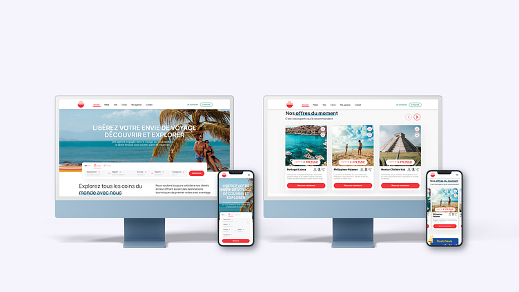
Introducing this travel agency website, designed to inspire and offer seamless booking experiences. With its sleek and modern design, this template showcases breathtaking destinations, enticing imagery, and user-friendly navigation that effortlessly guides visitors through a world of travel possibilities.
Hope you like it guys. Cheers! ✨
Welcome
Introducing this travel agency website, designed to inspire and offer seamless booking experiences. With its sleek and modern design, this template showcases breathtaking destinations, enticing imagery, and user-friendly navigation that effortlessly guides visitors through a world of travel possibilities.
Description
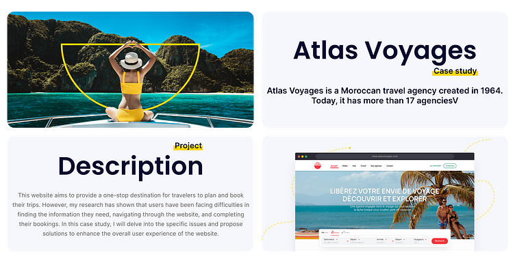
Atlas Voyages, a Moroccan travel agency established in 1964, boasts a network of over 17 agencies. However, despite its extensive reach, the company's website fails to meet modern standards, presenting several notable issues. Firstly, its outdated design diverges from contemporary aesthetics and fails to meet user expectations. Secondly, the website's poor user experience, characterized by cumbersome navigation, contributes to high bounce rates and low conversion rates. Lastly, inadequate mobile responsiveness hampers the experience for users accessing the site via mobile devices, further diminishing its usability.
About The Project
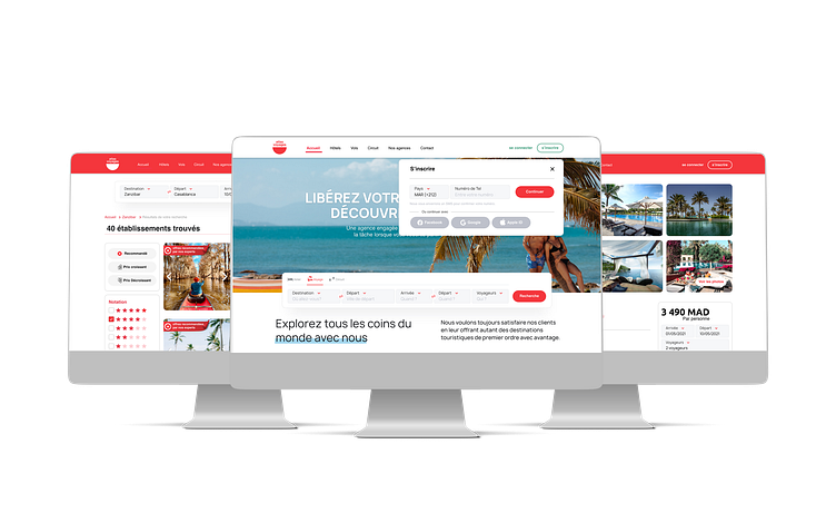
The project aimed to enhance the user experience of the Atlas Voyages website through a contemporary redesign. This involved improving navigation and accessibility, adopting responsive design for mobile users, streamlining the booking process, and integrating interactive and personalized elements. Ongoing usability testing and data-driven improvements ensure the website remains user-centric. These changes position Atlas Voyages as a modern, customer-focused travel agency, driving increased satisfaction, conversions, and brand growth.
Understanding the User
Before delving into the redesign of the Atlas Voyages website, I prioritized understanding user behaviors in travel. Initial focus involved deciphering traveler preferences and challenges during online booking. Due to time and budget constraints, I started with secondary research, analyzing existing data and competitor insights. This aimed to inform user-centric design decisions and ensure comprehensive understanding of the target audience.
Research Insights:
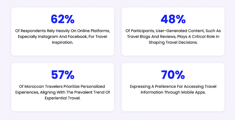
Key findings from recent market research on Moroccan travelers conducted by Atlas Voyages Team reveal crucial insights:
The process
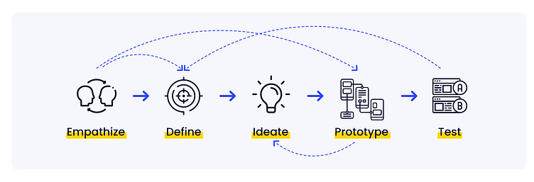
I followed a lean UX design thinking process to ensure that my decisions were supported through user research and feedback.
Research & Empathize
Market comparative analysis, User interviews, Storyboard, User persona
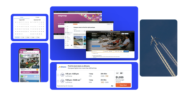
I researched market competition by focusing on travel companies offering similar travel packages and customized experiences like Atlas Voyages. My research included companies such as Booking, Kayak, Accor, Cozycozy, and Agoda.
To keep up with traveler’s demands for unique experiences, Atlas Voyages aims to establish a personal connection with their users. They didn’t offer support before, during, and after the trip to enhance the overall travel experience.
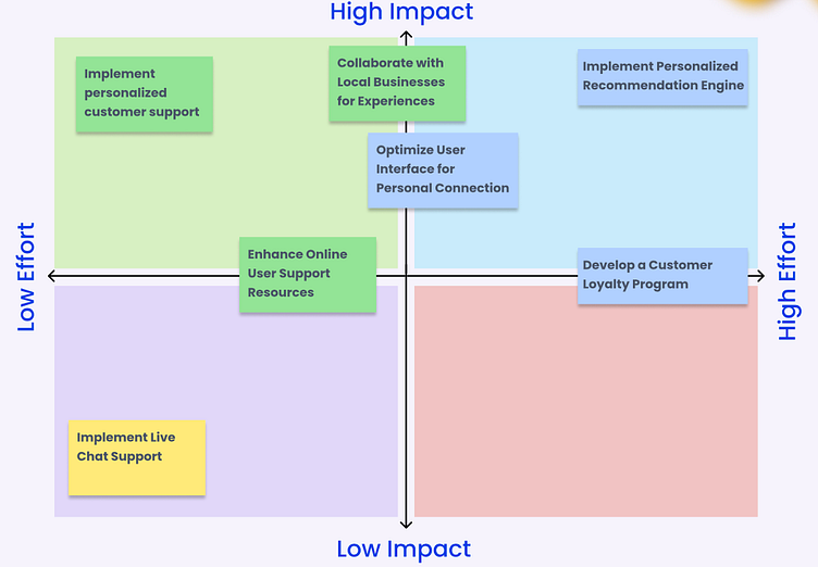
Impact Effort Matrix
Before progressing further with the website redesign, I found it essential to strategize and prioritize feature ideas effectively. Employing an impact effort matrix allowed me to assess potential features based on their projected impact and the effort required for implementation.
This method not only provided a comprehensive overview of the envisioned features but also guided me in determining which aspects to emphasize initially. The impact effort matrix served as a valuable tool, helping me pinpoint key features that align closely with the goals of the redesign, ensuring a focused and efficient approach to the design process.
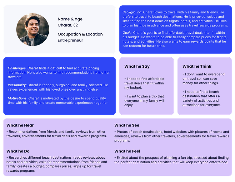
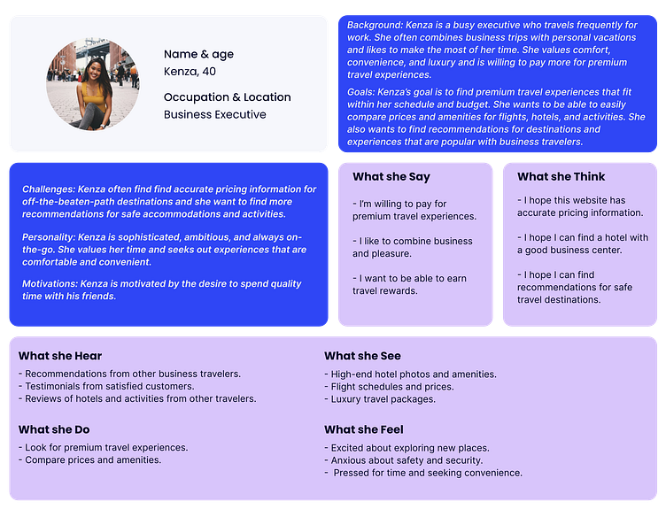
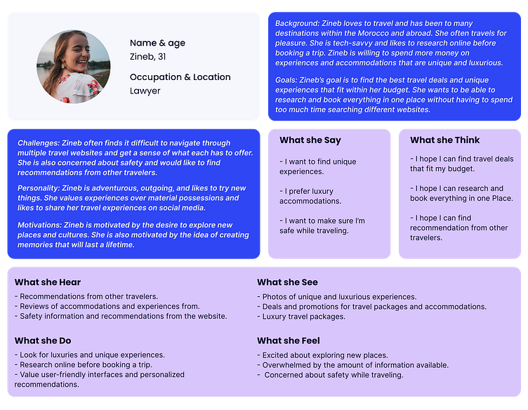
User interviews
I conducted 5 user interviews to uncover insights on booking and travel experiences, identifying goals, needs, behaviors, fears, frustrations, and pain points. The questions covered reasons for traveling, trip planning, meaningful experiences, and preferred services. According to Jakob Nielsen’s research, 5 user evaluators can discover about 75% of usability issues. Synthesizing the interview data through an empathy map revealed 3 key insights: users trust their preferred travel websites, desire spontaneity and flexibility in their travels, and like to have a variety of experiences available on their trips.
Design & Prototype
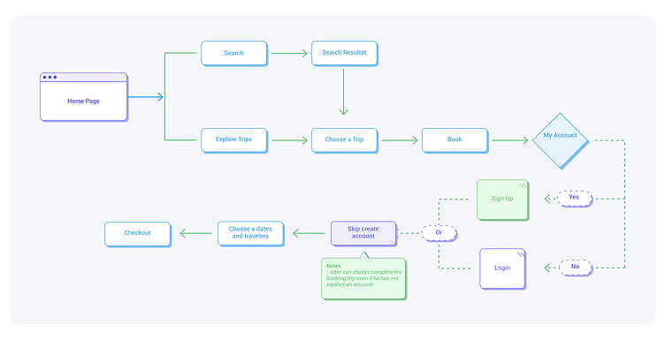
Sitemap
The next step in my design process was visualizing how the product would be structured. I crafted a sitemap that outlines the key navigational pathways and content hierarchy essential for an optimal user experience.
Sketches
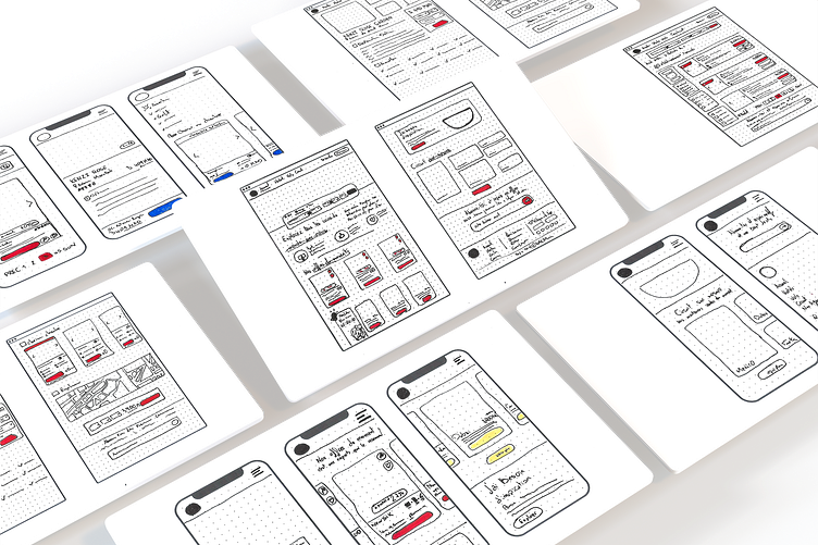
The design journey commenced with preliminary sketches aimed at defining the fundamental structure of the overall layout. Our paramount objective was to craft a user-friendly interface facilitating smooth navigation among diverse travel packages, personalized experiences, and account settings—all conveniently accessible directly from the homepage. The sketches provided herein encapsulate the conceptual framework, underscoring the user's capacity to seamlessly choose and explore various travel options while ensuring prompt access to their personalized account settings. These early sketches serve as the foundation for our commitment to a user-centric design, guaranteeing an intuitive and efficient user experience from the project's inception.
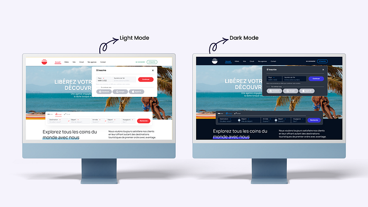
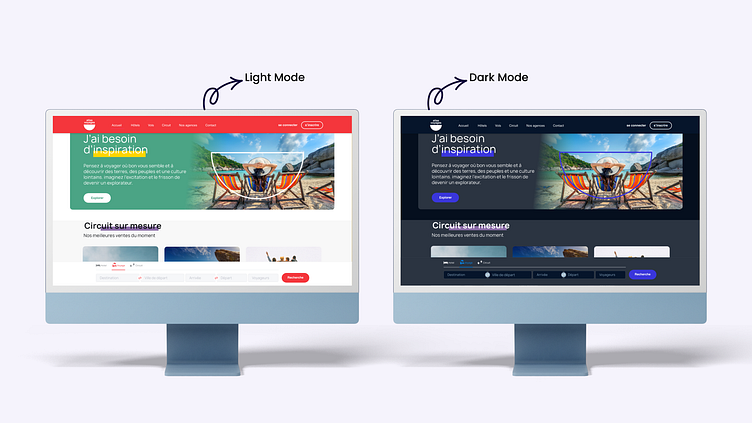
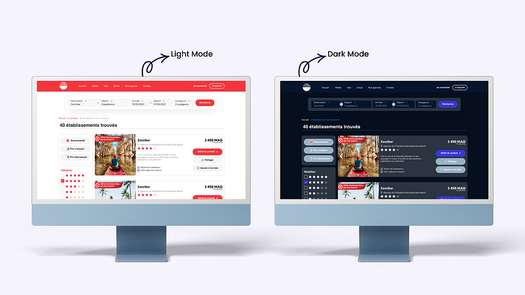
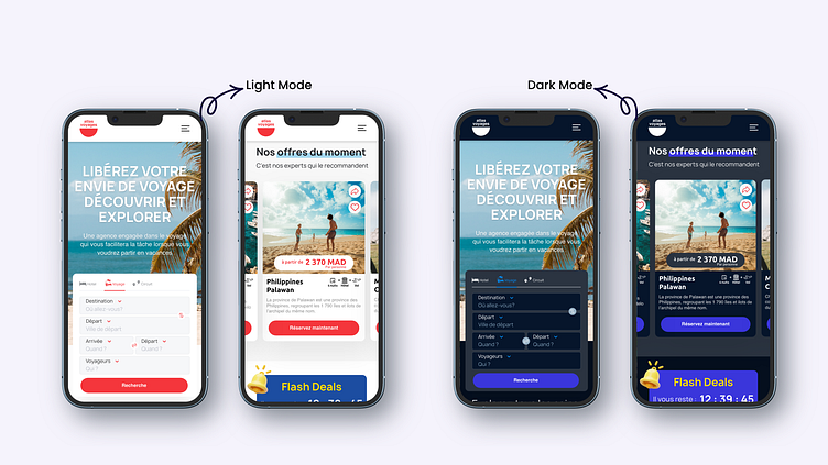
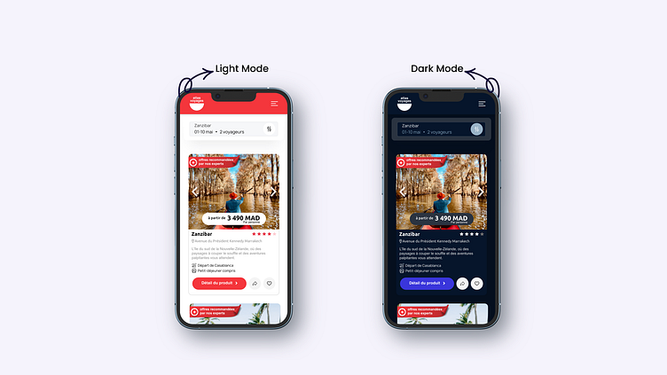
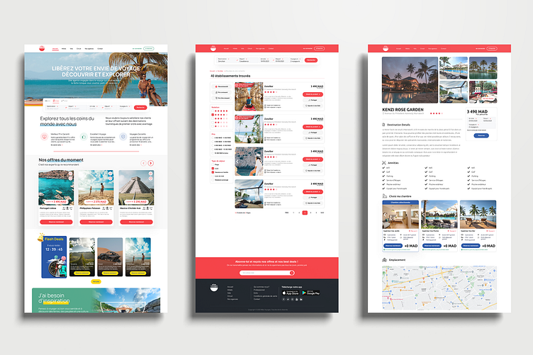
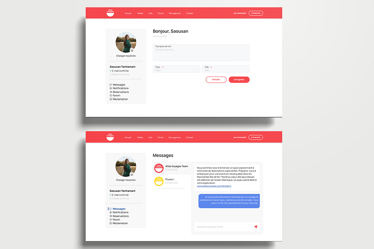
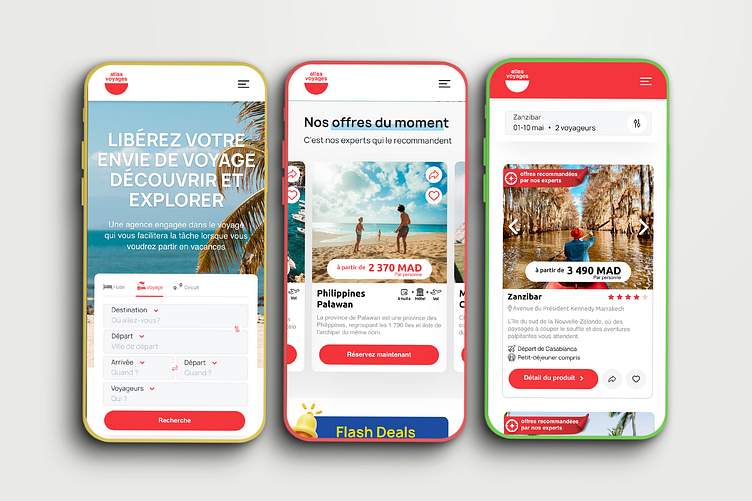
Design High fidelity
Press "L" if you like it and don't hesitate to share your feedback in the comments section.Thank you! have a nice day ✌️
Want to collaborate? Have a project idea?
Feel free to contact me at 📩 : justmouhssine@gmail.com