Mobile Design
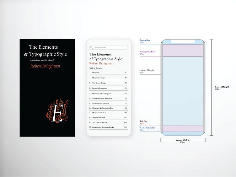
Responsive Design: Mobile devices come in various screen sizes and orientations, so it's crucial to create designs that adapt and respond to different dimensions. Responsive design ensures that the layout and content of the mobile interface adjust fluidly to fit screens of all sizes. This includes using flexible grids, scalable typography, and responsive images to provide a consistent and user-friendly experience across devices.