EDUtopia!
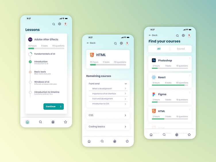
Done as a proposal for the client EDUtopia to relaunch their educational application. This application allows the user to learn creative software and coding through a series of video tutorials. EDUtopia offers you a series of structured videos that helps the user to grab the fundamentals regarding the topic.
Users can also enroll in multiple cause at one time and learn simultaneously.
Design decisions taken,
In the initial design, there was no status bar to understand the next lesson. Status bars were visually added to depict the amount of time that need to be spent.
A new leader board is added to represent badges and achievements of the user. This is to encourage the user to learn more.
You can add in to communities that learn the same areas. This will help in improving yourself and to gain / share new knowledge.
Colors are used in a way to represent the brand identity of EDUtopia
