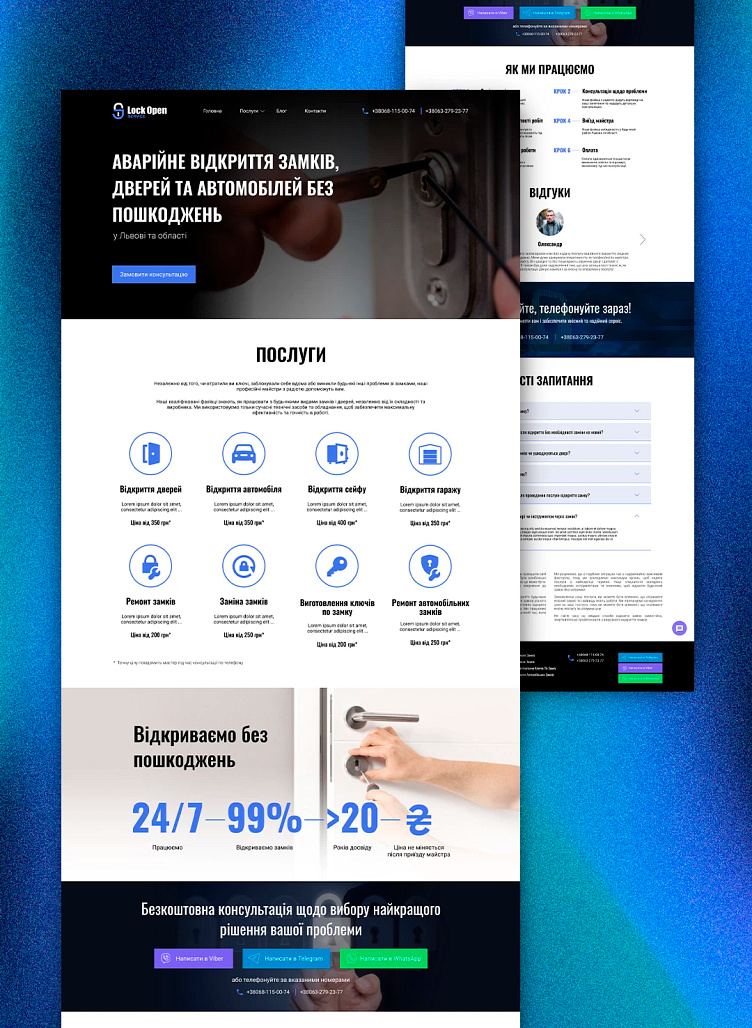
Lock Open Service - website
The site is a business card for a company specializing in emergency opening of doors, locks, cars, etc.
Task:
You need to create a site filled with basic information about the service and aimed at obtaining maximum interaction with the client.
That is, it is important to have forms of communication and contacts, a concise presentation of information, as light as possible and an uncongested design.
Decision:
The design is as light as possible, not overloaded with graphics and animations, in order to reduce the loading time of the site on mobile devices and increase the speed of operation.
It is very important that the site of this topic is adapted to the mobile version as much as possible.
After all, when a client has a problem with a lock, urgency is important to him and with a 95% probability he will view this site only from a mobile device.
The main page displays only the basic information necessary for viewing services and ordering a wizard call. All additional information is placed on separate pages for ease of use.
The colors and graphic materials used are selected in such a way as to symbolize the professionalism and craftsmanship of this company, and to indicate that it provides service services.
Colors used:
#5173EC, #f7f7f7, #05060d
Fonts:
main text - Roboto; headlines - Oswald.
Ready result:
SEO - promotion:
https://www.krylovcompany.com.ua/service/seo-prosuvannya-saytiv/
Layout on WordPress:
telegram: @d3n4ik_d

