Property Rental App Redesign
Hey everyone, Explore my Property Rental App Redesign.
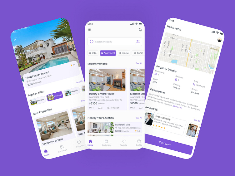
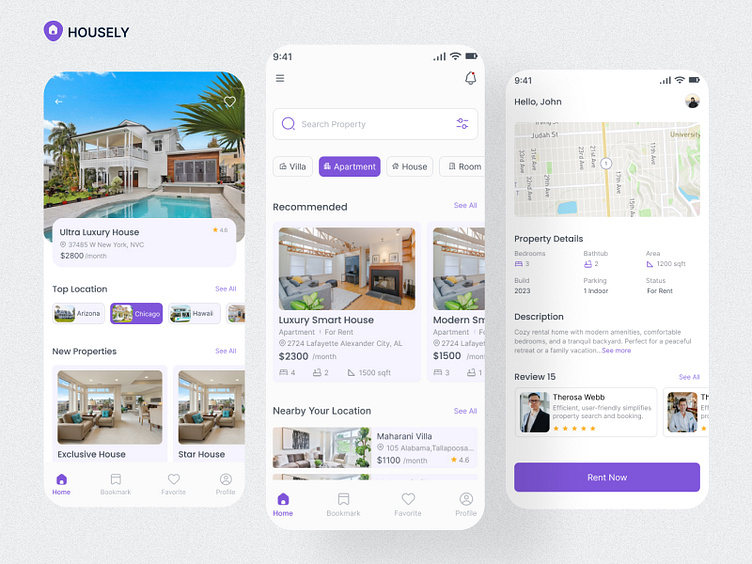
First Screen:
1st of all I am using Hamburger where a user can see his Home, About, etc screen.
2nd is through notification a user can see what new notification is coming.
3rd search bar and filter option.
4th select any one option actually what you need.
5th Recommended option through which users can know what is being recommended.
6th he can see what the location of the users can be and the last footer option is where the user can check his Profile, Favorite, Bookmark, and Home option.
Second Screen:
On the 2nd screen, the back button is used so that someone can actually back it, and if the user likes it he can add a favorite, he can see the house that will be the monthly rent, and how much the rating will be a user can.
A user can select 2nd top location and see all the top locations.
Third Screen:
1st of all a user name and profile are used and a map where a user can see the location of the property rent and how long it may take.
2nd user property details and description.
3rd user review and Rent Now Button.
Overall I have tried to make the design as user-friendly as possible.
Thanks for taking so much time.
If you like this project please appreciate it ( press "L" )
Follow me: Facebook / Behance / Uplabs
Contact: mdsharifhossain669739@gmail.com
Whatsapp: +8801705669739