Bliss Dashboard

My first major iteration on our Dashboard since taking over design at Bliss. (thanks to Ben Wilkinson (not a dribbbler yet)).
You can check Bliss out here: https://founderbliss.com/
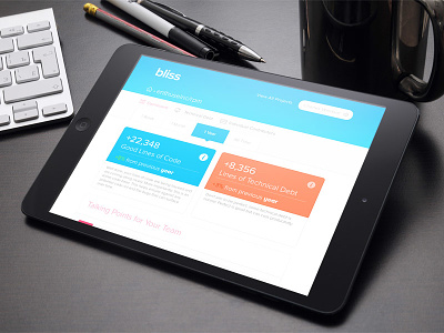
The idea is to help people understand the quality of developers code. Which is a hugely difficult and complex problem.
This first iteration tries to break it down into really simple terms. Some lines-of-code have been flagged as Tech Debt (shown in red), and other lines of code are Good Code (shown in blue) meaning this code passed all of our tests.
This is meant as the highest level overview of the user's code base.
-----
Heres what we're finding so far from our UX:
- Users don't initially understand what the numbers mean. It requires us to educate them. That's a bad first experience.
- There's nothing actionable to take away. For a dashboard thats a major issue.
- Users find they're not very interested in their overall code base, but want to know more about their team.
I'm eager to hear from Dribbble! Any feedback is appreciated
