Trilogy Tabletop

This was a freelance project I worked on with the game designer Ben Moxon. He's working on a tabletop RPG called Trilogy and part of the project involves creating a virtual tabletop application specifically for the game.
Ben asked me to develop the design and layout of the application to replace the prototype interface he had been working on.
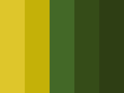
My first step was defining the colors and fonts used throughout the existing design work of Trilogy, which, at the time, only consisted of a book cover. I used Coolors to extract the colors in the book cover, then refined the palette to be more web-friendly.
Once I had those, I then established the fonts that would be used throughout the design. Ben had a modified version of the font "Old Europe," where the tittle of the 'i' was replaced with a triskele, a recurring design element in the reference material Ben gave me. In addition, I created a type-scale reference to work from:
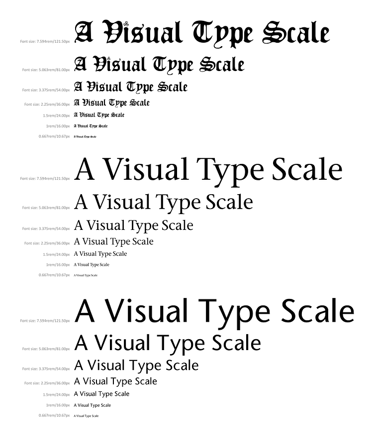
Here we can see I chose seven font size/line-height pairings and three fonts: Old Europe, ITC Stone Serif, and ITC Stone Sans. According to Ben, the latter two fonts were used for the text in the Trilogy rule book.
This type-scale was created using the wonderful Type Scale tool and using the existing Trilogy typography samples to understand the ratio the graphic designer used.
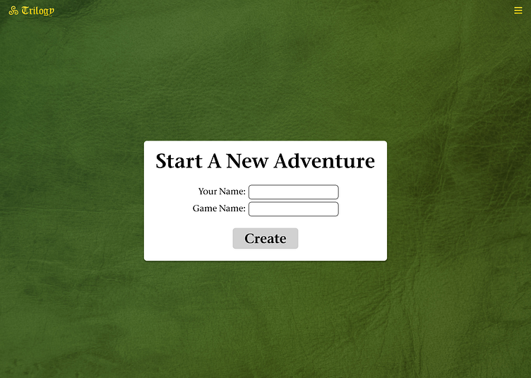
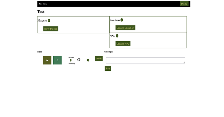
Next came the layouts. First was the screen for creating a new game. As you can see, the original layout was strictly function over form. Since this page's sole purpose was to create a game, I made it the most prominent element on the screen and increased the font size to make it easier to read at small scales.
I also created a Trilogy logo in the top left corner, making the interface feel like it was part of a product.
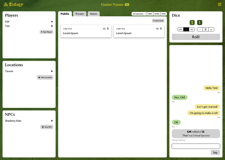
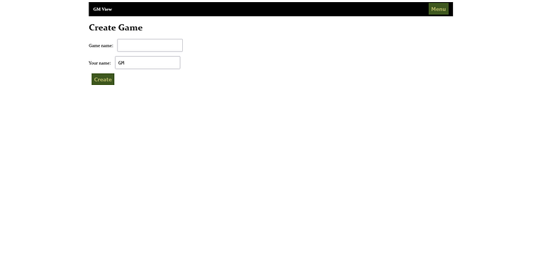
Next was the game master interface, where the game was played. The flow of the app was that the game master would go to the creation page and then be taken to this interface to manage the game.
Ben had thought about this part, but the design was crowded together, and no one part had a place where it 'lived' on the screen. This was where the bulk of my work on the design went: giving each part of the interface a dedicated home on the screen.
Ben did ask for an addition as part of the redesign for this part of the application. He wanted a panel where the GM and players could share a view of the currently unfolding scene. This was borrowed from an app called Fari, which had tabs for public (visible by all users), private (visible only to the GM), and notes (unique to each user).
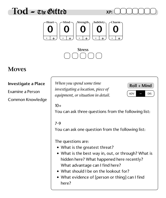
The last major piece of layout work I did for Ben was the character sheet interface. This is far from complete in my opinion, but Ben thought it was a good starting point for him to do the rest of the design.
The original character sheet left a lot to be desired, as, like with the other parts of the UI, everything was crammed together and lacked an obvious hierarchy. The design I came up with demonstrated roughly what the first tab of the character sheet UI would look like. This was the most important tab, as it contained the elements that a user would need to actually play the game.
