BeMe Health
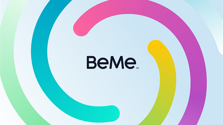
Here is an unused brand concept that was explored for BeMe Health, a mobile mental health platform to improve teen well-being by bringing together the best aspects of digital media, live support, and clinical care.
The mark is an abstract representation of emotional health. The multiple colors represent different emotions, diversity and the inward motion signals inclusivity. The mark also remains scalable at smaller sizes due to the simple and asymmetric nature. It also nods towards the Emotional Guidance scale.
More by Unfold View profile
Services by Dennis Pasyuk
Like


