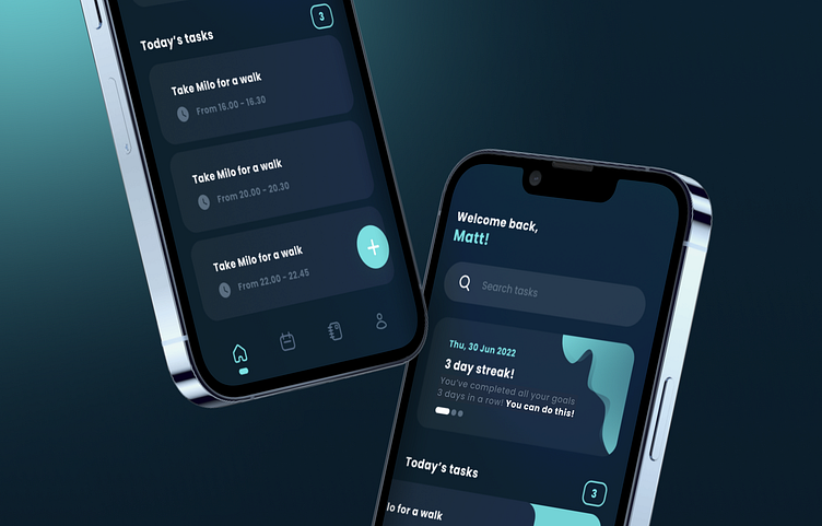
Productivity app (Dark mode) - UI/UX Visuals
Here is our dark mode version of Productivity app - UI/UX Visuals.
Pst. We prefer light mode! Absolutely love this colour palette but it just feels too techy and futuristic. It may not fit with what the app is about. What do you guys think? What colours would you use on a dark mode design?
Like what you see?
Don't hesitate to contact us! We have more designs on Dribbble and Instagram so feel free to check them out!
Email: contact@freshplay.co.uk
Instagram: @freshplayuk
LinkedIn: Fresh Play LTD
FP Team x
More by isuchie View profile
Like

