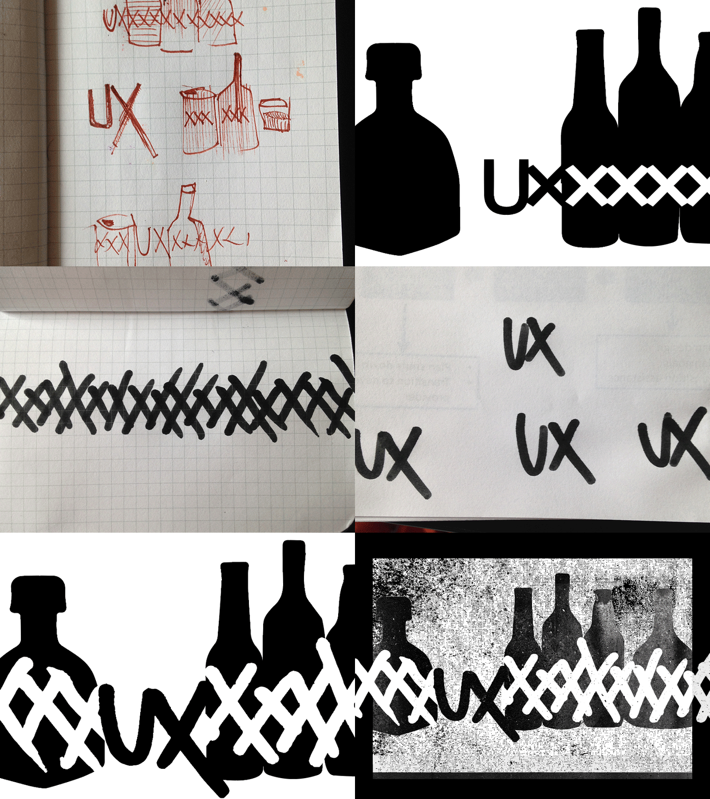
“UX of Alcohol Abuse” illustration process
We recently published link to Victor Yocco’s excellent article, “UX of Alcohol Abuse.” Here’s the process @Michael McAghon went through for the illustration:
“I had an idea to play off the ‘XXX’ label often used for strong alcohol and sketched a few options out in my notebook. I used Adobe Illustrator to refine the sketches, but ultimately was unsatisfied with the clean looking type and string of Xs. They were too mechanical and cold for such a personal post—so I went back to paper and wrote out the letters with a marker, photographed them and went back to Illustrator to trace. I brought the vectors in to Photoshop for some final texture.”
More by EY Design Studio PHL View profile
Like
