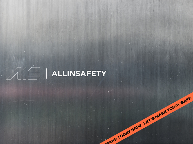
All In Safety / Brand Identity
Sup guys ⚡️
I have just finalized the visual identity for our construction safety equipment brand. It is based in New York and focuses on e-commerce.
The visual identity is built around a professional construction image, incorporating sharp angles, steel elements, and colors commonly associated with construction: grey (representing steel and beton) and orange (symbolizing safety hats and cones).
At the same time it doesn't mean it should look clean and polished, construction field is all about dust and professional small chaos. All this incorporated with love in new AIS brand identity.
Stay tuned to see a new shots from this project ✌️
Feel free to comment / critic / love ❤️
⚡️ Need a brand identity/website or whatever else? zmiydmitry@gmail.com
Dmitry Zmiy® 🇺🇦 Branding / Web / Package Designer
Designing world-class 🌎 branding ⚡️ & web ⤵
More by Dmitry Zmiy® 🇺🇦 Branding / Web / Package Designer View profile
Like


