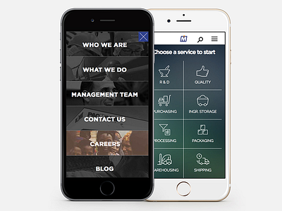
Pacmoore Interface
This was a really fun project. This site had multiple categories that all needed to be organized in a "finger friendly" way. So, we had two categories. One for reading content and one for functional content. It solved the messiness of a dropdown and made the user experience a lot of fun to use. We were able to get the rollovers to work on all mobile devices too, which was a great challenge.
More by Pierce Brantley View profile
Like
