VancouverLaptops.com Web Design Case Study
Introducing my latest UI/UX design case study: vancouverlaptops.com Homepage Redesign!
Vancouver Laptop Inc. is a premier technology company offering laptop sales, repairs, and solutions to small businesses and individual customers. With It online franchise, Vancouver Laptop, you can explore our wide selection of top-quality laptops and accessories available for purchase. The website also offers reliable laptop repairs, data recovery services, and trade-in options to enhance your experience.
I'm thrilled to be part of this project, which focuses on optimizing the UI/UX of the website's homepage. It's an honor to have been invited by the company to contribute to this exciting endeavor.
Looking to collaborate on your next project? Let's transform your vision into an unforgettable digital experience! 💼🔥
Contact me at wangtianqi317@gmail.com 📧
Want to know more? Check out my portfolio: wandawdesign.com 🌐
My Instagram: https://www.instagram.com/wandawstudio/
Design Process
Design Process
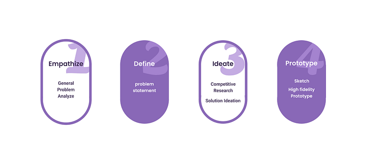
In this project, I followed the classic design thinking framework, which involved empathizing with the users, defining the problem, generating ideas, creating prototypes, and conducting tests to ensure the best possible outcome.
I have conducted a general problem analysis and defined the specific problems. I also conducted competitive research, generated solutions, created sketches, and developed high-fidelity prototypes.
General Problem Analyze
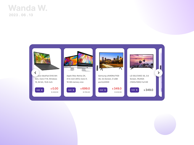
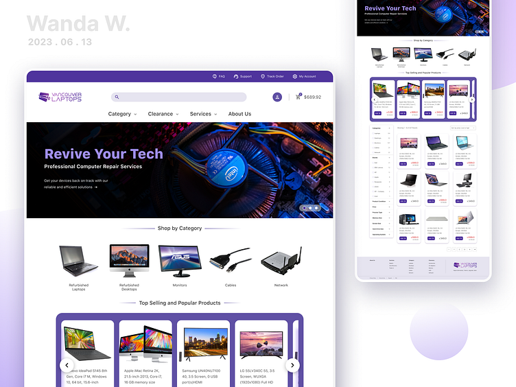
The website's homepage and product page have a lot of content, but it's not organized in a clear and user-friendly way, making it challenging for users to find the specific features and functionalities they need. This hinders their ability to navigate efficiently and locate the desired products
Additionally, there are some accessibility issues on the homepage. The line spacing is not sufficient, clickable areas are too small, and there's no clear indication of the user's current location on the website. These issues can make it challenging for some users to interact with the site comfortably.
Goal
Improve user engagement and navigation efficiency by increasing the average time spent on the homepage and product page and reducing the bounce rate.
Ensure WCAG compliance on the homepage by addressing identified violations.
Solution breaking down
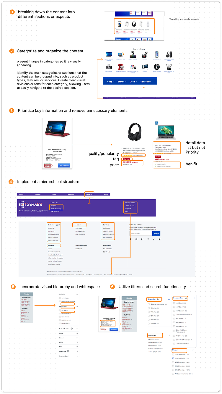
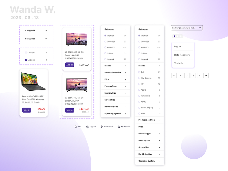
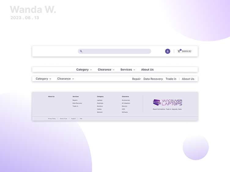
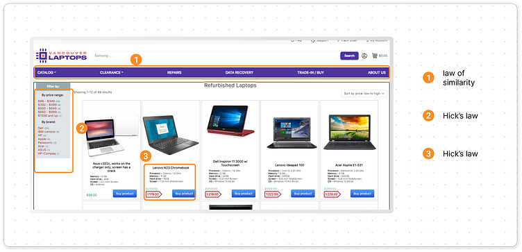
Breaking down the content into different sections or aspects
Categorize and organize the content
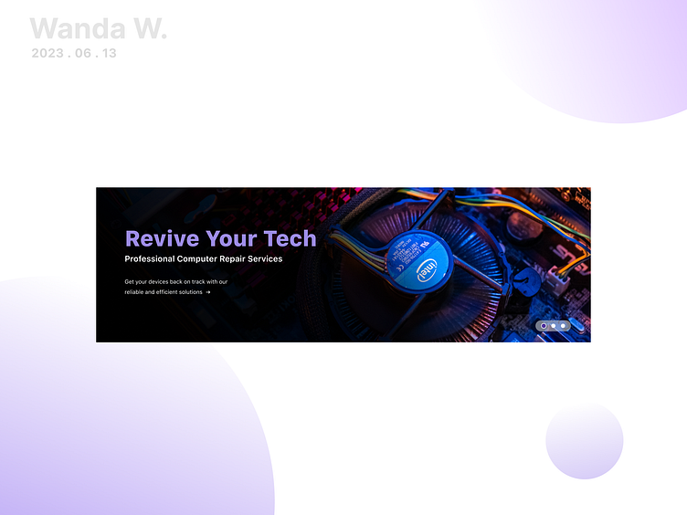
Prioritize key information and remove unnecessary elements
Utilize filters and search functionality
Incorporate visual hierarchy and whitespace
Implement a hierarchical structure
Wireframe and the Lo - Fi Prototype
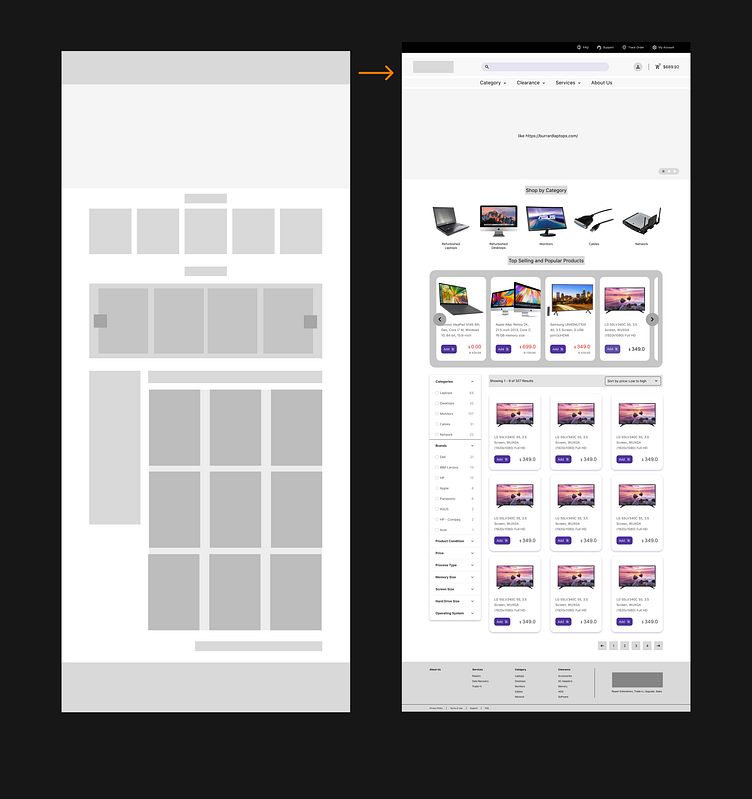
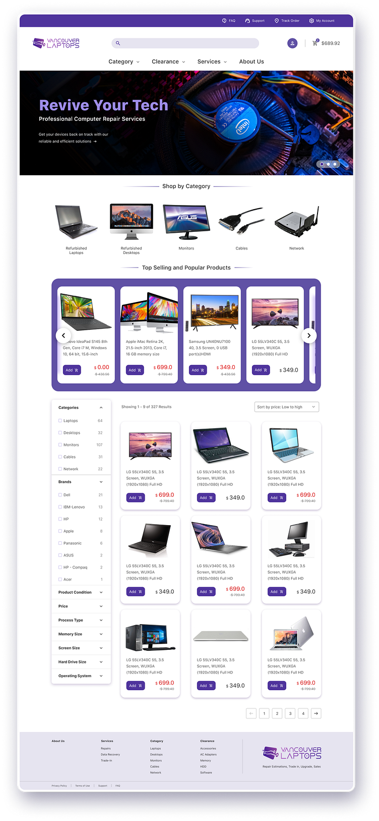
The Result
Link to the prototype: https://www.figma.com/file/mTOxewL6Dkwb6Rf9uxjAeO/Design-challenge?type=design&node-id=154-11862&t=dNc3ylZKjdtZx3JQ-0
Have fun with it.
Logo

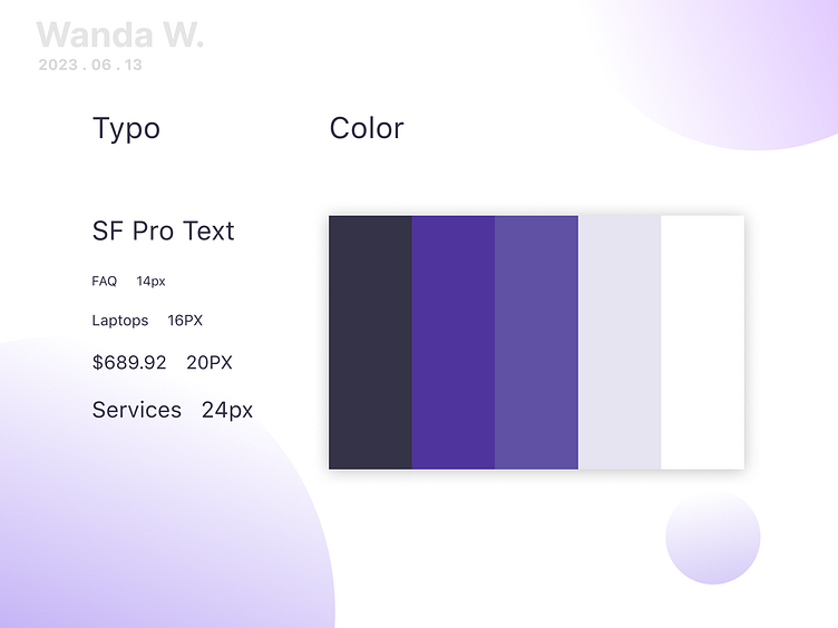
Design Guidelines & UI Components