Planty Fresh Case Study
Concept Design App | UX & UI | Mobile
Planty Fresh Project Brief:
Planty Fresh is a restaurant app for the plant-based and vegan community. The app helps our users discover new plant-friendly food experiences, no matter their location. Dining made easy, especially for those who are looking to eat fresh and healthy food while traveling! The app features user generated photo reviews and also videos to help users. It also features one-click easy ordering or reservations.

My Idea 💡
Have you ever been to a new city, and it taking forever to find a plant-based restaurant?
The idea for this app came up when we traveled to Moab, Utah for a 3 day mountain bike race. After each race day, we’d go back to our hotel to get ready then start searching for places to eat. It was a daunting task and took about 30 minutes before we finally found plant-based options.
For this project, I knew I wanted to have users be able to search by food categories, as well as any dietary restrictions (ie gluten-free). I also thought it would help users decide on menu options by offering photo and video reviews.
Research 👩🔬
Generating a survey about my idea.
I created a survey via Survey Monkey, and posted it on a Facebook group that I belong to called “Plant Powered Academy”. The average member is a cyclist of some sort and most likely follows a plant-based lifestyle.
After the survey was completed, I had now validated my question about how helpful this app would be in the market, and the popular vote was a “Yes”.
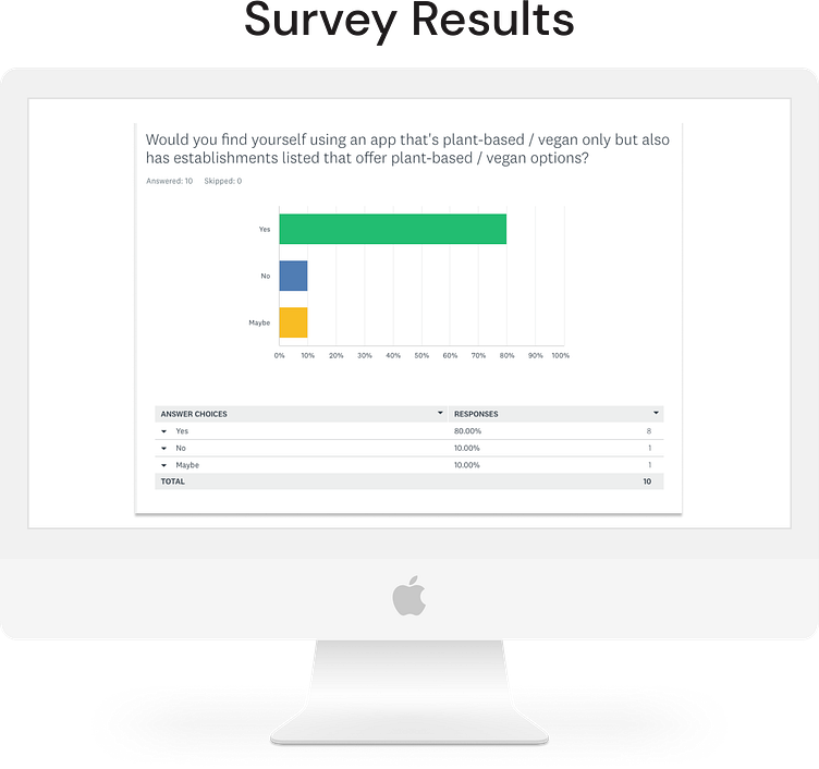
Survey results analyzed 🔬
The 3 takeaways that I learned from analyzing the results:
1) That a plant-based app would be useful in the market,
2) That reviews are generally used to guide users into ordering from the menu
3) That video reviews would be found useful in narrowing down their order
Research 👩🔬
Generating a survey about my idea.
I created a survey via Survey Monkey, and posted it on a Facebook group that I belong to called “Plant Powered Academy”. The average member is a cyclist of some sort and most likely follows a plant-based lifestyle.
After the survey was completed, I had now validated my question about how helpful this app would be in the market, and the popular vote was a “Yes”.
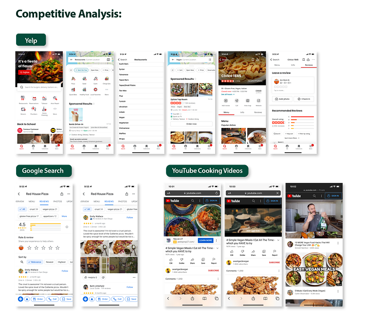
Competitive Analysis 🕵️♀️
I researched other apps to see if there were any pain points into finding vegan places to eat. I noticed that if you didn’t have an account with Yelp, you had to either type it in the search or go to “More Filters” via category and scroll all the way down to select it since it was listed in alphabetical order. I also tried out Google, Vegan Maps, and cooking videos via YouTube, since I wanted to feature Vegan News video content on the home page and also have a video review feature in addition to the photo reviews.
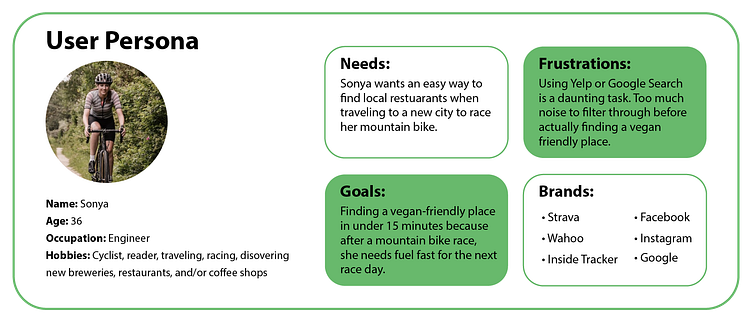
User Persona 🚴♀️
General information on needs, goals, frustrations, and brands.
Since the background of the user would primarily be plant-based or plant-curious, I created a general persona to get started on designing the app.
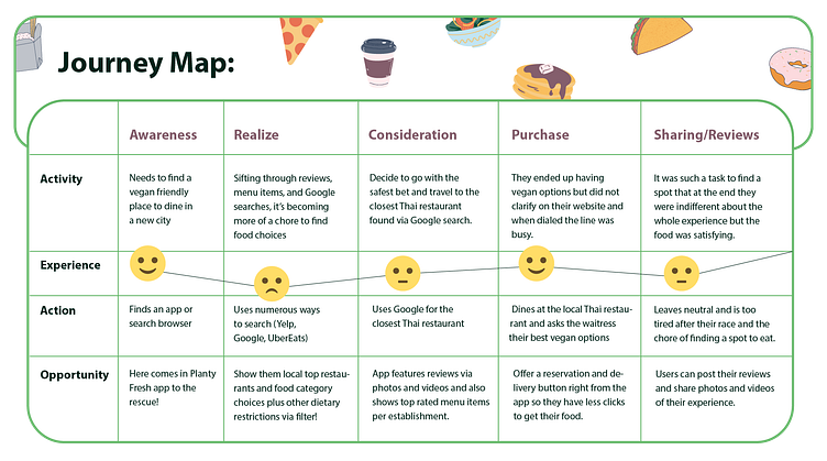
Journey Map 🗺️
Mapping out the user’s journey - from the search to the review process.
I wanted to create a map of the what the process would look like for a user to search for a plant-based restaurant via third-party search, consider their options, then choosing a place, and their overall experience from it.
Problem & Hypothesis ⚠️
Problem:
Users that follow a plant-based lifestyle only want to see establishments that offer these food menu items and eliminate the extra time it takes to find a place to eat.
Hypothesis:
By validating my problem from my survey I sent out, I found that an app would be beneficial to those who follow a plant-based lifestyle or those who had dietary restrictions. Now it was time to work out the design and interface details via sketching some wireframes.
User Flow 🎢
Documenting current and future user flows.
You can see the current user flow vs the Planty system user flow. This captures the decisions that the user and system can make in the process of browsing for restaurant options, viewing the menu, writing and/or reading reviews, and ordering.

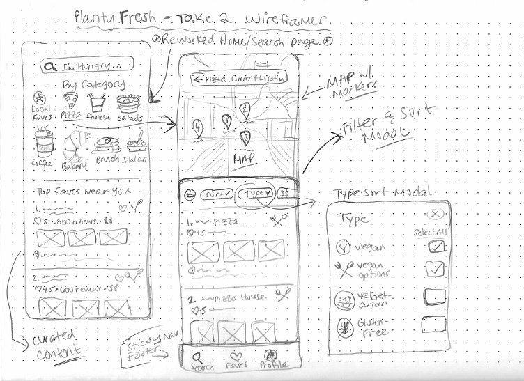
Low Fidelity Wireframes 🧮
Working out the interface and how I wanted it to flow.
I know I wanted to add some fun elements to this app, making it a whole experience for the user. Breaking down the decisions into popular food categories users typically search for and also adding a filter and sort to narrow it down.
I researched the most popular food categories people searched for and the results came at no surprise, with pizza came in at #1 with nearly 32%. However, I was quite surprised to see Burgers and Mexican food (5th and 6th) come in after Asian food and Sandwiches (2nd and 3rd spots).
You can see that in the second wireframe image, I added these popular food categories, among a few others such as, local favorites, brunch, bakeries, and farmer’s markets, to my home page.
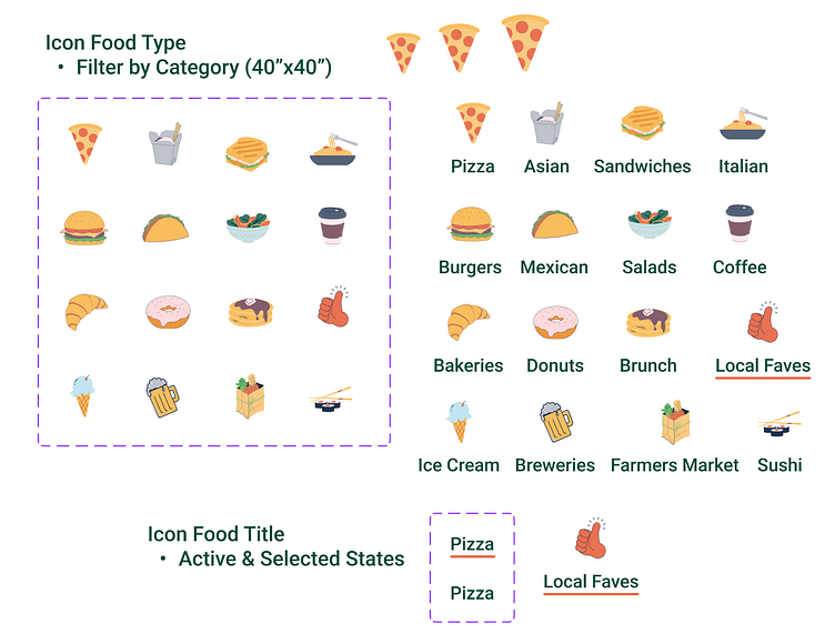
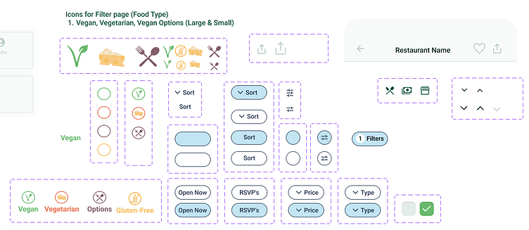
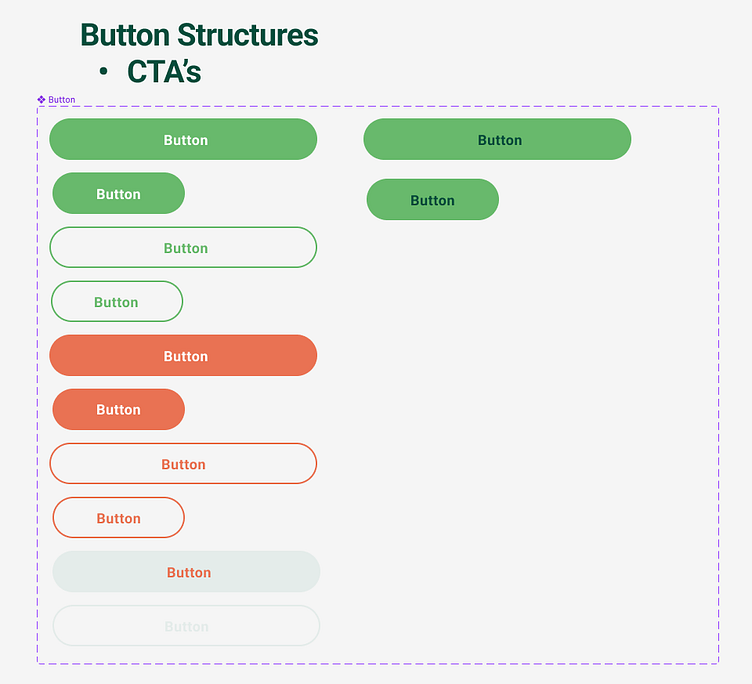
Design System 🎨
Consistent, seamless, design.
I created a design system for the Planty Fresh app so I would be able to make changes to components and their variants if needed as I was creating the screens. Also, there were a lot more screens to create for this case study and wanted to make sure all were consistent throughout the interface. Then in the end would be seamless and ready to hand over to the engineer team.


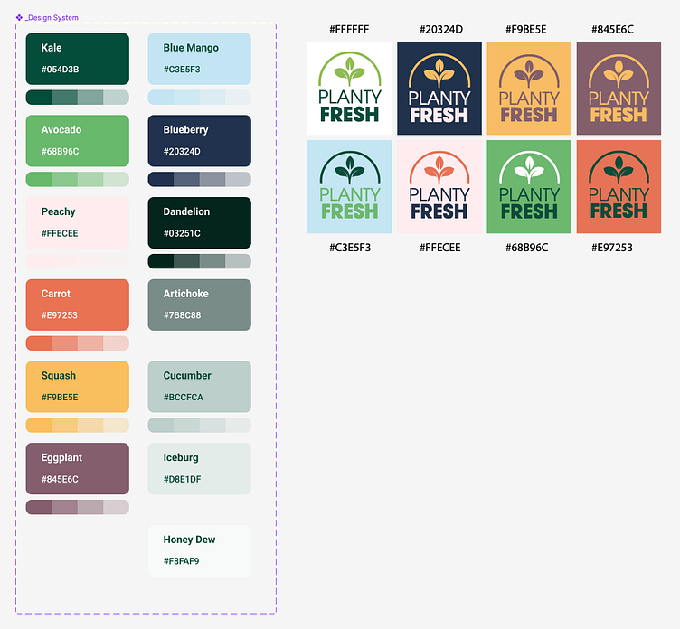
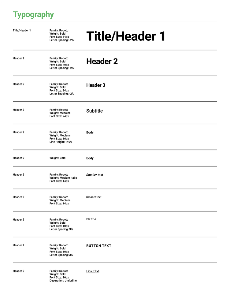
Style Guide 🎨
Brand Colors and Typography:
I started off creating a style guide after designing the logo for Planty Fresh. I wanted to mimic colors that you see in fruits and vegetables. That was my main inspiration as you can see the color names I used on my color scheme image.
I also documented the typography as well and saved these as text styles in Figma to use across the platform. I went with an easy to read digital font with weight and emphasized variations: Roboto Font Family.
Logo Color Variations 🌱
I came up with variations on my logo designs using the colors in my style guide, but ended up going with the Dandelion (dark green) color on the Avocado (bright green) ground color to portrait the “Planty Fresh” logo name.
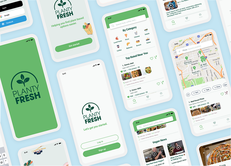
Design & Implementation 📲
High Fidelity - Splash & Onboarding Screens:
Upon opening the app, I created an interaction with the logo. The logo will increase it’s size for a few seconds and then prompt the user through screens to login or signup for an account.

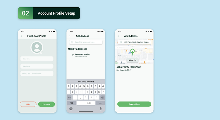
High Fidelity - Account Profile Setup:
After signing up for an account, it’ll ask the user to finish their profile by inputting their name and mobile number and add their current address but they can skip this step if they choose to.
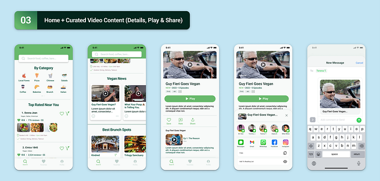
High Fidelity - Home screens and Video Content (Play & Share):
Laid out is the home screen with curated content based on your preferences, favorites and location. Below the fold, I have a row of video cards titled “Vegan News” which you can click on to watch now, save, or share with a friend.
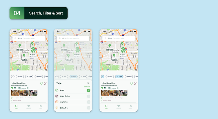
High Fidelity - Search, Filter, and Sort:
After searching via category or search bar, it’ll bring you to the search results page which from then you can filter by things like Type (Vegan, Vegan Options, Vegetarian, and or Gluten-Free), Price, and Open Now.
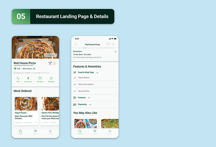
High Fidelity - Restaurant Landing Page:
Once a user selects a restaurant, they can view things like Most Ordered, Menu, Read or Write a Review, Add to Favorites, and Share to a friend. A few other things a user would find helpful are Features and Amenities which I have tucked under an accordion and a row of “You May Also Like” restaurant suggestions.
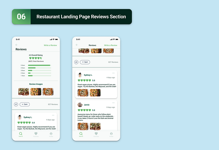
High Fidelity - Restaurant Reviews Section:
On the review page, it’ll recap the overall rating, total reviews, and how many stars each rating holds. From there the user can scroll through images, read reviews, and sort through what’s relevant to them.
Prototype 🎥
Featuring the Onboarding user flow process:
Here’s a prototype for the onboarding process. When you first open the app you’re greeted with a splash page that shows the logo then the user is prompted through the signup screens which is validated with a success model that pops up on the interface.
Conclusion 📝
Overall thoughts and takeaways from Planty Fresh product:
Designing a search based app is a big project. There are a lot of screens and layers that go into it such as interactions, modals, maps, and location markers. Gathering a lot of data and research before mapping out the design helped. Guerilla style interviews and sending out a survey validated some of the features I wanted to implement within the product. I went through and tried out different apps and asked users what they felt the pain points were. Also, starting off with a solid style guide and design system really streamlined the process as I went through and laid out all the screens. It was easy to go back to the components and edit them if something needed to be updated along the way. Overall, I am pleased at how the product design came out. I think there are a few things I would go back and update like condensing the onboarding process into less screens so the user can get started quicker.
