What-A-Muse

Welcome to What-A-Muse
Your ultimate event discovery and promotion platform.
With What-A-Muse, you can easily search for events based on categories and location, purchase tickets, add events to your personalized Event Calendar, and even create and promote your own unforgettable experiences. Say goodbye to event-related headaches and hello to a seamless and exciting event planning journey.

A Complete Introduction
My goal with the Main Page was to fully display the capabilities of What-A-Muse in a compact, but eye-catching way. The Home page prioritizes its main features at the top with the event search bar & main event categories displayed, followed by promoted events.
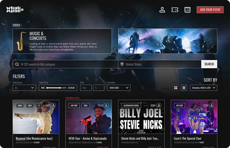

Layered searching & Advanced filtering
After entering a certain category the user has a lot of ways at their disposal to find their desired event, including a search bar affecting only events in this category, and a number of filters & sorting options dedicated to each event variable.
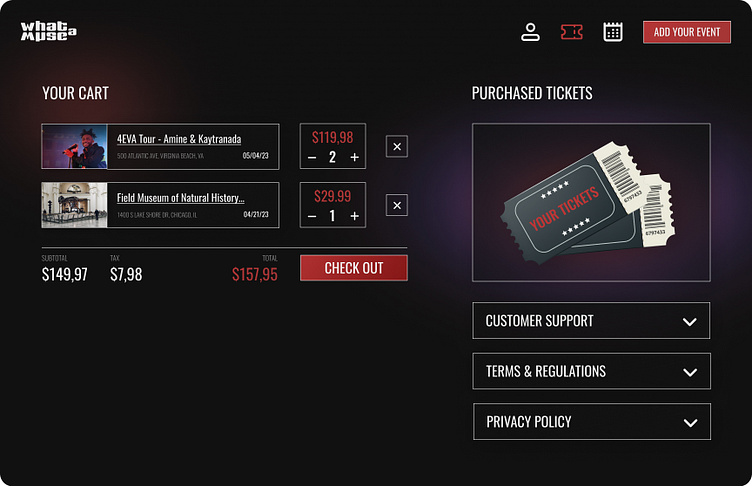

Tickets & Cart in one place
By combining these sections we allow the user to view this page more as a "Ticket Centre" with all they need regarding previously purchased tickets, as well as new ones added to the Cart. All of this is encapsulated in the minimalist top navigation with a simple ticket icon to match.
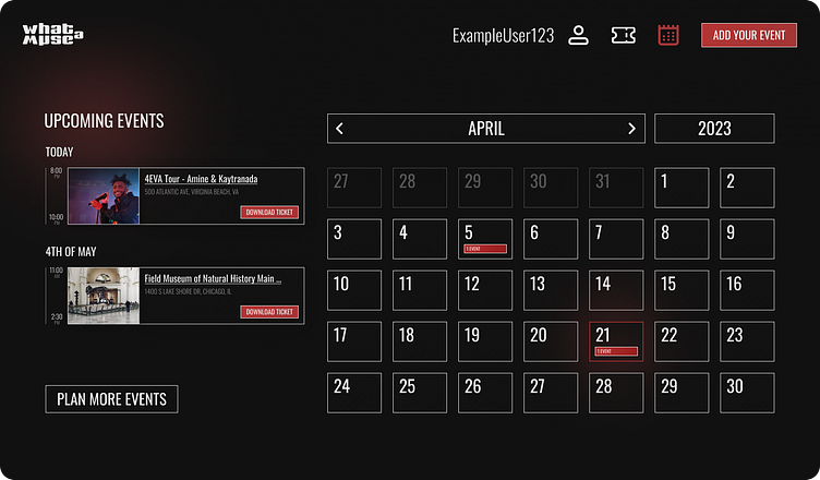
Timeline on the left, Grid on the Right
By displaying event data in this way we can give the User a complete sense of how their month is going to play out - with a timeline on the left focused more on the order of events & the calendar grid on the right showing their exact place in time.


Multi Step Event Creation
Promote Event as a Step, Not a Button
During the last few years, Multi-Step User Flows have taken over the redundancy of Long Forms which feel more cluttered & unorganized in comparison. I designed the What-A-Muse's Event Creation flow in the same way, as 5 steps of grouped information - with promoting your event as a final, optimal step of the userflow. This way users can fully focus on the feature instead of skipping it if it were a simple button.
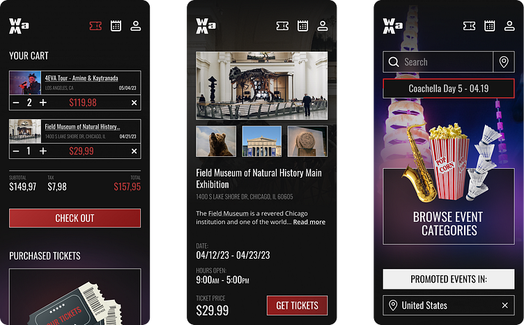
Responsive Design & Accessability
With my Mobile-first approach, I always take into account how each of the screens will be displayed, by making sure all of the information is not only fully optimized to the smaller screens but also fully accessible with correct font sizes & contrast.