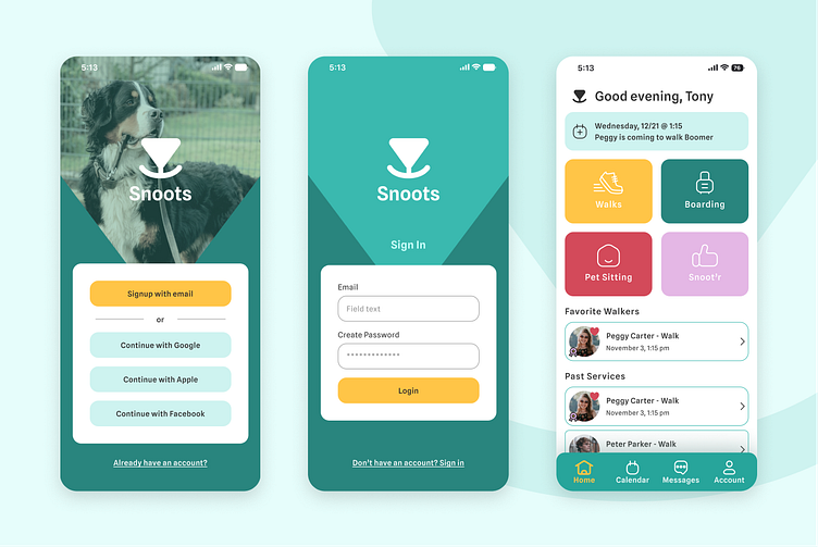
Not another dog walking app...
By now, you've probably seen a couple of dozen of these, but my goal was to make this one a little different. Let me tell you how.
The struggle is real...
I mean, finding a dog walker can be a real pain. I would know. I have 2 large dogs, one who doesn't trust people very easily and the other's never met a stranger. I knew right off the bat that there were a few major pain points I needed to address.
Time for some recon
The big competitors have been in the game for a while, so what do users have to say about them and where can we improve?
Playing the objective
We have a few solutions we can focus on to make everything easier for our users.
New app, who dis?
Let's give it some structure...
Time to throw some lipstick on this pig
NO CAPES!
This was where I really took a look at what people actually need from an app like this. The big stand out for me was "why does everyone have a map of where their walker lives?" That would make me uncomfortable. I don't care where my DoorDasher lives, I just want to know that my burrito is on the way and how long it's going to take. No maps. Well, not for the "find a walker" page at least.
I loved this project because I learned. A LOT. It was challenging to think of things in a way that others may not have, like scrolling reviews sections, this card system for the walker profiles, or even making the decision to not include a map in the walker search page (which was a polarizing idea when I discussed it with my peers).


