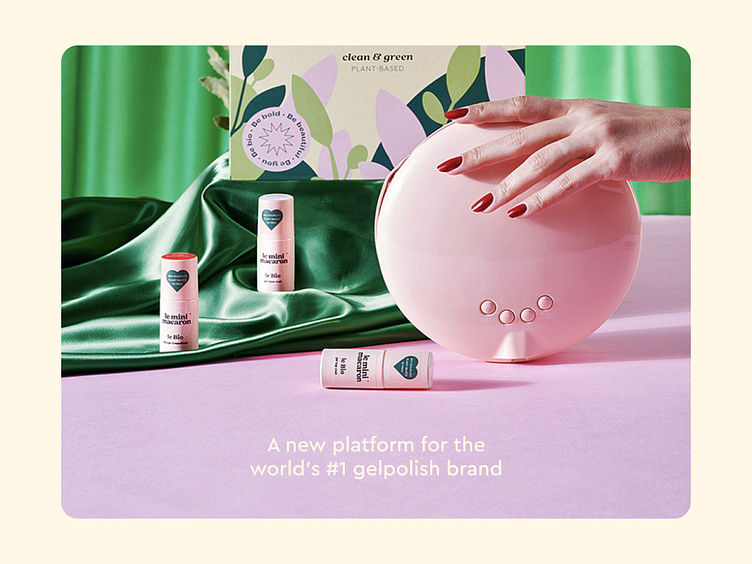
Le Mini Macaron
Project Description: UX/UI Redesign of Le Mini Macaron Website
Project Overview: The goal of this project was to redesign the UX/UI of the Le Mini Macaron ecommerce platform for both the US and EU stores, taking into consideration the new brand identity and storytelling. The fun visual identity and brand strategy behind Le Mini Macaron, a top international beauty brand specializing in gel polish products, kits, and colors, allowed us to focus on providing their customer base with an easy to use digital experience to acces fabulous gel manicures at home. The redesign focused on enhancing user experience, improving visual appeal, and optimizing the overall usability of the website.
Objectives: Enhanced User Experience: The primary objective was to create a seamless and intuitive user experience that aligned with Le Mini Macaron's brand values of simplicity and fun. The website was designed to guide users through the product selection process, making it easy for them to find and purchase their desired gel polish products, kits, and colors.
Improved Visual Appeal: The existing website lacked visual connection to the new visual identity and failed to capture the brand's vibrant and lively personality. The redesign incorporated visually engaging elements, including attractive product images, color schemes that reflected the fun and energetic nature of the brand, and visually appealing typography to enhance the overall aesthetics of the website.
Optimized Usability: The previous website had usability issues that hindered the customer's journey. The redesign focused on optimizing the user interface, streamlining the navigation, and improving the overall usability. This included reorganizing the product categories, enhancing search functionality, and simplifying the checkout process to reduce friction and increase conversions.
Key Features and Functionalities:
Intuitive Product Browsing: A user-friendly and intuitive interface was implemented to allow customers to easily browse and explore the wide range of gel polish products, kits, and colors offered by Le Mini Macaron. This included clear product categorization, effective filters, and sorting options.
Interactive Product Pages: Visually appealing and informative product pages were designed to showcase the gel polish products, providing high-quality images, detailed descriptions, and customer reviews. Additionally, interactive elements such as color swatches were included, allowing users to preview different shades on virtual nails.
Simplified Checkout Process: The checkout process was streamlined to minimize steps and reduce friction for customers, using the integrated Shopify checkout. Guest checkout was enabled, multiple payment options were offered, and a clear and transparent order summary was provided. A progress indicator was incorporated to guide users through the checkout process.
Personalized Recommendations: Various recommendation sections were implemented to suggest complementary products based on the customer's browsing and purchase history. This feature helped customers discover new products and increased upselling opportunities for Le Mini Macaron.
Mobile Responsiveness: The redesigned website was made fully responsive and optimized for mobile devices, considering the increasing number of users accessing the site from smartphones and tablets. The mobile experience was seamless and provided all the necessary functionalities of the desktop version.
Customer Reviews and Ratings: A review and rating system was integrated to allow customers to provide feedback on their purchases. Displaying genuine customer reviews and brag bars helped build trust and confidence in the brand, influencing potential customers' purchase decisions.
✉️ We are available for new challenges: info@rock.et


