Taskwise (App)
Project Overview
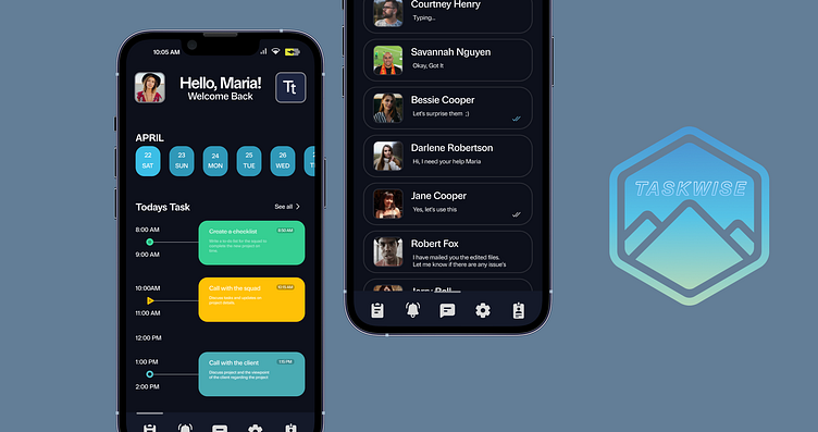
Task Wise is a comprehensive task planner app designed to streamline and enhance productivity in daily life. It offers two distinct modes, Today Task and Daily Task, along with chat integration, to provide users with a well-rounded experience. The app's visual design revolves around a dark background, soothing accent colors, and user-friendly icons to ensure a pleasant and strain-free user interface.

The Challenge
Creating an effective and user-friendly design for Task Wise posed several challenges that required careful consideration and problem-solving. Here are some of the design challenges encountered during the development of the app:
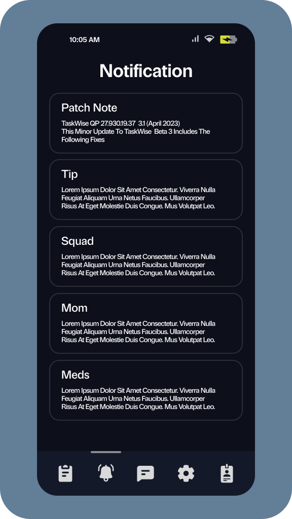
Dark Background and Eye Strain: Implementing a dark background as the app's primary theme required careful attention to avoid causing eye strain. Balancing the contrast between text, icons, and background colors was crucial to ensure readability and provide a soothing visual experience.
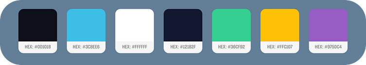
Accent Colors and Visual Cohesion: Choosing the right accent colors that complemented the dark background was essential for achieving visual cohesion. The challenge was to select colors that were not only visually pleasing but also provided a calm and harmonious atmosphere.
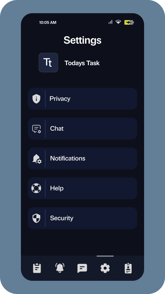
Iconography and Intuitiveness: Designing icons that effectively conveyed their meaning and function while aligning with the overall visual theme was a significant challenge. Icons needed to be easily recognizable and intuitive to ensure a smooth user experience and reduce the learning curve for new users.
Task Organization and Hierarchy: Designing a clear and intuitive task organization system was crucial to help users easily manage and prioritize their tasks. Balancing simplicity with flexibility in organizing tasks into lists or projects required careful consideration of information architecture and user flow.
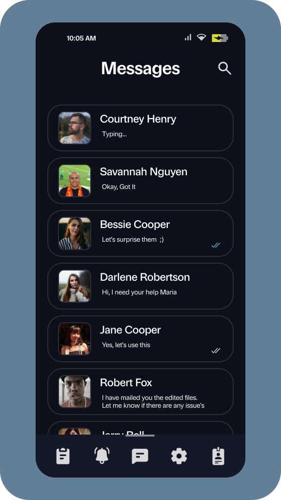
Chat Integration and User Engagement: Integrating chat functionality within the app required creating a seamless and intuitive user interface for communication. Ensuring that users could easily navigate between task management and chat features while maintaining a cohesive design posed a unique challenge.

The Solution
To address the design challenges faced in developing Task Wise, a thoughtful and user-centric design solution was implemented. Here are some key aspects of the design solution:
Dark Background and Eye Strain: The dark background was carefully calibrated to strike a balance between readability and eye comfort. Careful consideration was given to text color, contrast, and font size to ensure optimal legibility. Extensive user testing helped refine the color scheme and typography to create a visually pleasing and eye-friendly experience.
Accent Colors and Visual Cohesion: By selecting soothing accent colors that complemented the dark background, a sense of visual cohesion was achieved throughout the app. These colors were strategically applied to highlight important elements, such as buttons and notifications while maintaining a harmonious overall design.
Iconography and Intuitiveness: The iconography in Task Wise was meticulously designed to be intuitive and easily recognizable. Clear and concise icons were used to represent different functions and actions, ensuring users could quickly understand their meaning and purpose. User feedback and usability testing played a significant role in refining the iconography for optimal user understanding.
Task Organization and Hierarchy: A user-friendly task organization system was implemented, allowing users to categorize tasks into lists or projects. The design ensured a clear hierarchy, making it easy for users to prioritize and manage their tasks effectively. Intuitive drag-and-drop functionality and visual cues helped users organize their tasks effortlessly.
Chat Integration and User Engagement: The chat integration was seamlessly incorporated into the app's design, enabling users to communicate with contacts or task collaborators effortlessly. The user interface was designed to ensure a smooth transition between task management and chat features, with clear indicators for unread messages and task-related conversations. This encouraged user engagement and collaboration within the app.
Discovery
During the UX discovery phase for Task Wise, extensive user research, interviews, and usability testing were conducted. The goal was to gain insights into users' task management habits, pain points, and expectations. This process helped identify key user requirements, preferences for color schemes, iconography, and layout, as well as insights on the integration of chat features. The findings from this discovery phase informed the app's design and guided the development of a user-centric and intuitive task planner experience.
Design
Enter your Task Wise's design is centred around creating a visually appealing and user-friendly experience. With a dark background and soothing accent colors, the design aims to reduce eye strain and provide a calm atmosphere. Intuitive iconography and task organization enhance usability, while seamless chat integration promotes effective communication. The design strikes a balance between simplicity and flexibility, ensuring that users can easily navigate and manage their tasks while enjoying a visually cohesive and engaging interface.
Road Map

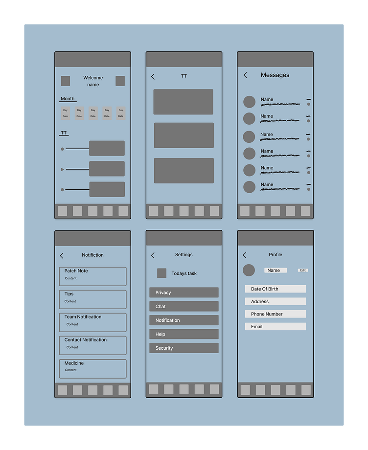
Wireframe
The wireframing process for Task Wise involved creating low-fidelity mockups that outlined the app's structure and functionality. Iterative wireframes were developed to define the layout, navigation, and placement of key elements such as task lists, chat interfaces, and settings. These wireframes helped visualize the user flow, establish information hierarchy, and facilitated early user testing to gather feedback and make necessary adjustments before proceeding to higher-fidelity design stages.

Mobile Application
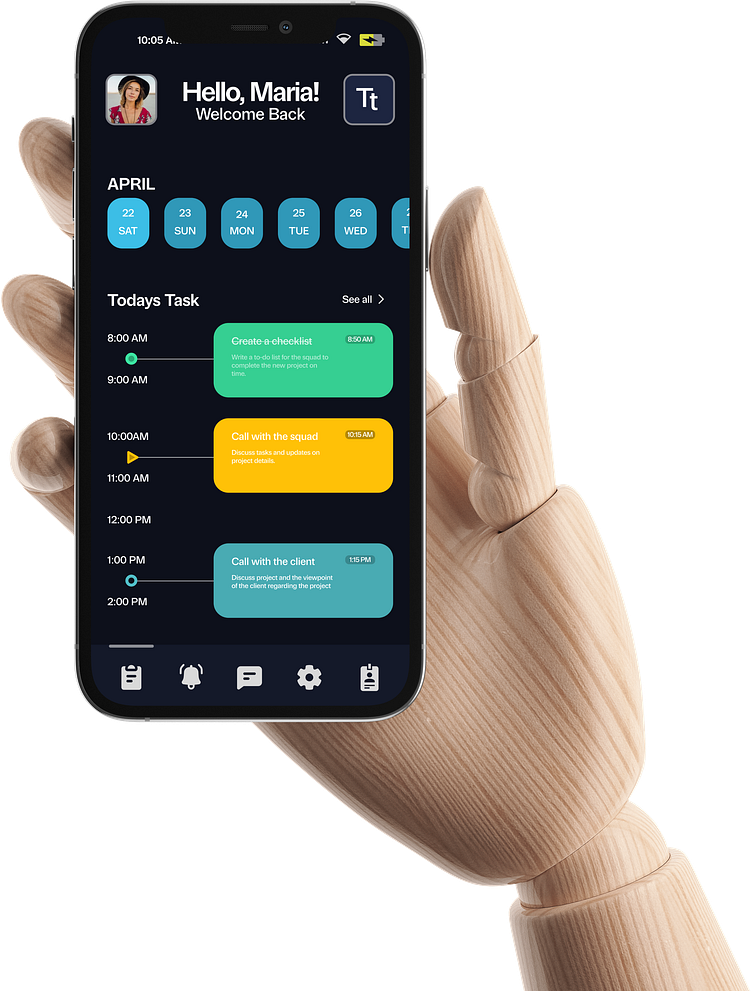

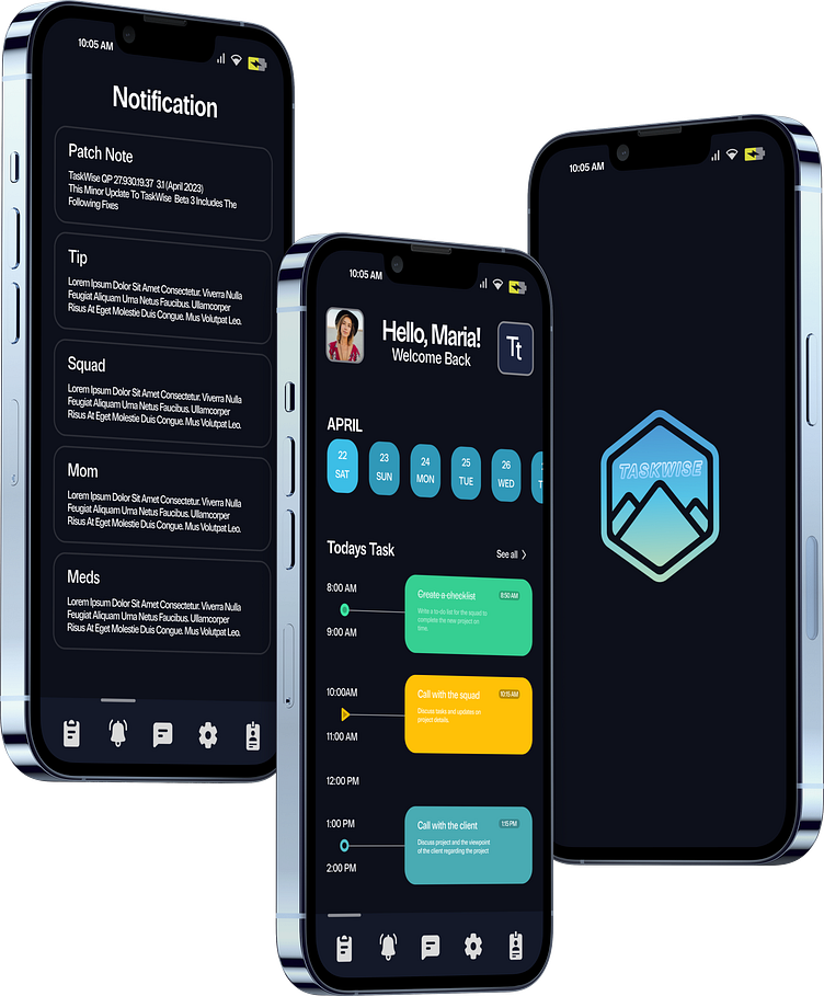
Preview