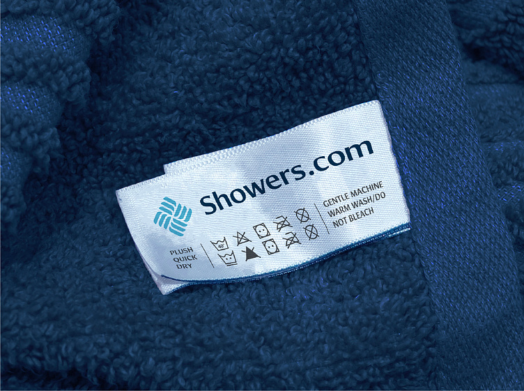
Showers.com brand identity design
Showers.com noticed a niche in the bathroom and showers industry that could be filled by a brand that provides high quality products and services at affordable prices. They needed a logo and brand identity design that felt luxury and unique yet affordable.
After the research stage of my process, I noticed that almost all of their competitors utilise cliche visual signifiers of the industry with the likes of water droplets, bubbles, etc. I then pondered on how to be unique whilst identifying as a bathroom and showers brand and thought about how water flows down drains. I began sketching out lots of different versions until I found a few I was happy to develop further.
Once I refined and finalised the logomark, I set upon pairing it with some elegant yet modern type and found this combination in Cora. It elevated the logomark allowing it to be used in mass-market applications as well a luxury niche. Next came the colour palette.
As part of the brief, the team were set on blue which made a lot of sense for the industry but we still needed to stand out. I conducted some colour analysis of some of their closest competitors and found a gap where we could use multiple shades of blue rather than just one as their competitors tended to do. The blue hues also route the brand in feelings of trust and security - perfect for a high-ticket brand.
Ready to create or refresh your brand's identity?


