NOTATION (App)

Project Overview
Notation is a revolutionary note-taking application designed to address the file management challenges faced by users, while also providing a seamless and visually appealing user experience. The app aims to simplify the process of organizing and accessing notes, ensuring easy navigation and segregation of files within folders. With its calming blue color scheme and intuitive features, Notation aims to enhance productivity and reduce eye strain for users.

The Challenge
Traditional note-taking methods often lack efficient file management systems, making it cumbersome to organize and retrieve notes. Users frequently struggle with locating specific notes, especially when dealing with a large number of files. Additionally, many note-taking apps feature distracting color schemes that can strain the user's eyes and hinder their concentration. Overcoming these obstacles was crucial to ensure a seamless and user-friendly experience for the app's users:
File Management: One of the primary challenges was creating an intuitive file management system that allowed users to easily organize and access their notes. Designing a folder-based organization structure that accommodated unlimited nested folders while maintaining simplicity was a delicate balance.
Navigation and Segregation: Enabling users to navigate through their notes effortlessly was another design challenge. Implementing a search function that delivered accurate and relevant results within a large database of notes required sophisticated algorithms and efficient indexing.
Color and Theme: Striking the right balance between aesthetics and functionality was important, particularly in choosing the app's color scheme. The challenge was to settle on a calming blue theme that wouldn't strain users' eyes during prolonged usage while also maintaining an engaging visual experience.
The Solution
Notation addresses these challenges by introducing a range of features designed to streamline file management and enhance the user experience. By implementing a folder-based organization system, users can easily categorize their notes and access them effortlessly. The calming blue color scheme chosen for the app's theme ensures a soothing experience and minimizes eye strain, allowing users to focus on their work for extended periods. several solutions were implemented to ensure a seamless and user-friendly experience for the app's users:
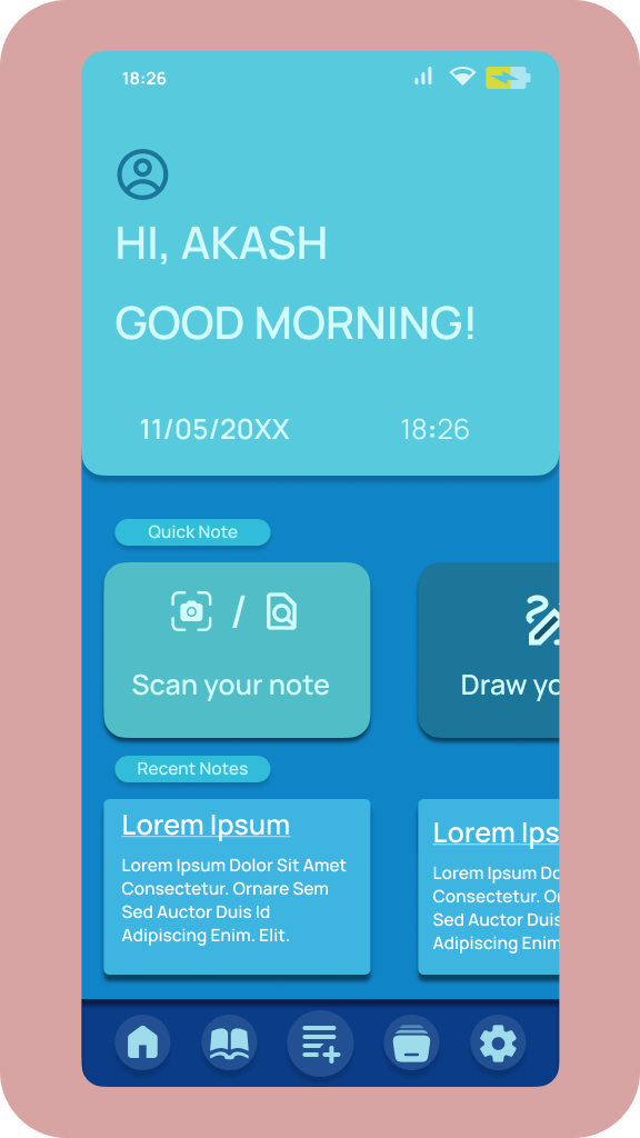
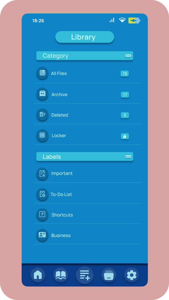
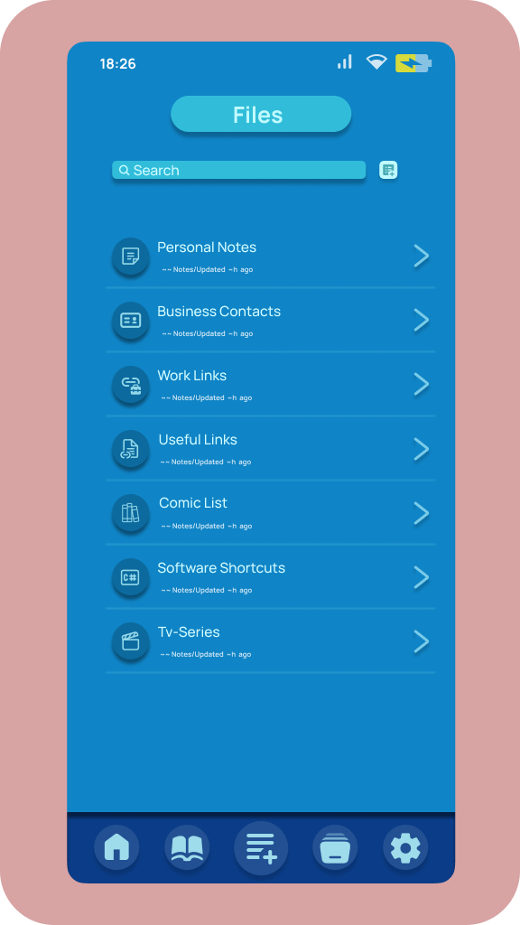
Folder-based Organization: Notation introduced a folder-based organization system, allowing users to create a hierarchical structure for their notes. This solution simplified file management, enabling users to categorize and locate their notes easily. The intuitive interface made it effortless to create, edit, and organize notes within folders.
Intuitive Navigation: A robust search function was implemented to enable users to quickly find specific notes. Advanced algorithms ensured accurate and relevant search results, saving users valuable time. The app also featured a user-friendly interface with clear navigation options, making it easy for users to browse through their notes and folders.
Calming Color Scheme: The design solution involved selecting a calming blue color scheme to create a visually pleasing and soothing experience for users. This color choice aimed to reduce eye strain during extended usage, promoting a comfortable and focused note-taking environment.

Discovery
During the UX discovery phase for Notation, extensive user research and testing were conducted. This involved understanding user pain points in file management and note organization, evaluating existing note-taking apps, and gathering user feedback. The research aimed to uncover user preferences for color schemes, folder organization systems, and navigation. Insights gained from this process guided the design and development of Notation, ensuring a user-centric and intuitive note-taking experience.
Design
Notation's design focuses on simplicity, usability, and visual appeal. The app features an intuitive interface with a clean layout, allowing users to easily navigate and access their notes. The calming blue color scheme was carefully chosen to create a soothing experience and minimize eye strain. The design also incorporates customizable themes, empowering users to personalize their note-taking environment. Attention to detail in the design ensures a seamless and enjoyable user experience.
Road Map
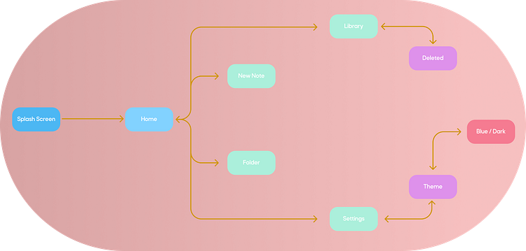
Wireframe
The wireframing process for Notation involved creating low-fidelity representations of the app's interface and functionality. This included sketching out the layout, navigation, and key features of the app. Through wireframing, the team focused on structuring the folder organization system, search functionality, and note editing interface. Feedback from stakeholders and user testing informed iterative improvements, ensuring a well-planned and user-friendly app design.

Mobile Application

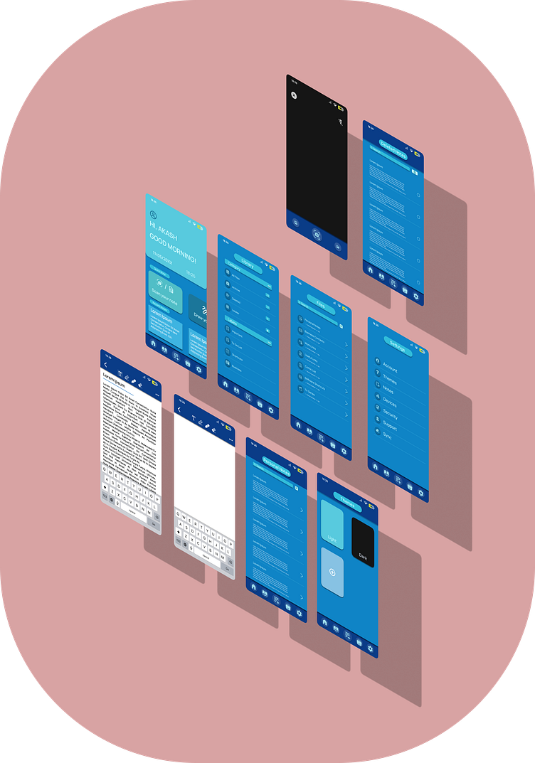


Preview