Redesign the Vineyard Web that I Designed 3 Months Ago
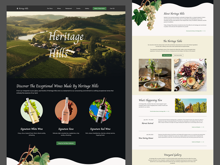
Remember the Vineyard landing page I designed three months ago? I recently gave it a fresh redesign, exuding an elegant new interface. With a refined color palette and typography, the overall look and feel have been enhanced.
In addition to the visual improvements, I carefully considered the logical flow of the landing page. I restructured a few sections and adjusted their order to create a smoother user journey. Additionally, I differentiated each section with different background colors, ensuring a clear hierarchy and improving user comprehension.
I hope you like it 👌
I'm Violet, a freelance UX designer based in Australia.
Let's Connect for Collaboration 😍
Contact me at:
violetchen.ma@gmail.com
Please also check my:
Services:
UX UI Design
Web design
Mobile Application Design
Webflow Website Build
Keep Scrolling Down to Check the Entire Landing Page ↓
& The old version is here: https://dribbble.com/shots/20958489-Vineyard-Web-Design

