St. Elias Brewing Co.
St. Elias Brewing Co.
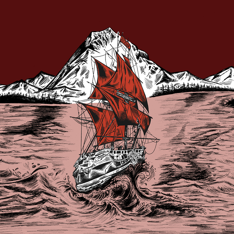
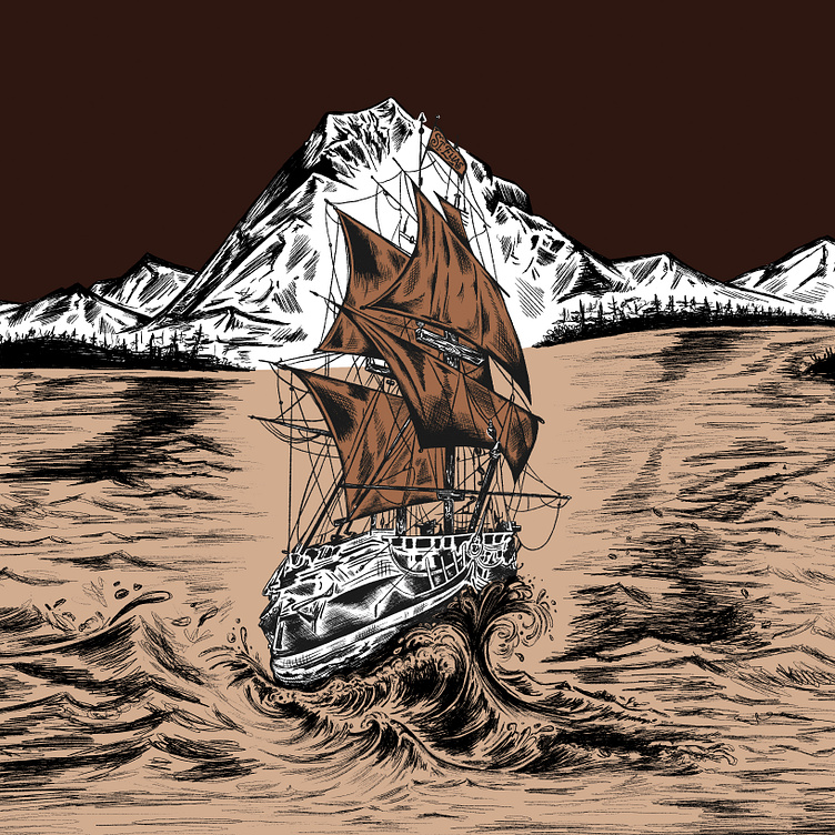
Logo design, branding and packaging design for St. Elias Brewing Co., a family owned and operated brewpub in Soldotna, Alaska since 2008.
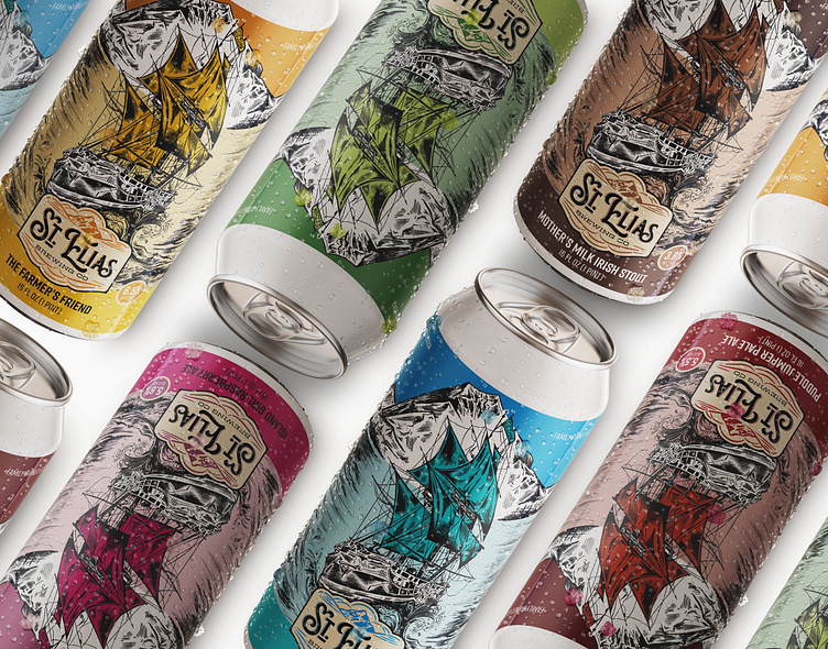
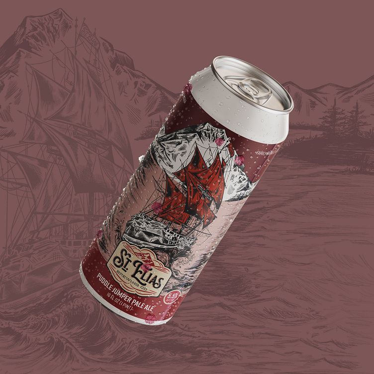
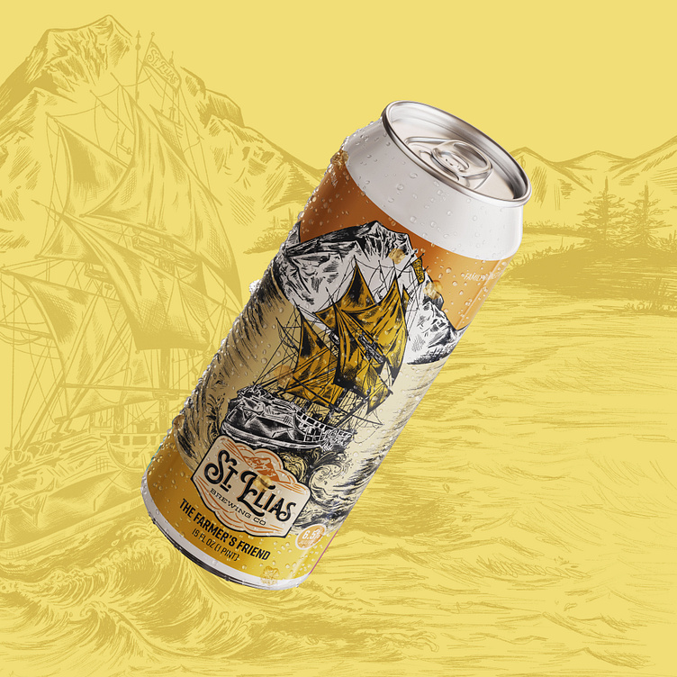
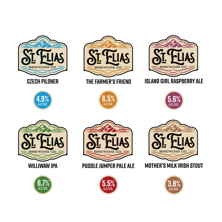
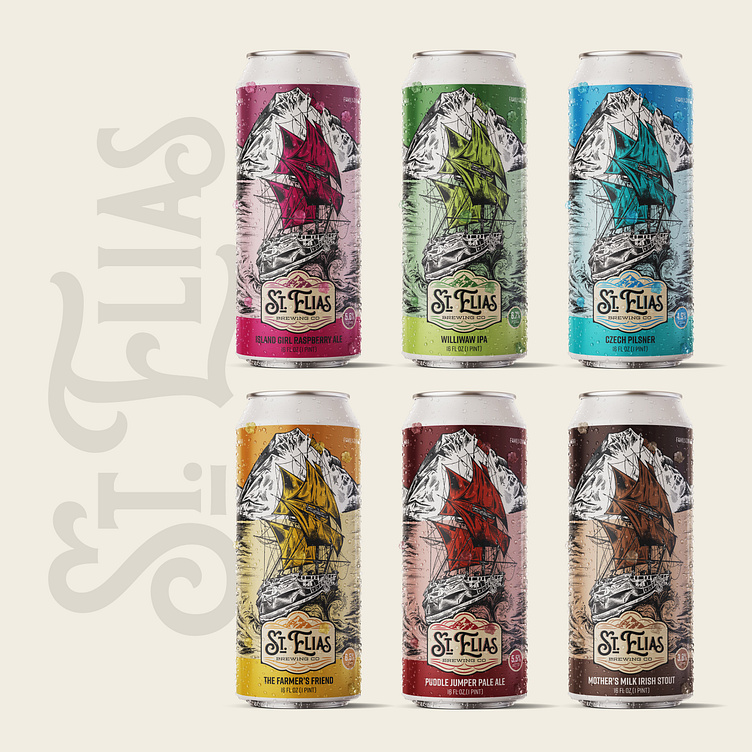
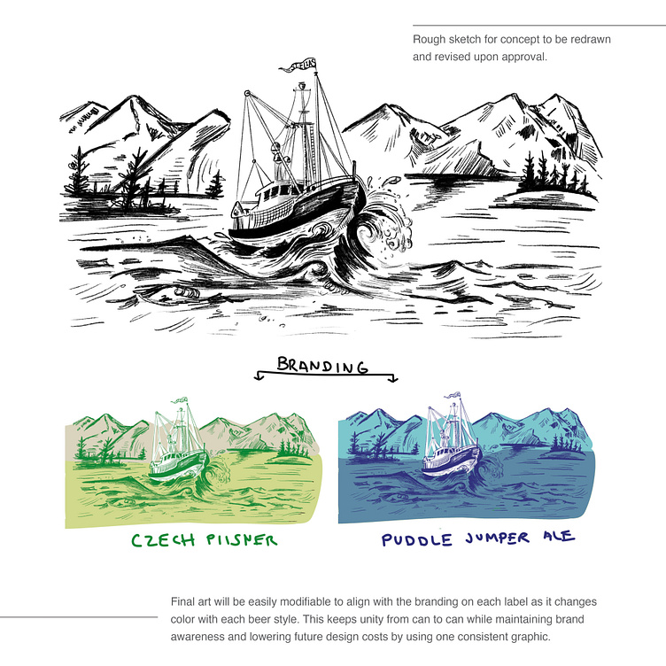
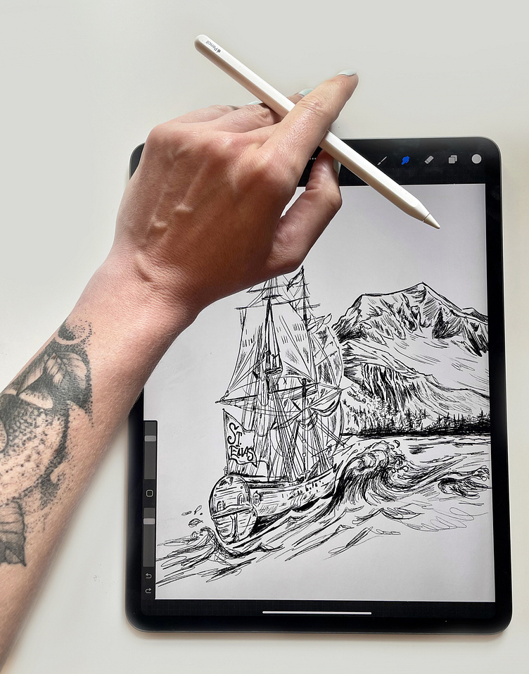
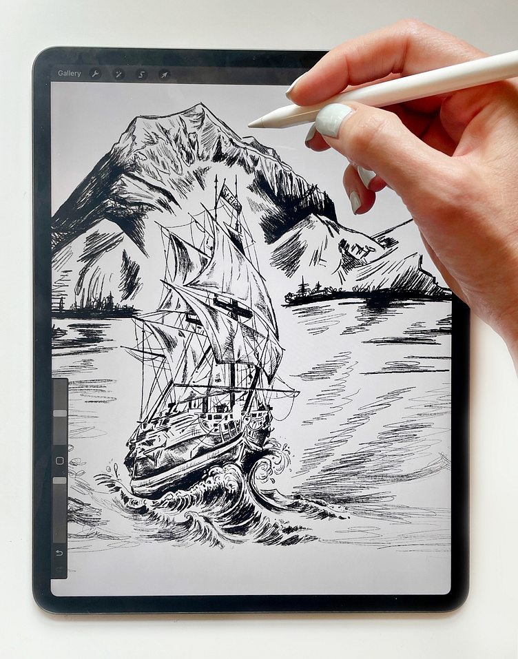
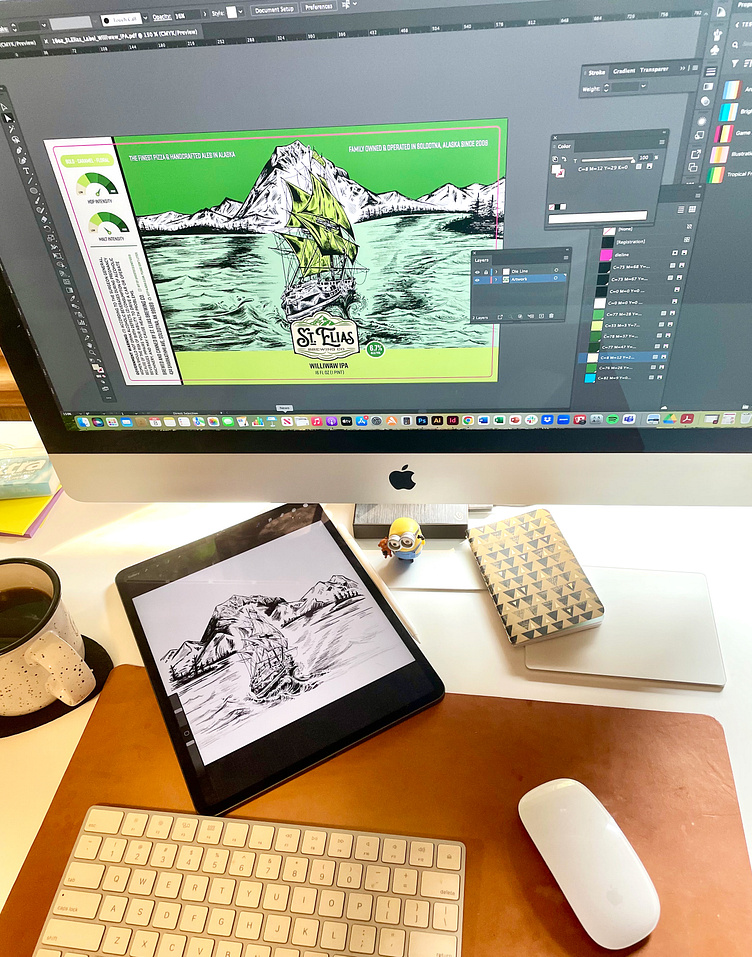
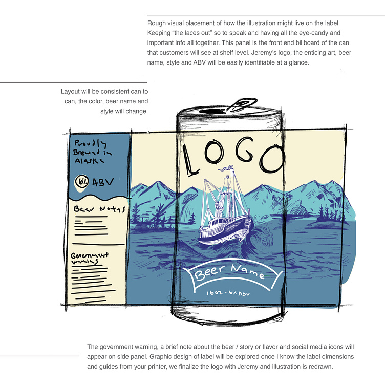
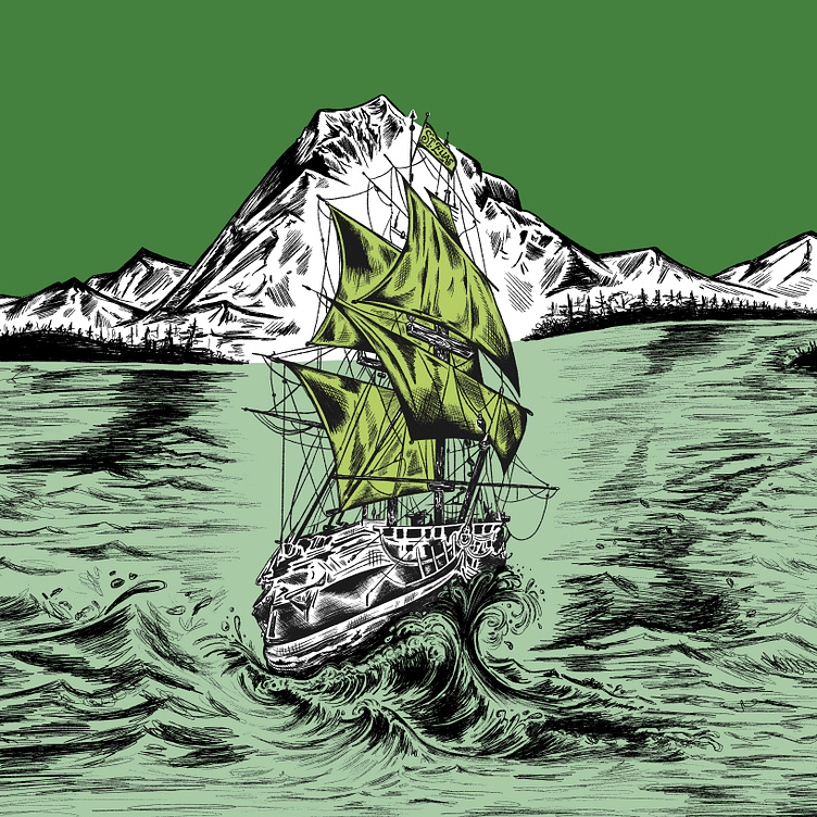
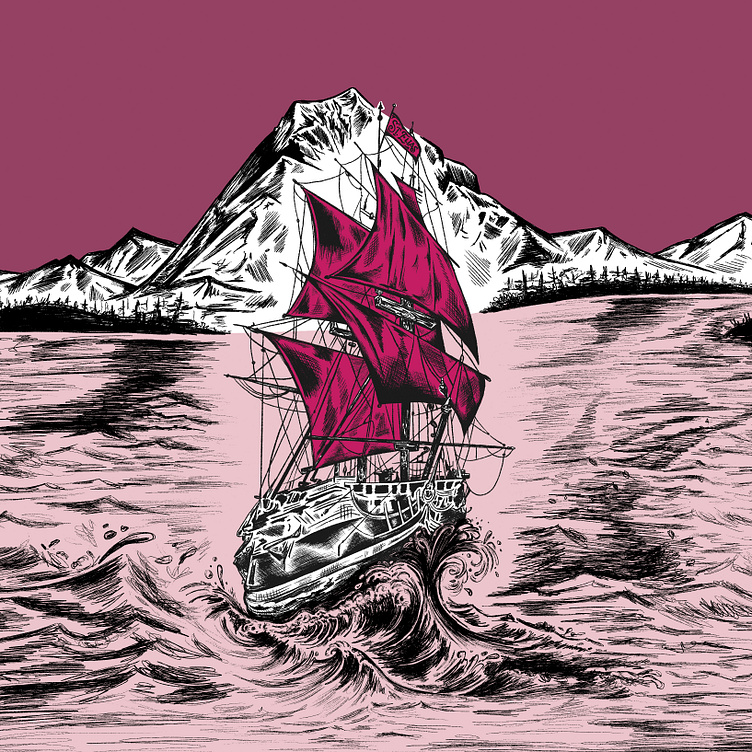
Our task was to refresh the logo and brand to reflect the spirit of Mount St. Elias, the fourth highest peak of North America and the surrounding landscape of the Wrangell Mountain range. When designing the packaging, we wanted to visually show the craftsmanship and quality of each beer. The hand-drawn explorer ship crusting a giant wave enhances the timeless look of the overall label design. The sketchy style of the artwork adds an artisan personality to the branding. Each beer is differentiated by a monochromatic color system which allows the style of the beer to stand out on the shelf while maintaining the brand recognition of the brewery.
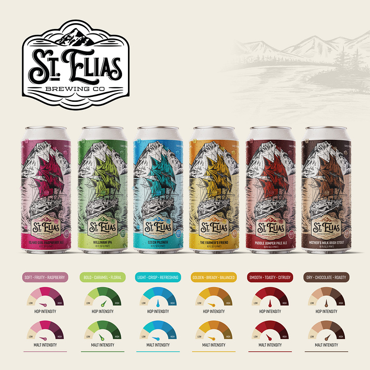
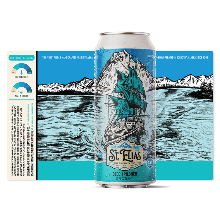
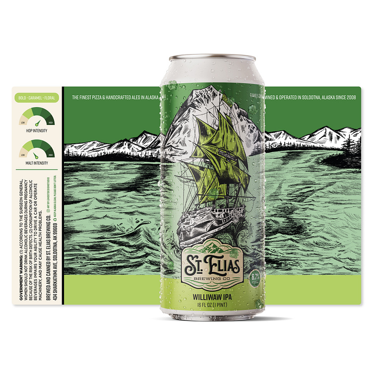
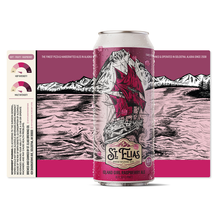
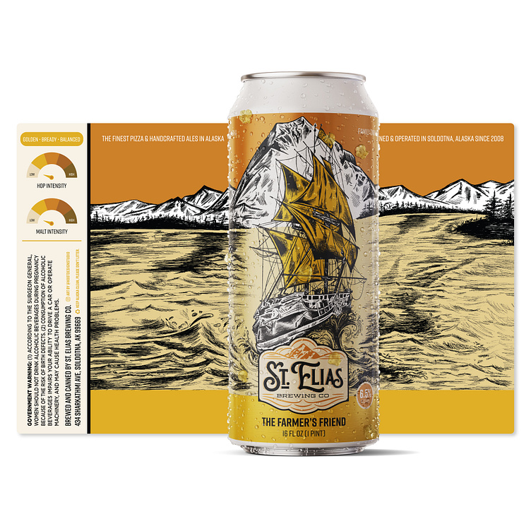
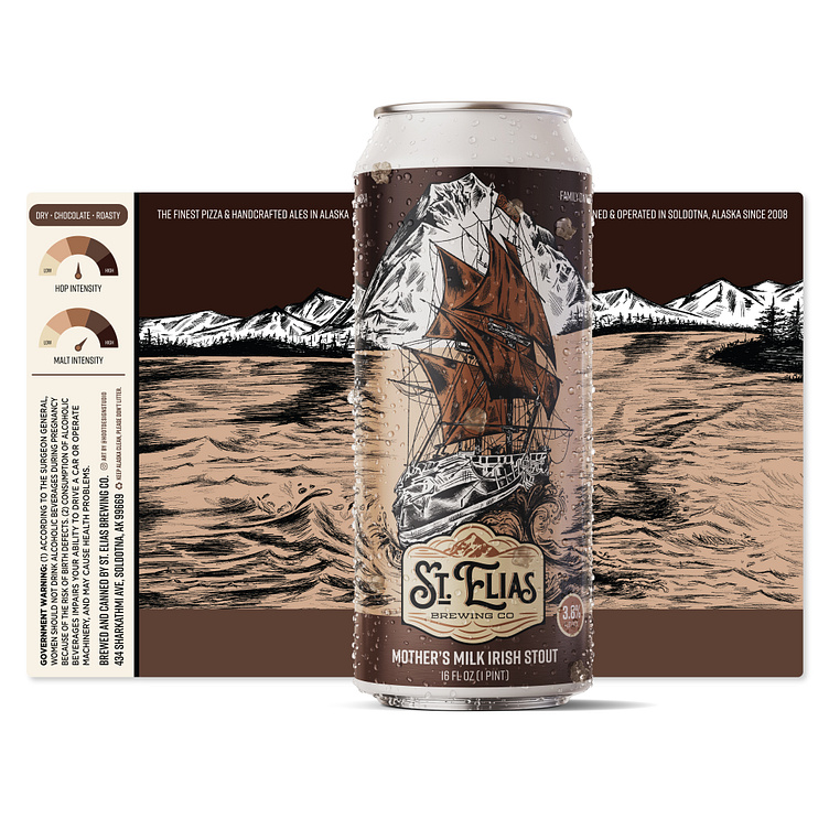
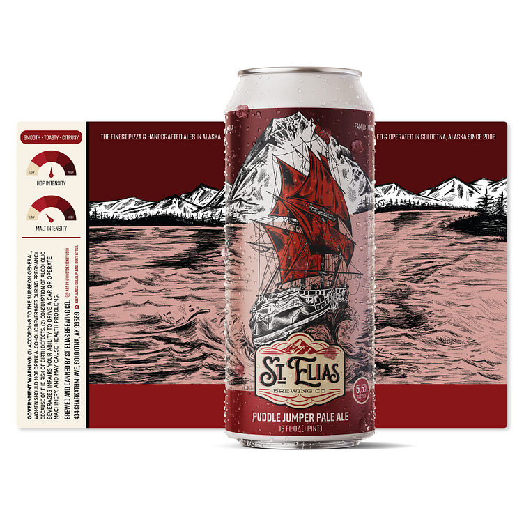
The craft beer market is very competitive and the brand needed a visual identity that would be recognizable with a coherent design from label to label. The consistent imagery and layout allows unity from can to can while allowing the beer name and style to shine. This visually directs the customer's tastebuds to the hop & malt intensity they desire. The strong identification system not only creates brand awareness, but also effectively cut overall design costs while providing functionality and brand identity.
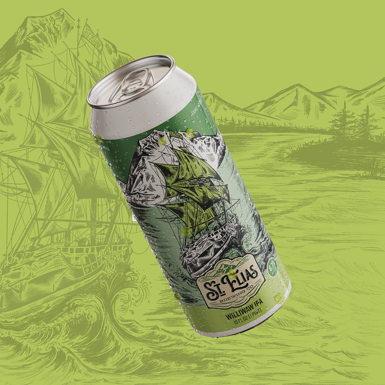
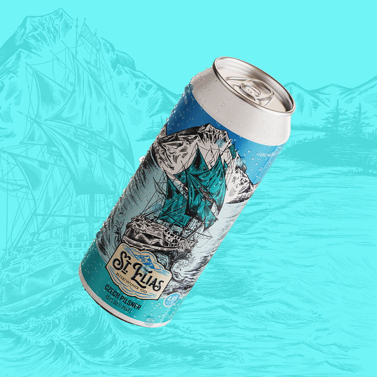
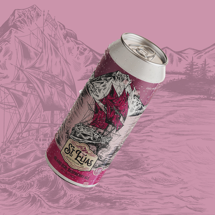
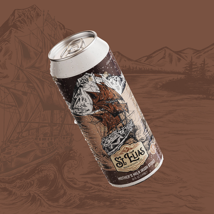
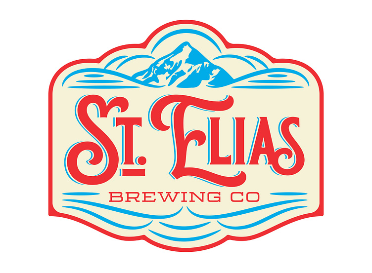
Enter your text here...St. Elias Brewing Company believes in handcrafted and high quality world class beers! The design challenge was to first refresh the logo to build a bolder brand imprint. Hand-drawn letter forms paired with a classy mountain range illustration allowed for a badge design that makes the brewery easy to spot on the shelves. Bold. Identifiable. Timeless.
Creating clear rules for the logo, typeface and color, meant we could playfully express each beer’s distinct personality, whilst heroing the custom lettering by Jeremy Friend.


Hoot Design Studio
Craft Beer Label Design • Brewery Branding • Packaging Design • Pen & Ink Illustration • Logo Design • Apparel Graphics
www.hootdesignstudio.com | Follow along on Instagram