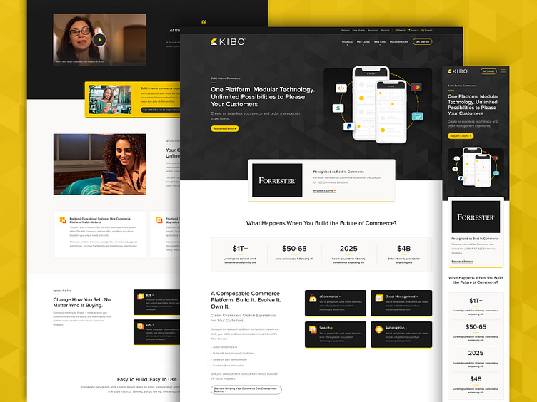
Kibo - Website Redesign, Homepage
Kibo hired Orbit to revamp their entire website! Kibo wanted to elevate the visual aesthetic, and they provided a handful of competitor website links for inspiration... these reference links served as a metaphorical bar that we needed to surpass. Along with the aesthetics, Kibo was very interested in improving the user journey of the site. That meant optimizing the site map architecture, and tailoring the messaging and content in a way that improves domain authority for Kibo so that they can stand out amongst their competition to attract new users.
This particular design (Dribbble shot) is a static design that we presented early in the Design Phase. Our process consists of sharing a handful of key pages, and also sharing how these designs will respond on differently-sized devices.
